

OSes are never truly finished. macOS has been continuously evolving for decades, and it would be foolhardy to declare it ‘finished’ in any sense of the word. It’s not.
However, when you step back and look at macOS over time, trends and storylines emerge from the feature list minutiae of each release. For the past few years, no narrative thread has been more important to the Mac and its operating system than their realignment within Apple’s product lineup. It’s a fundamental transformation of both hardware and software that has taken shape over years, beginning publicly with Craig Federighi’s WWDC Sneak Peek in 2018.
The story begins with a Sneak Peek at the end of a WWDC keynote in 2018.
A parallel story has been playing out with the iPad’s hardware and OS. The iPad’s trajectory has been different than the Mac’s, but today, we find ourselves with two distinct but more closely aligned platforms than ever before. To get there, the iPad has grown into a powerful, modular computer, while the latest Macs now run on the same processor architecture as the iPad Pro and no longer work differently in places just because that’s the way it’s always been.
The journey hasn’t always been easy, especially in the wake of questions about Apple’s commitment to the Mac. The company took those concerns head-on in an unusual meeting with a handful of tech writers in 2017. Still, it was only natural for users to question whether the direction macOS was heading was the correct one.
It didn’t help that those first Catalyst apps that were part of the 2018 Sneak Peek – Home, News, Stocks, and Voice Memos – were rough around the edges and a departure from long-held beliefs about what constitutes a great Mac app. The Mac’s apps had historically been held out as a shining example of the kind of user experiences and designs to which developers who cared about their apps could aspire. Unfortunately, many early Mac Catalyst apps weren’t very inspiring.
The realignment has been rocky for iPad users, too, especially for iPad Pro uses. The Pro’s hardware has been infrequently updated, and the performance of the Apple silicon processors they’ve run on has outpaced what the apps on the platform can do.
Users’ fears have also been fueled by Apple’s institutional secrecy and the multi-year scope of the company’s undertaking. Early communications about Mac Catalyst and SwiftUI left developers and observers confused about the role of each. The situation is more clear today, but at the same time, the question of how to approach building a Mac app is best answered with ‘it depends.’ That isn’t a very satisfying answer. Nor does it help that despite the added clarity, technologies like SwiftUI still have a long way to go to reach their full potential.
Catalina was full of promise, but the road ahead was unclear.
Yet despite the bumps along the road, macOS has made great strides since that 2018 Sneak Peek. With Catalina, we saw the first steps down a path that pointed the Mac in a new direction. Although sometimes messy, the promise of Catalina was exciting because, as I concluded in that review:
There’s no greater threat to the Mac than resistance to change that exists not because the change is worse, but because it’s different.
Catalina was a counter-strike against the sort of inertia that would have doomed macOS eventually, even though at the time, it was more a promise than a destination.
Big Sur’s design changes brought the direction of macOS into sharper focus.
Big Sur picked up where Catalina left off, adjusting course and clarifying where macOS was heading. The update continued the harmonization of user experiences across Apple’s entire lineup, creating a more natural continuum among the company’s products through new design language and updated system apps without abandoning what makes the Mac unique. I don’t mean to suggest that Catalina or Big Sur were unmitigated successes. They weren’t, and some of the missteps of those releases have yet to be addressed, but there was no mistaking where macOS was headed after the release of Big Sur.
Monterey harmonizes system app updates across all of Apple’s platforms.
Monterey’s focus is all about system apps, a topic near and dear to me. With the technical building blocks in place and a refined design out of the way, Monterey is one of the most tangible, user-facing payoffs of the past three years of transition. More than ever before, Apple is advancing system apps across all of its platforms at the same time. Finally, everything is everywhere.
However, as much as it pleases me to see the groundwork laid in years past pay dividends in the form of new features being rolled out simultaneously on all platforms, Monterey’s payoff isn’t an unqualified success. Every OS release has its rough spots, but this year, Shortcuts is especially rough. As optimistic and excited as I remain for Shortcuts to be the future of automation on the Mac, it’s too frustrating to use at launch. That’s not to say I haven’t enjoyed any upside using Shortcuts on my Mac, and it has improved over the course of the beta period, but it still gets in my way more often than it should.
Alright, that’s enough looking back. Let’s dig in and see where things work, where they don’t, and what lies ahead when you install macOS Monterey.
[table_of_contents]
Testing, Compatibility, and Performance
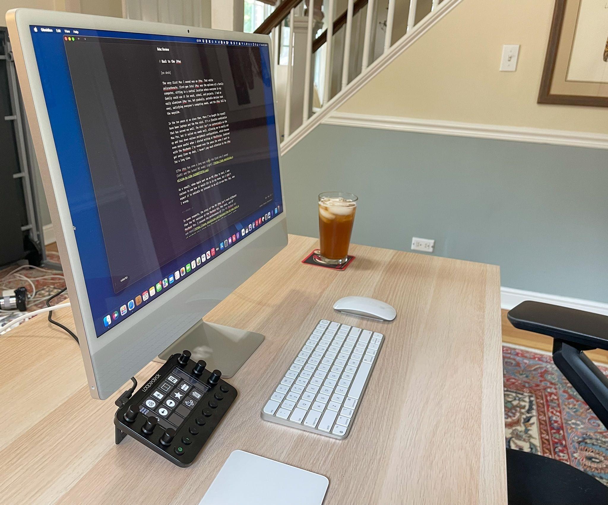
I’ve spent over 1,000 hours working on the M1 iMac using Monterey since June.
My testing was a little different this year than in the past. Shortly before WWDC, Apple sent me an M1 iMac that I reviewed in July. That’s the Mac that I’ve spent 99% of my time working on with Monterey. In fact, I’ve done the vast majority of all my work on this iMac since June. I also installed Monterey on a 2016 MacBook Pro, but that was primarily to track down a Safari bug that has since been fixed.
As an aside, I’m an even bigger fan of the M1 iMac than I was when I first reviewed it, something I’ll be writing about more for Club MacStories+ members soon. The design looks great on my desk, but it’s the bright, crisp screen and M1’s performance that has made it a pleasure to use daily. I’ve only managed to work the iMac hard enough to make its fans audible once when I was doing some screencast work for Club MacStories. It’s a truly remarkable machine and one that may wind up being my next desktop Mac after I return this review unit.
I installed developer beta 1 on the M1 iMac during WWDC and havne’t looked back since. In the interim, I’ve spent every day since early June working in Monterey. It’s been an unusually busy summer at MacStories thanks to the expansion of the Club in August, which has meant I’ve given Monterey a workout beyond what I’d normally do during this time of the year.
Typically, I’ll gradually work my way into using a beta of macOS until I’m using it full-time by August. This year was different in part because I enjoy working on the M1 iMac so much that I couldn’t pull myself away from it, but also because it’s been one of the most stable macOS betas I’ve ever run.
That’s not to say there haven’t been issues, but none were show stoppers. Safari was unstable early on but improved significantly over the course of the summer. There were also a couple of audio apps (Adobe Audition and iZotope RX6) that I use for podcast editing that I continued to run on a 2018 Intel-based Mac mini because they didn’t work with the early betas. I haven’t tried switching that part of my workflow to Monterey yet because it’s been so easy to do on the mini, but I plan to soon.
I also spent most of the summer recording podcasts using an M1 MacBook Air running Big Sur because I couldn’t afford to lose a recording, and I rely on Rogue Amoeba’s Audio Hijack, which only recently updated to work with Monterey, but now, seems to work as expected based on my early testing. However, unlike most years, I edited every show we produce at MacStories in Apple’s Logic Pro running on Monterey. It’s been rock-solid since beta 1, which hasn’t always been true in past years.
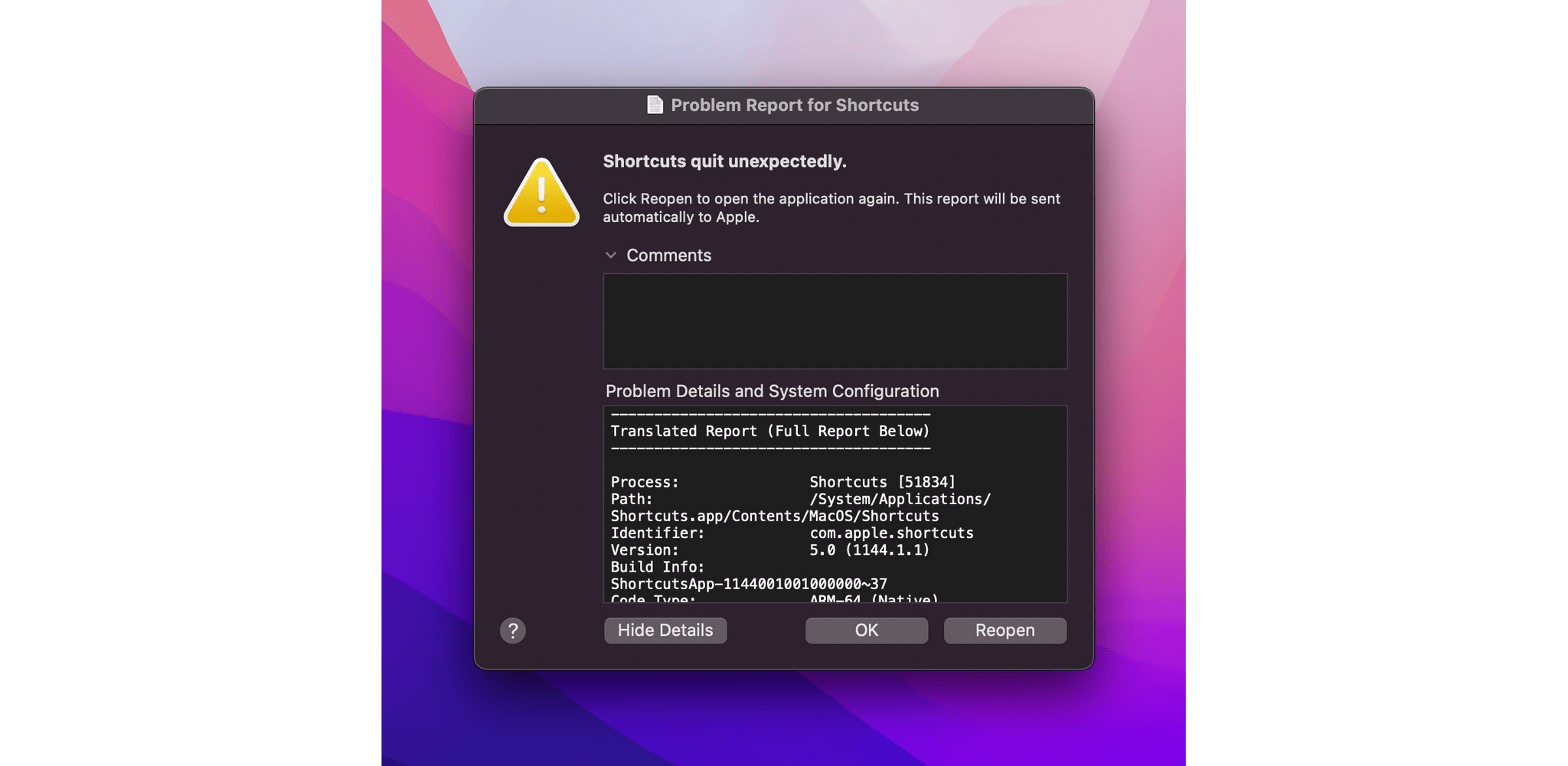
Shortcuts still crashes on me periodically, but far less than in the early betas.
The standout trouble spot on Monterey has been Shortcuts. I’ll dive deeper into the issues later in the review, but the frequency of crashes and bugs have been on par with the issues on iOS and iPadOS 15 that Federico experienced, and substantial enough that I spent most of the summer staying away from the app, hoping it would improve.
Shortcuts has improved. Crashes are less frequent, and there are fewer UI oddities, too, but the app is still too hard to use in its current state, which is a shame. I remain excited about the promise of a unified approach to automation across iOS, iPadOS, and macOS. I’m also reaping the rewards of running shortcuts on my Mac that were created in years past for the iPhone and iPad. However, for now, my advice is to take it slow on Shortcuts for the Mac and be prepared to hit some walls.
Overall, though, my experience with Monterey has been stellar and beyond my expectations of any beta. Over the course of the past four months, I’ve thrown all my typical tasks at it: writing, editing podcasts, working in a variety of web apps, producing screencasts, and the type of web browsing, email, Discord, Google Meet, Zoom, and Webex calls, messaging and other things that most people do on their Macs. With very few exceptions, the process has been seamless.
High Sierra running on a 2016-era MacBook Pro.
Of course, not everyone is using the latest M1 iMac every day. As I mentioned above, I’ve installed Monterey on a 2016 MacBook Pro, which works fine in my limited testing, but here’s Apple’s entire compatibility list:
- MacBook (Early 2016 and later)
- MacBook Air (Early 2015 and later)
- MacBook Pro (Early 2015 and later)
- iMac (Late 2015 and later)
- iMac Pro (2017)
- Mac mini (Late 2014 and later)
- Mac Pro (Late 2013 and later)
That leaves out the following Macs that support Big Sur but not Monterey:
- MacBook (2015)
- MacBook Air (2013-2014)
- MacBook Pro (Late 2013-2014)
- iMac (2014)
This year, however, the compatibility story comes with caveats. There are some features that require an M1 Mac, including:
- Portrait mode FaceTime calls
- On-device dictation with no time limit
- Neural engine-based text to speech
- The interactive globe and 3D city experiences in Maps
Also, AirPlay to Mac is limited to the following Macs:
- iMac (2019 and later)
- iMac Pro (2017)
- Mac mini (2020 and later)
- Mac Pro (2019)
- MacBook Air (2018 and later)
- MacBook Pro (2018 and later)
Spatial audio requires a Mac from 2020 or later that with an M1 chip, using internal speakers, wired headphones, or AirPods, an Intel-based Mac laptop from 2018 or later using internal speakers or wired headphones, or an Intel-based iMac from 2018 or later using wired headphones. Low Power Mode is supported by MacBooks from early 2016 and later and MacBook Pros from the same time period.
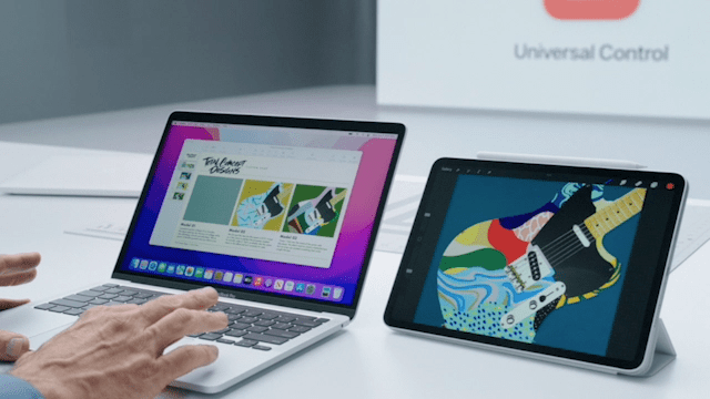
Universal Control was missing from Monterey’s betas all summer.
Universal Control has its own spec requirements, too, but Apple has said it won’t be released until later this fall, so specs released earlier this year may shift by the time it debuts.
The long list of compatibility footnotes and caveats this year underscores Apple’s commitment to moving on from Intel-based Macs. Many of the caveats are explained by their reliance on Apple silicon features like the Neural Engine. I expect we’ll see more Apple-silicon-reliant features in the future as more and more Macs migrate to Apple’s SoC architecture. That’s not to say Intel-based Macs won’t continue to be supported for the foreseeable future, but it’s likely that support will include fewer cutting-edge features as time passes.
As for whether it’s safe to upgrade to Monterey, my answer is a qualified ‘yes.’ It’s a qualified ‘yes’ because you should always do some research about whether apps you rely on for critical tasks work with a new OS. I’ve tried a lot of apps on Monterey this summer, but there are thousands I haven’t. If you have a critical app that you discover doesn’t work with Monterey, and you don’t have a ‘Plan B’ like running it on a secondary Mac, wait to update. However, for most people running Apple’s system apps and downloading actively maintained apps from the Mac App Store, I think you’ll find Monterey to be stable and a pleasure to use despite a few rough patches here and there.
Safari
Few apps are more important to the macOS experience than Safari. Whether it’s for work or leisure, an enormous part of your computing day is probably spent within the confines of a browser window with multiple tabs open. As a result, design changes to Safari are high-stakes gambles that should be approached with caution and should only be implemented where they serve a clearly defined goal that meaningfully improves the browsing experience for users.
Apple took a big risk with the Safari design that was introduced at WWDC, and it fell flat. I spent most of the summer working with that design, and it never grew on me, and I never got used to it.
To Apple’s credit, it listened to the feedback and corrected course, fixing the most egregious issues with Safari’s tab design. The compact tab design that combines Safari’s toolbar and address bar with its tabs in a unified interface was made optional early in the beta period. Then, very late in beta cycle, Apple reverted rolled back the remainder of its tab design changes and made tinting the chrome of Safari’s toolbar an option only if you use compact tabs. It’s been quite a journey that has largely wound up back where we started, but the summertime drama over Safari’s shifting design shouldn’t overshadow the fact that the browser also includes excellent new features like tab groups and Quick Note integration that have worked their way into my day-to-day web browsing workflow.
Tabs
Unifying tabs and the Safari toolbar is optional.
At WWDC, Apple announced sweeping design changes to Safari across the iPhone, iPad, and Mac. The reaction was swift and negative, especially with the way the address bar was initially handled on iOS.
Safari’s window chrome can change color along with the Club MacStories logo in compact mode.
On the Mac (and iPad), Apple took a different tack. The address bar and tabs weren’t moved to the bottom of Safari’s window. Instead, the address bar was merged into the active tab, and the tab bar’s chrome changed with the tint color of the website open in each tab.
For most of the Monterey beta tab bar colorizing is turned on by default. I lived with it turned on for a couple of months, and with a single site with a rich color palette open, the effect can look beautiful. In practice, though, the feature is a distraction. One moment the tab bar might be the familiar dark gray of macOS’s dark mode, but switch tabs, and suddenly everything is bright red. If you work with a lot of tabs, you want the tab bar to be consistent. Changing colors from tab to tab makes it harder to locate extensions and other toolbar buttons, so in the end, I turned the feature off and never looked back.
Colorizing the tab bar to match the site you visit is only available in compact mode and can be turned on in Safari’s Advanced Preferences tab.
In the shipping version of Monterey, tab bar colorization is still available but the option has been further de-emphasized. Now, the option to turn colorize tabs is only visible in Safari’s Preferences after you turn on its streamlined tab bar mode.
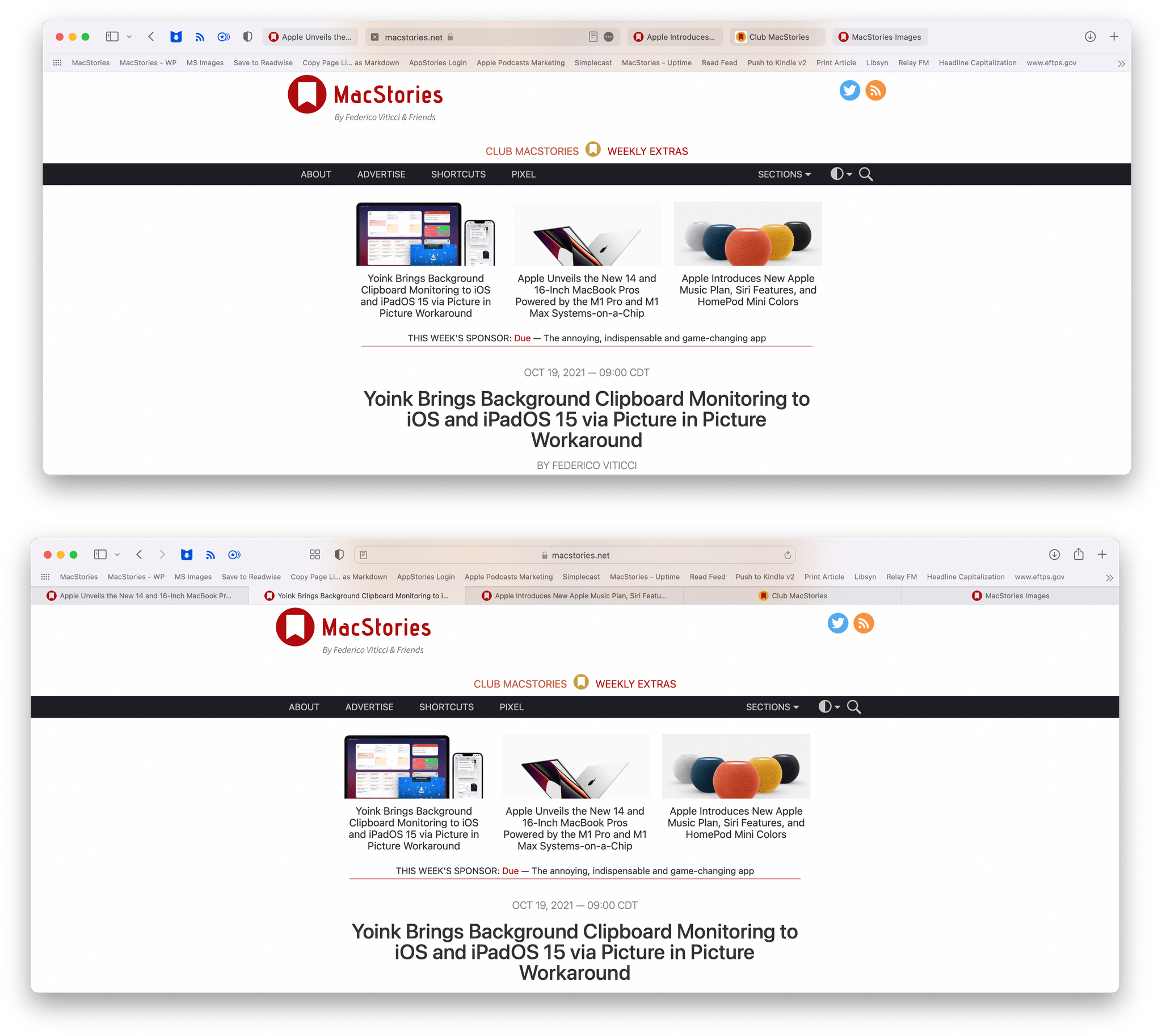
The compact tab bar (top) and separate tabs and address bar (bottom).
The the Compact tab layout, what Apple sometimes refers to as the streamlined tab bar, combines Safari’s address bar and toolbar with the active tab. The Compact layout was the default in the early Monterey betas, but that has changed. Now, the Compact tab layout is turned off by default. I don’t recommend using the Compact tab layout, but if you want to see what it’s like, head to the Tabs section of Safari’s Preferences and select ‘Compact’ under ‘Tab layout.’
If you switch to the streamlined tab bar, you’ll see the address bar and the buttons on either side of it disappear. The address bar is moved to the active tab, which makes it wider than any other tabs you have open. Most of the toolbar buttons for Safari features and third-party extensions you’ve installed move to the left and right sides of your row of tabs, but some of those buttons, like the Share button, move behind a new ‘more’ button that appears on the right side of the active tab’s address bar.
Separate address and tab bars.
Compact ‘streamlined’ tabs.
The streamlined tab layout undeniably increases the vertical space visible in a Safari tab. The trouble is that the gains aren’t worth the cost of cramming so much into a single horizontal strip of UI. It’s simply a bad trade. Look at the difference between the screenshots above. This example wasn’t cherry-picked to emphasize my point. I easily could come up with a more egregious example.
I have five tabs open in the screenshots above. In the ‘separate tab’ layout, the tabs span the window, I can see the URL of the active tab and the site names and most of the page titles for the other tabs are visible. When I switch to the Compact layout, I can still tell I’m on MacStories, but the tabs are crammed in the center of the window eliminating most of the detail about my other tabs to make room for toolbar buttons and the address bar.
Safari saw a lot of design drama this summer. The app was harder to use than before, and it was distressing to see an app on which I rely so heavily take such an abrupt turn for the worse. That, however, is water under the bridge. What’s important is that Apple listened to its users and, in the end, I think Safari’s design experiments landed in the right place.
Tab Groups

I typically park sets of research tabs in tab groups that I want to return to later.
The changes to Safari this year aren’t strictly about its design. There are some excellent new tools available with Monterey, my favorite of which is tab groups.
When tab groups were explained onstage at WWDC, I was left scratching my head. At first, tab groups struck me as bookmarks masquerading as something new and different. In fact, the difference is real and the sort of thing that is a fantastic addition for anyone whose browser use spans multiple projects and tasks over time. That’s because tab groups let you park sets of tabs in a safe, synchronized spot any time your browsing gets interrupted.
There are all sorts of scenarios where I’ve found tab groups to be useful, but first, let’s examine how they differ from bookmarks because it makes a difference in how they are used. A saved bookmark takes you to the same URL every time. Bookmark macstories.net, and every time you click on the bookmark, you’ll wind up on MacStories’ homepage.
You could add the MacStories homepage to a tab group, too, but the experience is a little different. That’s because a tab group is more like a saved browsing session than a link to a specific webpage. If MacStories is in one of your tab groups when you open it, but you navigate from it to another site like 512 Pixels, the next time you open the Tab Group, one of the tabs will be for 512 Pixels, not MacStories where you started.
I have a few sites I use every time I produce AppStories, so they’re bookmarks, not a tab group.
If you want to open a set of saved websites and always be taken to the same sites, you can use folders of bookmarks. For example, let’s say you send out invoices for your business once a week, and to do that, you always start with three tabs: your bank, your invoicing service, and a Gmail tab for emailing customers. That’s the perfect scenario for a folder of bookmarks that will take you to those same three sites every time you need to send out invoices.
To extend that scenario further, though, say you had ten invoices to send out, but before you could get all of them out, you’re interrupted by something else that required you to open a bunch of different tabs. This is where tab groups shine. You could leave your invoicing tabs open and then open more tabs for the new task, but depending on how long it takes you to get back to the invoicing, those tabs can quickly get lost among the tabs for the new task you started, plus any other tabs you open in the meantime.
With tab groups, you can take the invoicing tabs from my example and create a tab group, saving their state the way you left them when you picked up a new task. Better yet, the tabs in your invoicing tab group would be synced across your devices, so you can pick the task back up later no matter what device you’re on.
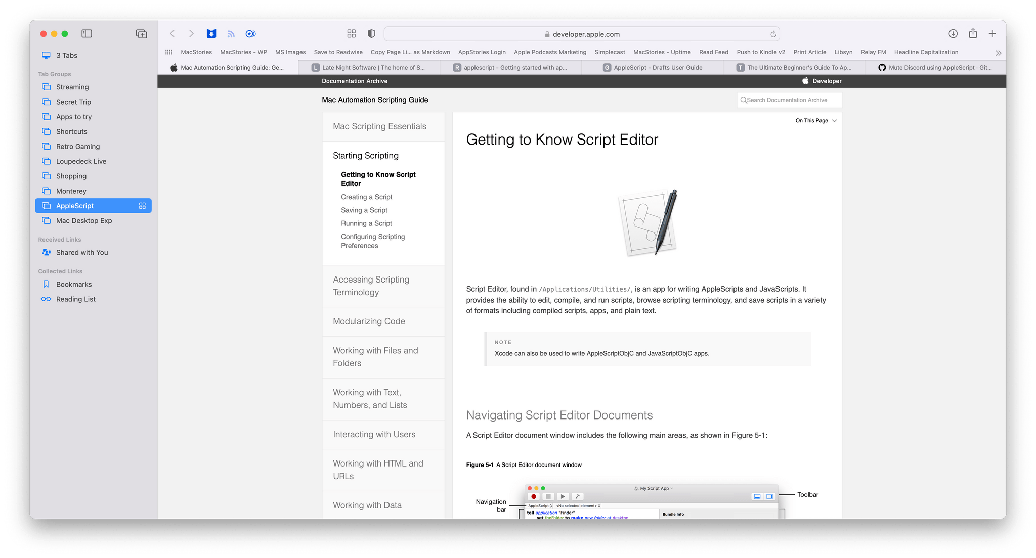
I’ve been doing some ongoing research about AppleScript, which is perfect for a tab group because I can continue whenever I have time on any device.
I’m a big fan of tab groups. The interrupted task scenario is just one example of where they come in handy. I’ve also found tab groups to work well as a very lightweight ‘read later’ service where I can temporarily park articles I find throughout the day for reading on my iPad mini in the evening when I have the time to read.
Tab groups are also excellent for long-term research that I don’t finish in one sitting, whether that’s for a family trip or research for a longer-term work project. I’ve still got tab groups that I saved at the beginning of the summer that I continue to periodically revisit on a variety of devices. One thing I’d like to see added in the future on all platforms is the ability to create tab groups, add to them, delete them, and retrieve the links saved in them using Shortcuts.

You don’t need to open the sidebar to access your tab groups.
It’s also worth mentioning that you can quickly switch to a tab group without opening Safari’s sidebar. Click on the caret next to the tab group icon in Safari’s toolbar for a drop-down list of all of your tab groups. Pick one, and you’ll be immediately switched to those tabs. You can also share the links in a tab group by right-clicking on it to copy the links or dragging them into a text field. What you’ll get is a list with the name of the tab group and the links below it.
The Rest of Safari’s Sidebar
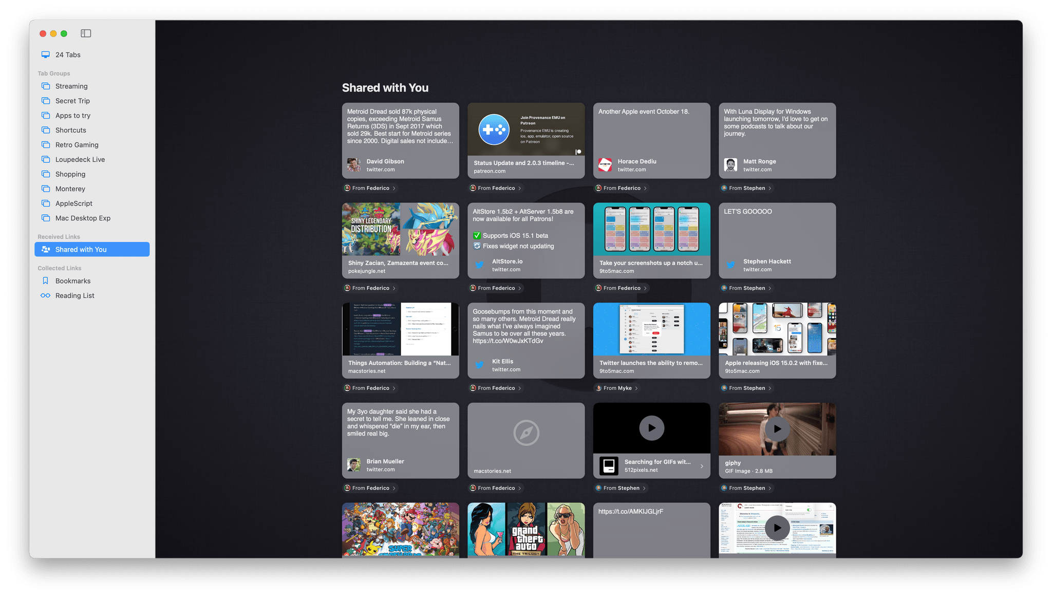
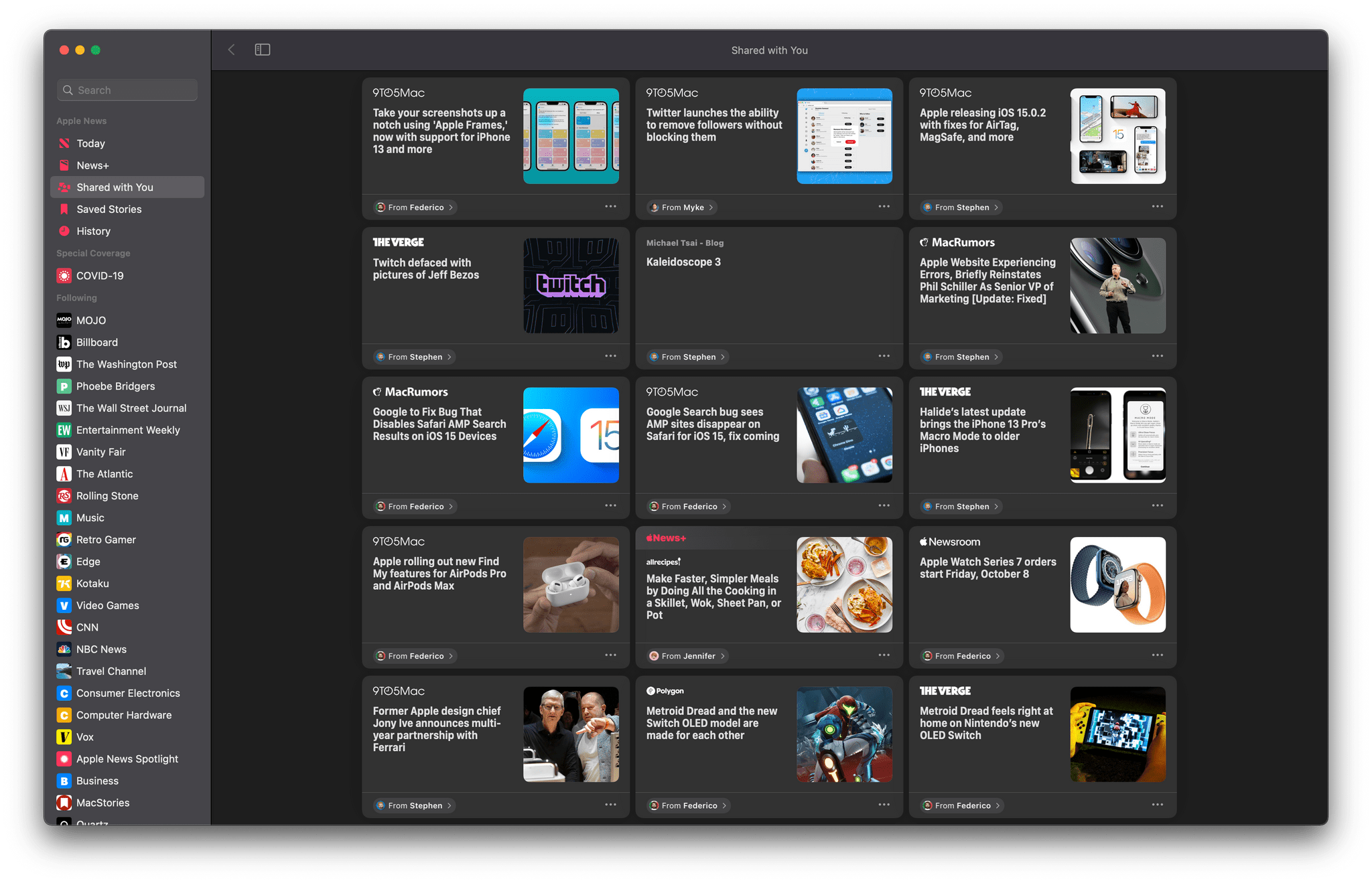
Shared with You in Safari.
Tab groups reside in Safari’s redesigned sidebar alongside Bookmarks, Reading List, and Shared with You links. The close relationship between tab groups and bookmarks makes them an obvious, complementary pairing in the sidebar. The same goes for Reading List, although I wish Apple had taken the opportunity this year to refine Reading List too. The feature has barely been touched in years and is in desperate need of an organizational framework like folders or tags for it to be useful to anyone who saves lots of articles to read later.
I’ll cover Shared with You when I get to Messages, but these are a collection of links shared with you in the Messages app, which are sometimes duplicated in Apple News, if they’re available there, and can be added to your custom Safari start page too. I haven’t found Shared with You to be very useful, and I wish Apple would provide a setting in Preferences to hide that section of the side bar and the others that I don’t use, similar to the way I can hide content sections of Music’s sidebar.
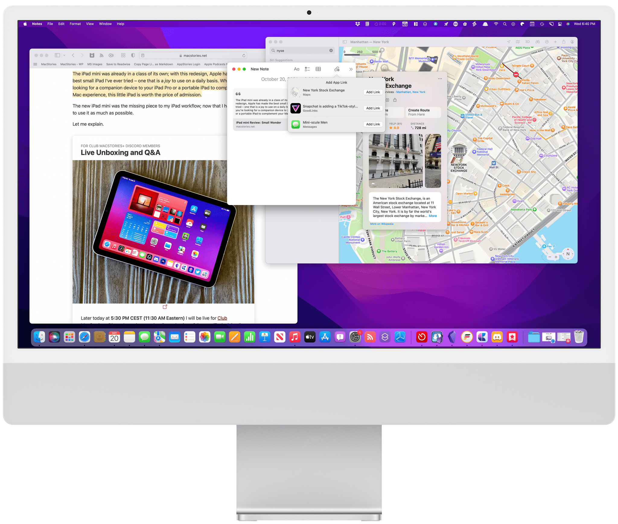
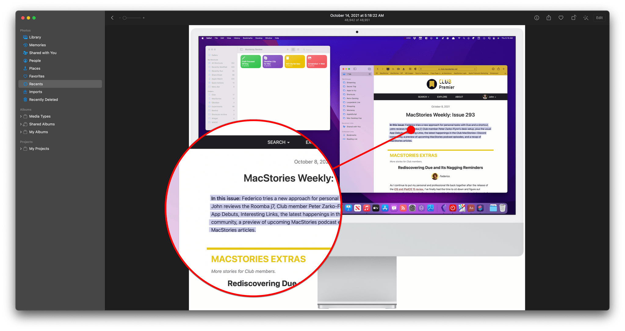
Safari and Quick Note
Quick Note is a new feature of the Notes app that includes a special integration with Safari. The feature can be opened on the Mac with the Globe or Fn key + Q keyboard shortcut, which can be changed by visiting the Shortcuts for Mission Control section of the Keyboard System Preferences pane. Quick Note can also be tied to any of the four Hot Corners in the Desktop & Screen Saver System Preferences pane.
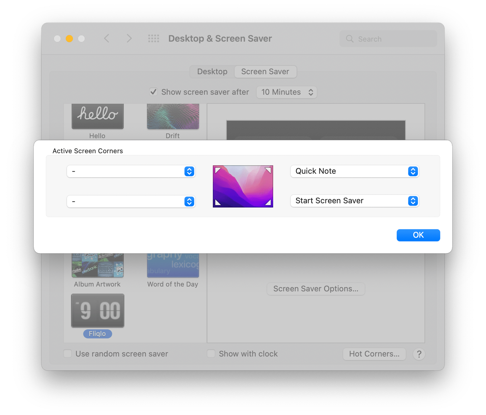
Quick Note can be assigned to a Hot Corner in System Preferences.
If you’ve read Federico’s iOS and iPadOS 15 review or my story on the feature from over the summer, you already have a sense of what Quick Note can do. On the iPad, Quick Note’s separate hovering window marks a significant new direction for iPadOS.
On the Mac, the experience is a little different. By and large, I prefer the iPad experience because you can swipe between your collection of quick notes adding to whichever is relevant to what you’re doing. In contrast, the Mac opens either the last note you worked on or a new one depending on the setting you picked. By default, Quick Note picks up where you left off with your last note.
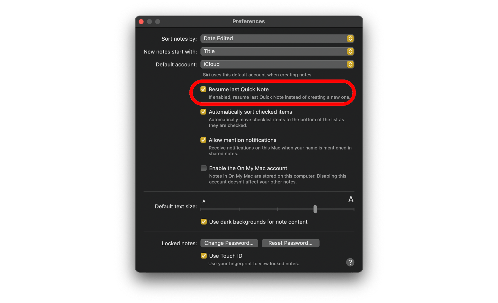
Whether you start a new Quick Note or pick up where you left off can be selected in Notes’ preferences.
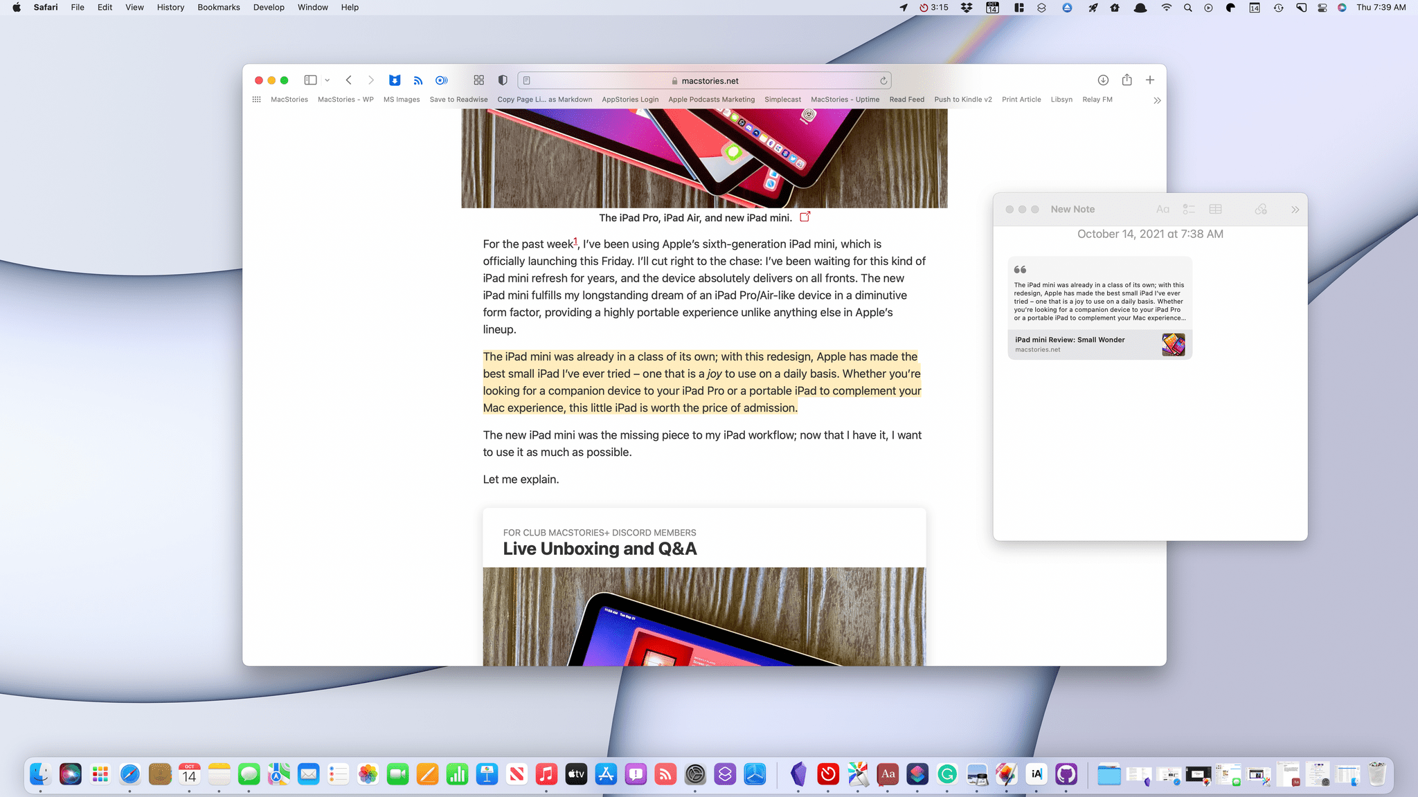
A big part of Quick Note’s utility on the iPad is the novelty of having a floating window available to take notes without having to dedicate a Split View or Slide Over space to Notes. On the Mac, which has always been a windowed environment, having a separate Quick Note window is inherently less useful, but the feature is still powerful because of its deep linking support, which is why I raise this feature in the context of Safari. If you’re browsing in Safari, you can select page elements, including text and images, and highlight them by right-clicking and picking Add to Quick Note.
The highlighting is persistent, meaning it remains visible between visits to the site you’ve highlighted. Return to the page you’ve highlighted, and a thumbnail of your Quick Note appears in the corner of the screen that you can use to reopen the note. You can also reopen the note by clicking on your highlights. The power of bi-directional linking of this sort pushes the combination of Notes and Safari far up the research tool ladder for a lot of users, myself included.
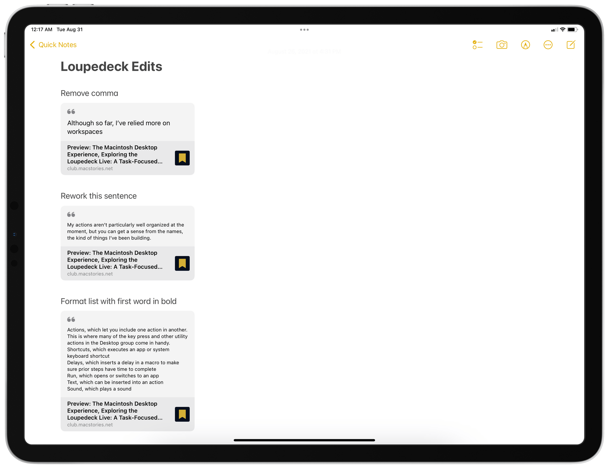
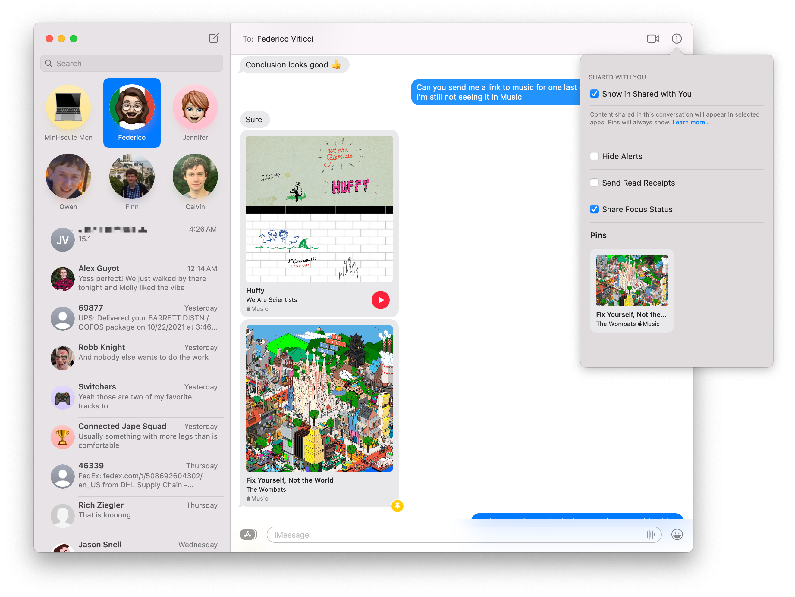
Federico and I have begun sharing edits with each other using Quick Note.
Another unique use case for Quick Note that Federico discovered over the summer is for collaborative editing. If I save a draft article to our WordPress or Calliope systems, Federico can review it in Safari as an admin user. Despite the fact that the draft article is unpublished behind a login, he can highlight excerpts, dropping them into a note with Quick Note and adding some explanatory notes alongside each excerpt. When he’s finished, he can share that note with me, and I can review it alongside the draft article to make any changes, all behind our admin logins.
The same process that Federico used on iPadOS to mark up my articles using Quick Note, I used when editing his iOS and iPadOS 15 review. Whether I was on my iPad Pro or Mac didn’t matter; both worked equally well whether I was doing the editing or receiving Federico’s edits of my work. When we finish with a story, and it has been published, we simply delete the shared quick notes.
I’d like to see the same sort of tight highlighting and Quick Note integration added to more apps, including Books and Preview. Really, any text-based document app where highlighting is useful is a good candidate for Quick Note integration.
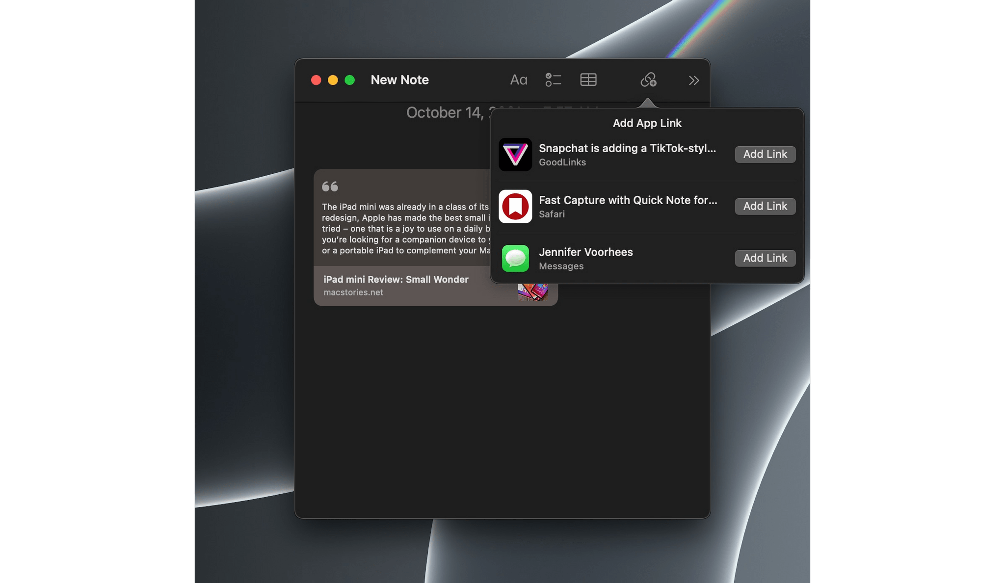
Quick Note can link to a long list of apps.
In addition to highlighting support in Safari, Quick Note can link to any app that takes advantage of NSUserActivity, adding deep links to content in those apps that reopens them when the Quick Note link is clicked. A lot of my favorite apps that have come to the Mac from iOS or iPadOS already support Quick Note, so I expect you’ll find linking suggested when you invoke Quick Note while using your favorite apps too.
Notes and Live Text
Tagging and Smart Folders
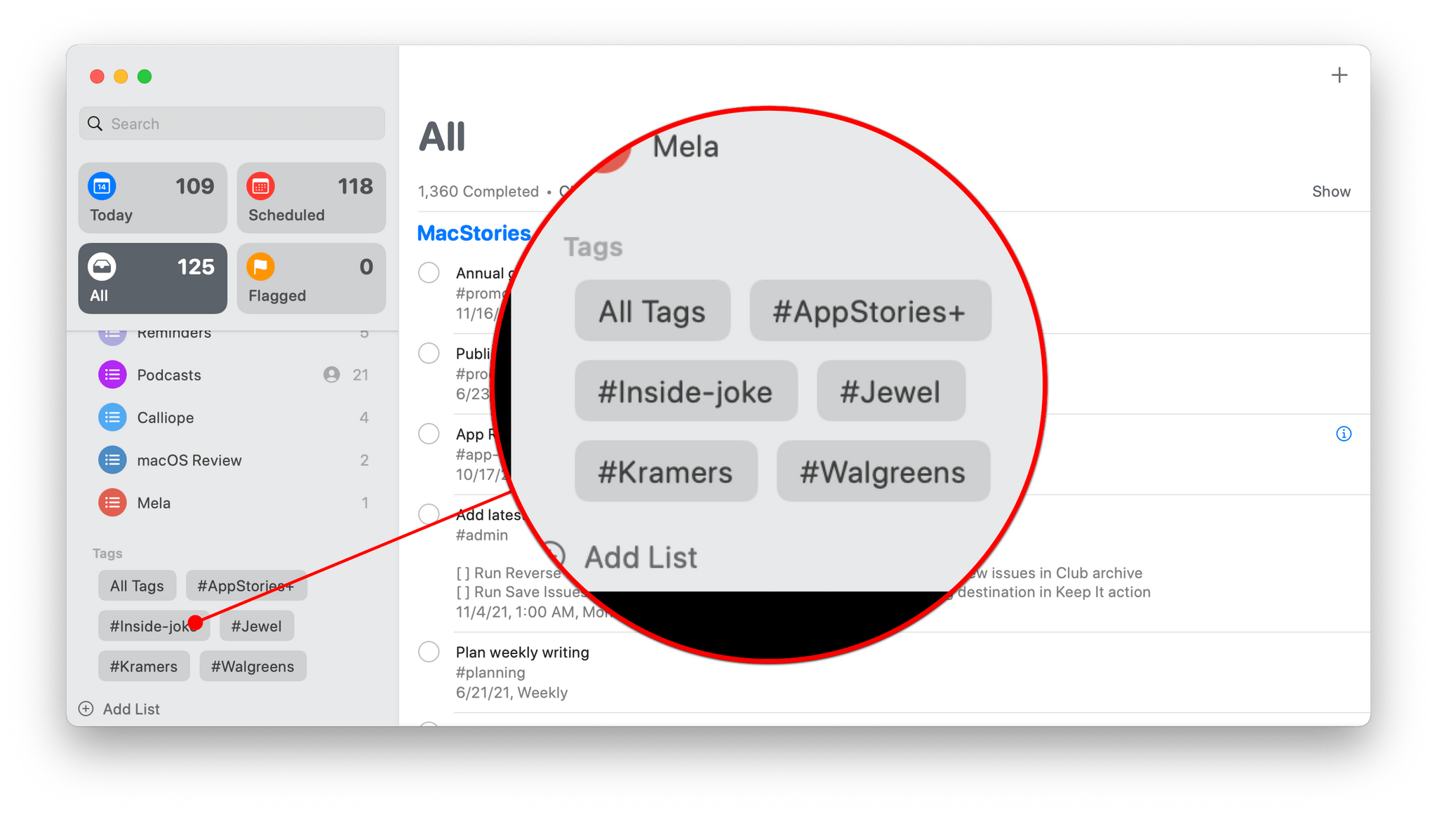
Quick Note is, by far, the most important new feature of Notes in Monterey, but it’s not the only one. Notes has also added tagging.
Historically, Apple’s support for tagging has been limited. The Finder supports text-based tagging to which you can assign one of seven color options or no color, but that’s about it. Now, with Notes and Reminders, which I cover below, Apple’s approach to tagging is expanding and evolving. Notes supports hashtags, which can be added anywhere in a note. Simply add a ‘#’ symbol in front of a keyword inside a note, and your note is tagged.
Tags sit at the bottom of Notes’ sidebar.
Of course, the advantage of tags over a folder-only organization structure is that it allows users to add multiple tags to one note. For example, I might create tags for ‘writing,’ ‘MacStories,’ and ‘Club’ and then apply ‘writing’ and ‘MacStories’ to notes for an article like this one that is destined to be published on MacStories and ‘writing’ and ‘Club’ to notes about articles I’m planning for our Club MacStories newsletters and columns.
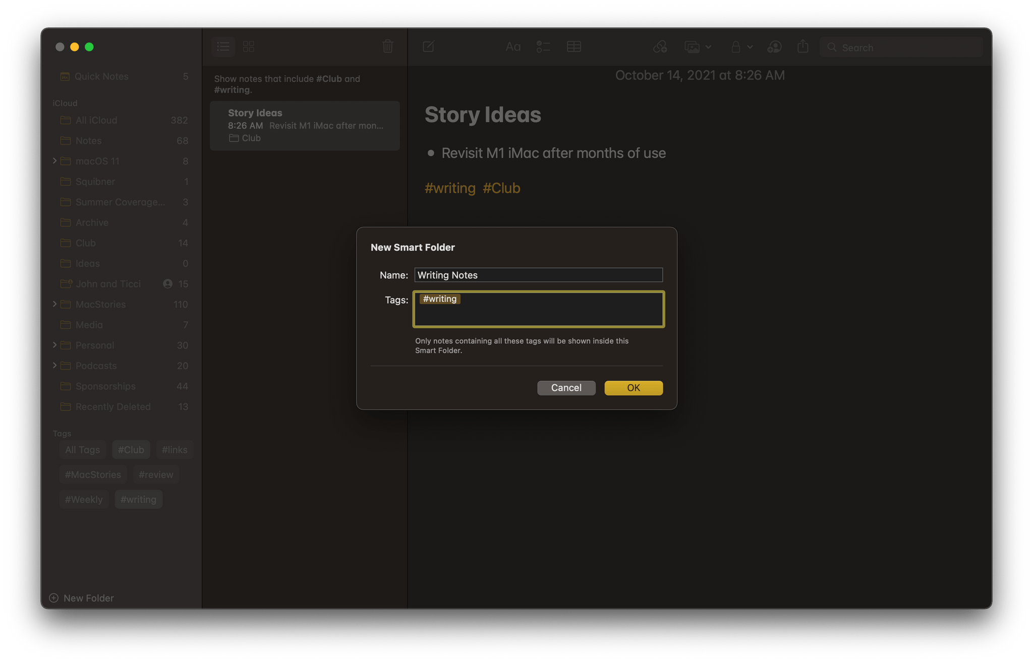
A Smart Folder collecting all #writing notes among all of my notes.
Apple makes use of tagging with another feature called Smart Folders, which can filter notes based on multiple tags. That way, I can have a Smart Folder in Notes for ‘writing’ that collects all of my writing no matter where it’s going to be published, and a ‘MacStories/Writing’ Smart Folder that only contains notes related to stories I’m writing for publication on MacStories.
Instead of creating a dedicated Smart Folder, clicking on the writing tag in the Tag Browser has the same effect as the folder in the screenshot before this one.
Notes’ new Tag Browser makes navigating by tag easy too. Click on a tag listed in Notes’ sidebar, and Notes automatically filters by that tag, so only those notes that include the tag you select are displayed. Click on more than one tag, and notes that are tagged with both are displayed.
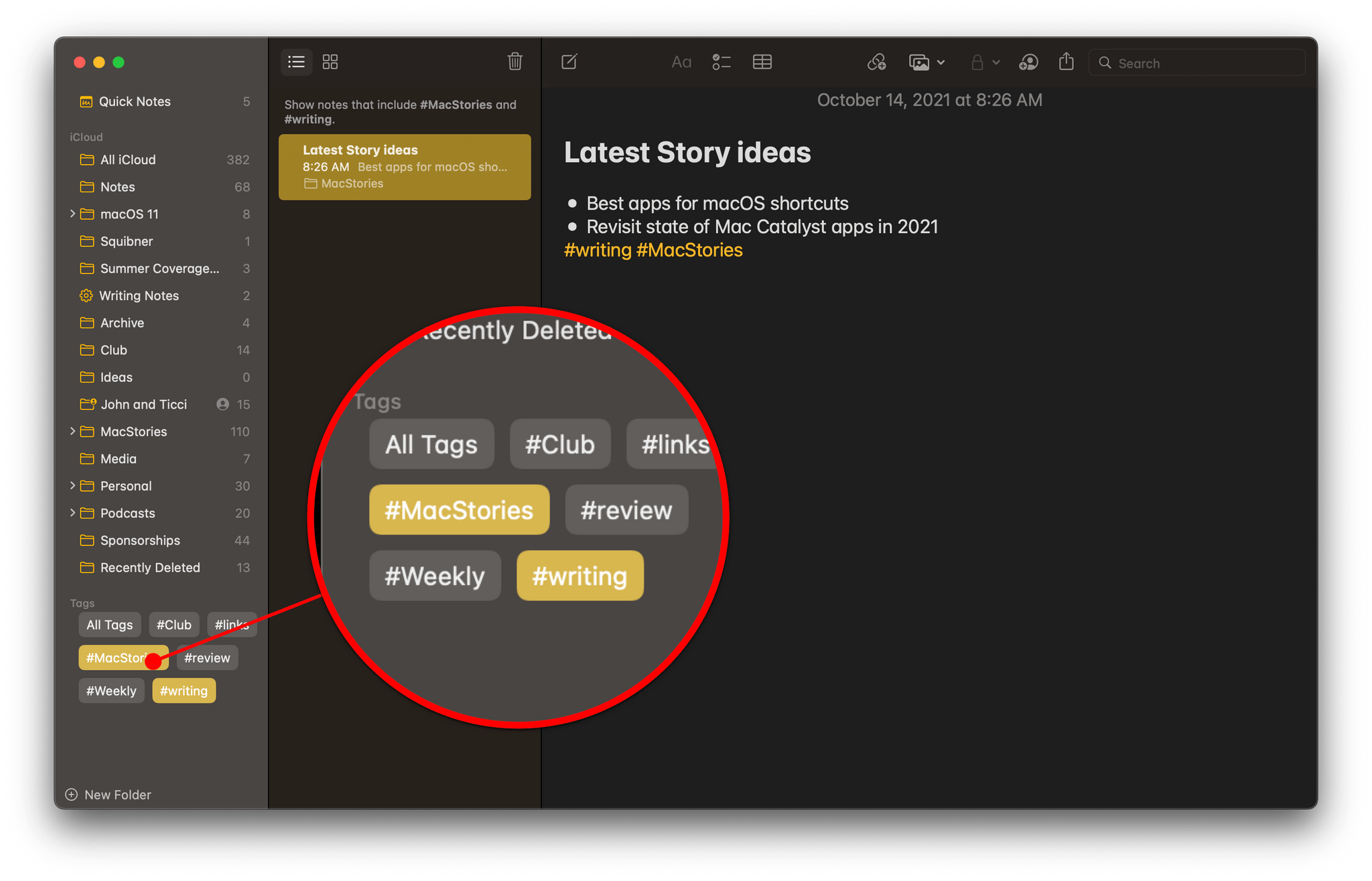
Filtering notes by selecting multiple tags.
For anyone with a lot of notes, the new tagging and Smart Folder features are a boon. However, they don’t go far enough. There is a lot of other metadata relevant to notes, like creation date, modification date, whether it has been shared, and more that should be exposed to make Smart Folders even more powerful. What’s a little curious about the lack of depth to Notes’ Smart Folder filters is that Reminders added tagging in Monterey too, but Reminders’ Smart Lists can also be created based on a long list of other metadata filters. Whatever the reason for Notes’ limited Smart Folder implementation, I hope it follows in Reminders’ footsteps in the future.
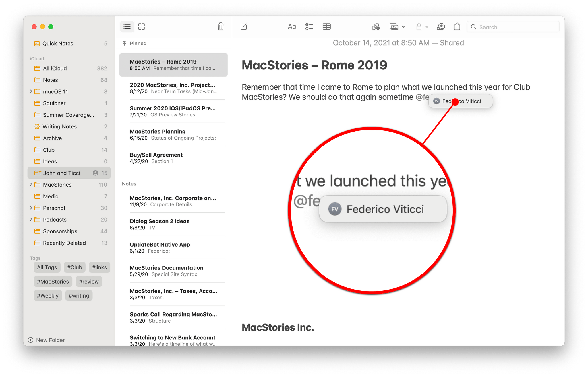
As you add an @mention to a note, the app auto-completes the person’s name, using your Contacts database.
The other marquee feature of Notes this year is @mentions. If you share notes with a group of people, mentioning their name preceded by the ‘@’ character sends them an alert. For any shared note with more than two people, @mentions strike me as an excellent way of making sure you get someone’s attention in a shared note beyond the default notification that a note has been edited.
Apple has also included an Activity view in Notes that records a list of edits made by collaborators on a note and a highlights mode for tracking changes that, together, make it easier than before to keep up with a rapidly evolving document shared by multiple people.
Live Text
With Live Text, you can highlight text in an image, like this screenshot, in Photos or any other app.
While I’m on the subject of text, I wanted to highlight Live Text, which is a system-wide feature that is a big win on the iPhone, iPad, and Mac. With Live Text, your Mac recognizes text in images, which makes it possible to select and copy it. This is optical character recognition (OCR) but applied system-wide and automatically.

Live Text even works on images on the web.
A note with the text copied from the image above.
Not only can you use Live Text to copy text in images, but it also supports data detectors. That means if Monterey detects a phone number, email address, URL, address, flight number, or other structured data, it can offer to do more than just copy the text. Data detectors mean you can click on a URL in an image and visit the website in Safari or click on an email address to send a message, for example. The feature even works with images you find on the web.
Live Text supports data detectors.
It’s hard to express the power of Live Text because once the text in an image can be manipulated in the same way as though it appeared in a text editor, it quickly becomes second nature to treat it like any other text. Initially, Live Text was slated to be an M1 Mac-only feature, but over the course of the summer betas, Apple expanded Live Text’s compatibility to Intel Macs too, which I’m glad it did because Live Text is one of those quality-of-life improvement features that should be made available to as many users as possible, and which they will expect since it’s available on a wide range of iPhones and iPads too.
Reminders
Another bright spot in Monterey this year is the surprising power added to Reminders. The app has evolved a lot from its modest beginnings as an app for making simple checklists. With Monterey, Reminders has become an app that goes far beyond shopping lists, making the app a viable choice for much more sophisticated task management.
I covered the biggest change to Reminders on all of Apple’s platforms over the summer in a story that covered how effectively the app harnesses metadata to allow users to generate Smart Lists of tasks personalized to their specific needs and tastes. What makes Smart Lists in Reminders more compelling than the Smart Folders in Notes is the incorporation of metadata other than tags. Like Notes, Reminders lets users associate hashtag-style tags with tasks and browse them from the Tag Browser at the bottom of the app’s sidebar.
Like Notes, Reminders includes a Tag Browser in its sidebar.
Tags can also be used to create Smart Lists, which apply a set of filters to tasks based on them. However, unlike Notes’ Smart Folders, Smart Lists can also filter by:
- Date
- Time
- Location
- Flag
- Priority
Building a Smart List is reminiscent of creating a Smart Playlist in Music (and before that, iTunes). Each of Reminders’ filters includes multiple options. For example, a date can be set to ‘Any,’ meaning a task with any date associated with it, a Specified Range of dates, and a Relative Range for a certain number of hours, days, weeks, months, or years in the past or future. For a full description of each Reminders filter and how to create Smart Lists on your Mac, as well as on an iPhone or iPad, check out my story from the beginning of September, which covers the topic in detail.
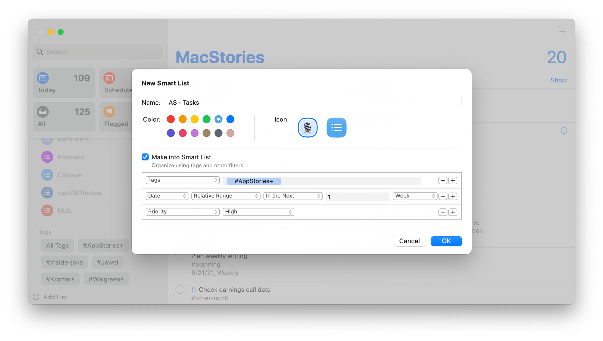
There are a lot of filters that can be applied when building a Smart List in Reminders.
What’s exciting about Reminders is the prospect that it may signal an expansion of app customization across all of Apple’s platforms. Apple hasn’t experimented with tagging for quite some time, and now, it’s done so in two of its system apps. The idea of ‘smart’ lists and folders is far newer on the iPhone and iPad than it is on the Mac, but even on the Mac, smart filtering hasn’t advanced in recent years. Combined with a renewed interest in automation with the introduction of Shortcuts on the Mac, Apple is poised to bring a unified system of customization and automation to users across all of its platforms that previously amounted to a patchwork of disconnected OS features coupled with third-party solutions that filled the gaps.
Reminders has added a handful of other features too. Apple says Reminders’ natural language support has been expanded to include phrasing like ‘Workout every other morning,’ which suggests setting a reminder every two days at 9:00 AM. Deleting completed reminders is easier than before, too, with a new ‘Clear’ button at the top of lists.
Reminders is the perfect spot for Apple to have begun exploring app customization across all of its platforms. Few categories of apps are as personal to the way people work as task managers, which is evident from the large number of third-party apps available. Reminders isn’t going to make more fully-featured apps like Things, Todoist, GoodTask, or OmniFocus obsolete. People juggling a lot of projects and tasks will always need third-party apps like those. However, Reminders has grown into a viable option for a much larger segment of the population, elegantly scaling from a simple grocery list to a meaningful option for individuals in charge of complex projects.
Shortcuts
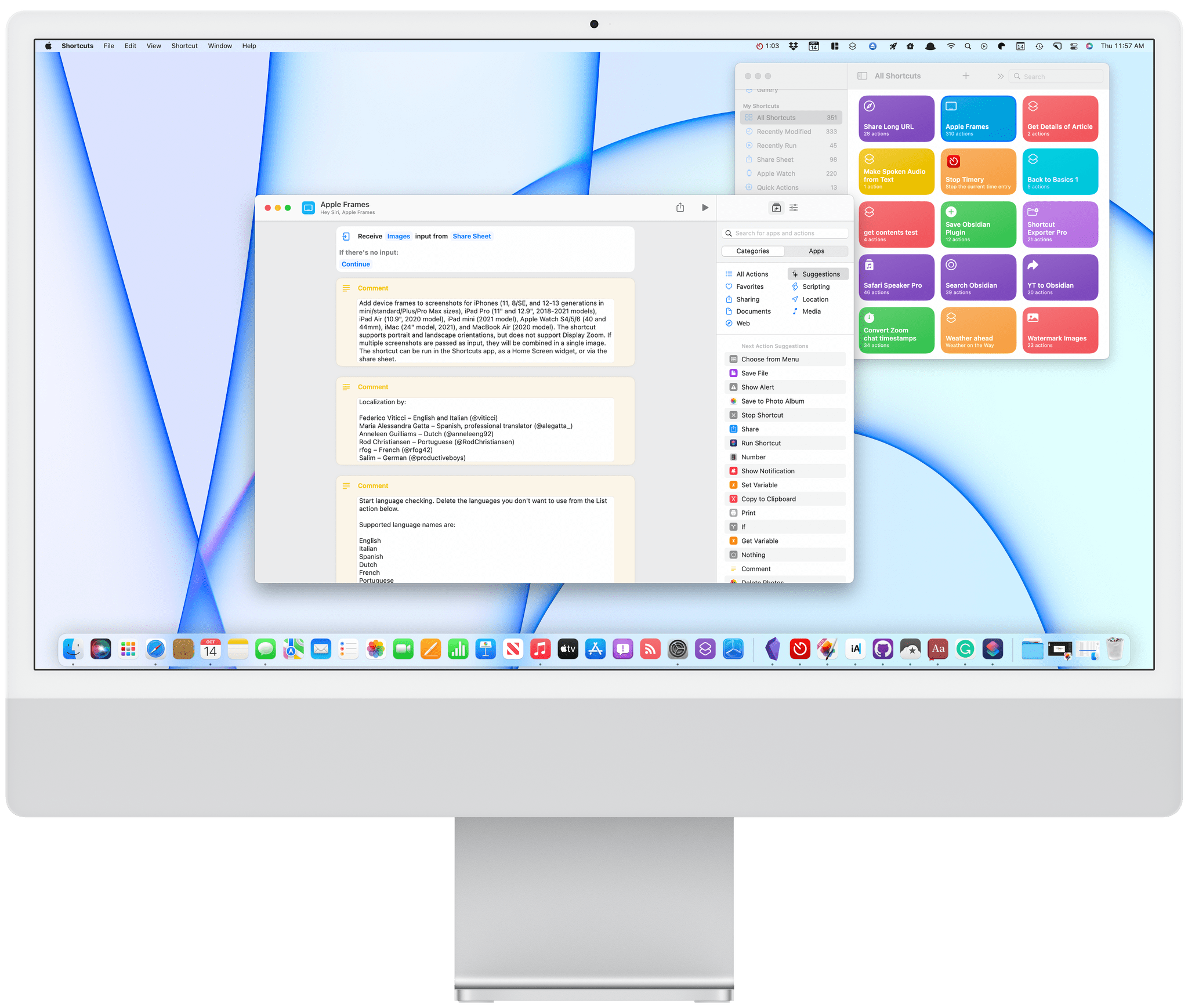
Using a Shortcut to frame a screenshot of Shortcuts for a review of Shortcuts.
Perhaps I let my hopes and expectations get away from me. I’ve wanted Shortcuts on the Mac since it was called Workflow and long before it was acquired by Apple. Then, when Shortcuts for Mac was finally announced this year at WWDC, Apple’s message was even stronger than I’d expected. “Shortcuts is the future of Mac automation,” they said.
The WWDC presentations backed up the bold keynote statement. Shortcuts was embracing existing automation tools on the Mac like AppleScript and Automator, incorporating a command-line tool, and hooking into everything in macOS from the menu bar to the Dock. Shortcuts was rough on that first developer build of Monterey, but it was a brand new app, and it seemed to be a top priority. As a result, I expected the app to improve by leaps and bounds over the summer. The trouble is, it didn’t.
I still think Shortcuts will get there, and I believe Apple is committed to Shortcuts on the Mac, but the version of Shortcuts that has shipped with Monterey is still more a promise than a workable solution. On the one hand, that’s fine. Automator and AppleScript haven’t gone anywhere, and third-party tools like BetterTouchTool and Keyboard Maestro are still there to fill the gaps in Apple’s tools.
On the other hand, though, as someone who relies heavily on Shortcuts every day, I can’t help but be frustrated and disappointed by the state of Shortcuts on the Mac. I don’t want to over-dramatize the problems because many of my shortcuts do work on the Mac. However, the UI for interacting with Shortcuts is rough, and there are some gaping holes in the action library that make it hard to build what I want.
I expect things will improve with future updates to Monterey and beyond, but I’m concerned that Shortcuts may be squandering its chance to win over Mac users. That would be a shame because the app has so much potential. Let’s take a closer look, and I’ll explain what I mean.
Shortcuts’ UI on the Mac is a lot like the iPad version.
One of the greatest strengths of Shortcuts on the Mac is its familiar UI. If you’ve used the app on the iPhone or iPad, you’ll immediately be at home with the app’s colorful collection of shortcut tiles and sidebar. That’s a big advantage for the many users who come to the Mac already familiar with the iPhone or iPad.
Of course, there are differences, too. The first that you’ll probably run into is that on the Mac, Shortcuts’ brightly colored tiles aren’t buttons like they are on an iPhone or iPad. Instead of just clicking on the tiles to run a shortcut, there’s a play button in the top right-hand corner of each tile. Double-clicking a shortcut’s tile opens the editor. It didn’t take long for me to grow accustomed to the play button on shortcuts, but it is a somewhat unusual choice when apps like Home and Reminders include big tile-like buttons that can be operated with one click.
The sidebar on the left of Shortcuts’ window is the same as on the iPad, except there are no Personal Automations, and Home Automations can still only be created in the Home app. There are also additional categories in the ‘My Shortcuts’ section, including Recently Modified and Recently Run shortcuts, as well as categories for Quick Actions and Menu Bar shortcuts. Those last two are exclusive ways shortcuts can be run on the Mac, but I’d love to see Recently Modified and Recently Run added to iOS and iPadOS as a way to quickly access my most active shortcuts.
The details panel is where you’ll find the biggest differences between Shortcuts on Mac and the iPad and iPhone versions.
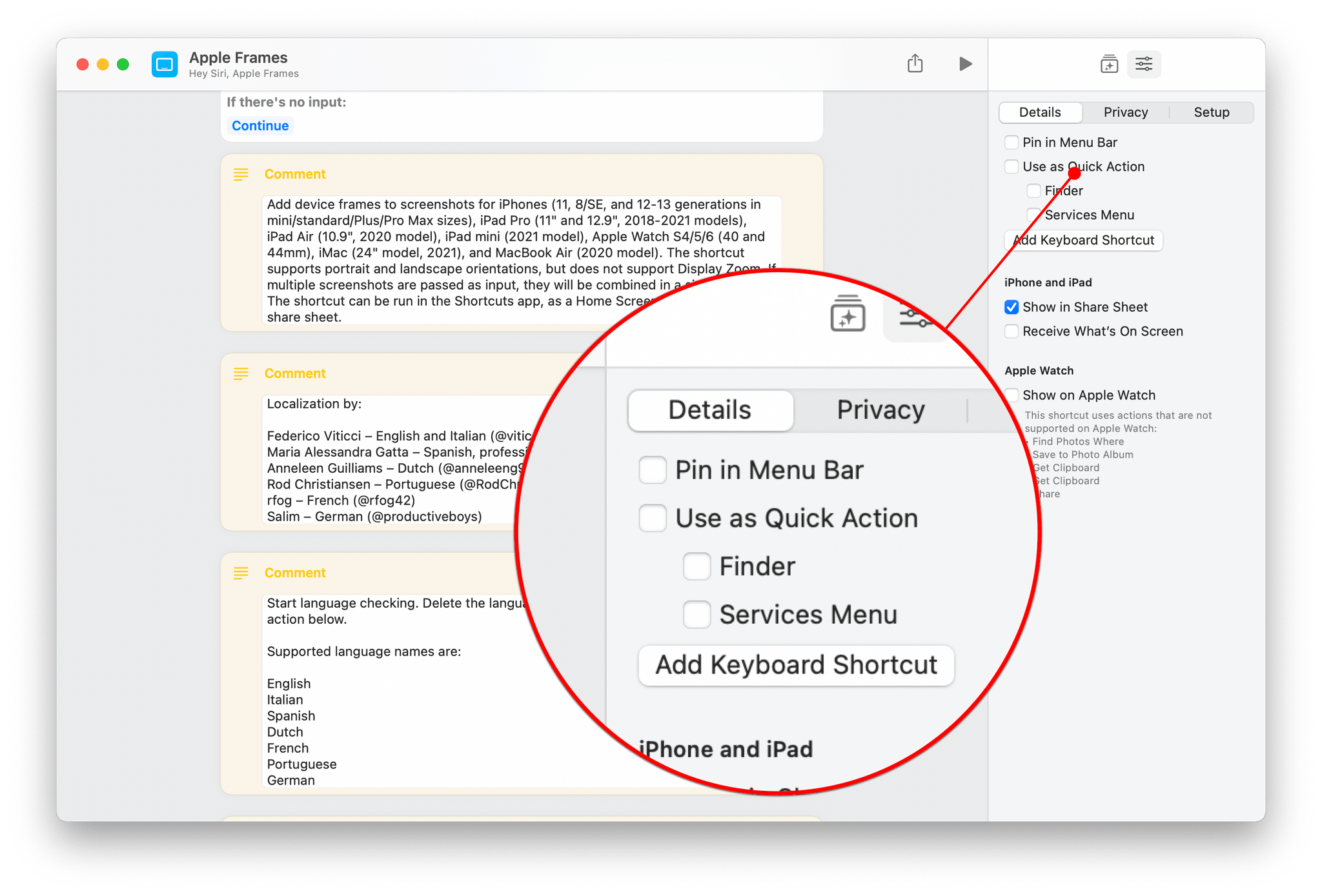
The toolbar along the top of the Shortcuts windows provides options to collapse the sidebar, create a new shortcut, view your shortcuts as a grid of tiles or a list, or search for a shortcut. The shortcut editor is nearly identical to the iPad version too. The panel on the right organizes the available actions by category and app, which can be changed to a settings view with the button in the toolbar. The first section of Settings, labeled Details, is one of the areas that the Mac version of Shortcuts differs from the iPad. This section is where you can choose to pin your shortcut to the Mac’s menu bar, set it up as a Quick Action that’s available in the Finder or as a Service, and assign a keyboard shortcut. You’ll also find iPhone, iPad, and Apple Watch settings, and there are new Privacy and Setup sections of Settings that parallel the changes made on the iPhone and iPad.
The process of building shortcuts is familiar too. Add actions from the Action Library by dragging them into the editor or double-clicking them, in which case they’re added to the bottom of the shortcut. What’s different, though, is that there are actions available in Shortcuts for the Mac that you won’t find on the iPhone and iPad. Those actions, along with others that also made their debut in iOS and iPadOS this year, were inherited from Automator. They aren’t new to Mac automation, but they reflect Apple’s commitment to Shortcuts as the future of automation on the Mac.
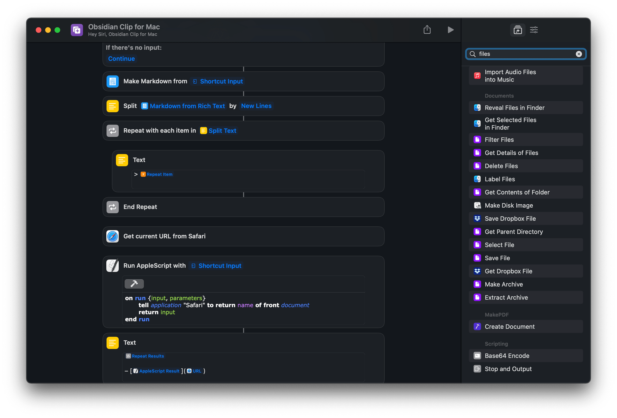
Unsurprisingly, you’ll find that a lot of the actions brought from Automator to Shortcuts are related to files.
The new Automator actions are among the most popular ones from that app and include:
- Add New Calendar
- Connect to Servers
- Create Photo Album
- Eject Disk
- Get Contents of Folder
- Get Current URL from Safari
- Get File from Folder
- Get Selected Files in Finder
- Get Text from PDF
- Hide App
- Import Audio Files into Music
- Label Files
- Make Disk Image
- Make Image from PDF Page
- Make Spoken Audio from Text
- Mount Disk Image
- Move File
- Open File
- Quit App
- Rename File
- Reveal Files in Finder
- Run AppleScript
- Run JavaScript for Mac Automation
- Run Shell Script
- Select File
- Split PDF into Pages
- Start Screen Saver
Further extending Shortcuts’ integration with Automator, most Automator workflows can be converted to shortcuts by dragging and dropping an Automator workflow file onto Shortcuts, which is an excellent user-friendly touch.
Shortcuts for Mac also has actions to find, move, and resize windows, which, combined with actions to hide and quit apps and open specific files, opens the door to creating task and project-specific desktop setups. There are plenty of dedicated apps that will do the same thing or more, but it’s handy to be able to do the same thing with a built-in tool if you’re particular about the location of your windows.
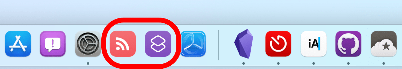
I’ve got a shortcut for creating a Markdown link list from RSS and adjusting my office lights in my Dock.
The number of ways to invoke shortcuts on the Mac is extensive. The list of options is impressive, but there’s one omission that makes it hard to adapt some iOS and iPadOS shortcuts for the Mac. You can run shortcuts from:
- The Shortcuts app
- The Dock
- The menu bar
- The Services menu
- Spotlight
- Siri
- The Touch Bar on compatible Mac laptops
- Widgets
- Global hotkeys
- The Finder
- AppleScript
- Shell scripts
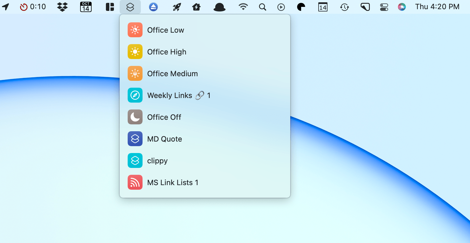
I’ve been experimenting with menu bar shortcuts, some of which also have keyboard shortcuts assigned to them, too.
Not only can you launch a shortcut with AppleScript or shell scripts, but shortcuts can also run AppleScript, shell scripts, and JavaScript for Mac Automation. I’m of two minds about the scripting support in Shortcuts. On balance, I’m glad it’s there because of the power and flexibility it provides users. However, one of my longstanding complaints about Automator is that every time I’ve used it in the past, I’ve quickly hit a wall where the solution was to use Automator to run a script that could do what Automator couldn’t. Too often, that made Automator feel like a script launcher instead of a powerful automation tool in its own right, which I hope doesn’t happen with Shortcuts for Mac.
Shortcuts has been integrated into the Terminal too.
Shortcuts can also be run from the Terminal with the command shortcuts run 'name-of-shortcut'. There are commands to list, view, and sign shortcuts too. Signing is the most complex of the Terminal commands allowing users to specify the sharing mode, location of the shortcut file being signed, as well as an output destination.
The one inexplicable omission from the way shortcuts can be run is share sheet support. Share extensions on the Mac have never been supported well by Apple or taken off with third-party developers the same way they did on iOS and iPadOS. On those platforms, the share sheet launches some of my most important shortcuts. I work with webpages, links, and text all day, and being able to grab a URL or other data from a webpage or the App Store and process them in different ways is core to my work.
I’ve tried recreating the same shortcuts with the Services menu, but the problem runs deeper than the inability to hook things up to a share button. On the iPhone and iPad, it’s simple to grab the title, URL, and selected text of any webpage using the Get Details of Safari Web Page action. In other shortcuts, I use Get Article Using Safari Reader. Both actions are central to working with web-based data and are available in the Mac app, but neither works. What’s curious is that both actions are available in the app, and Web Pages and Articles are listed as content types available as shortcut input.
Undeterred, I set out to find a way around the trouble I was having, and while I was at it, I created a few other shortcuts for my Mac to give readers a sense of what’s possible. There are plenty of shortcuts you can create that will work on any of Apple’s platforms, but here are four that are Mac-only.
MD Clip for Mac
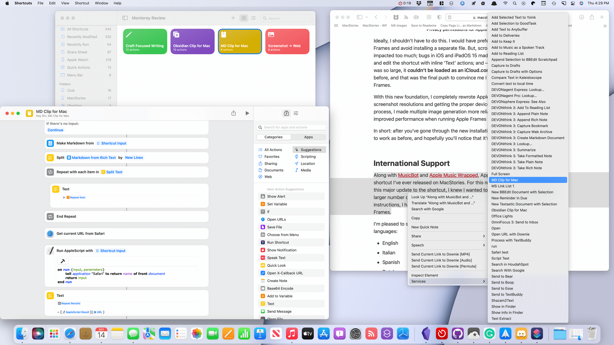
The first shortcut I built is a workaround to deal with the lack of webpage support I mentioned above. As I do research, I like to grab text from articles as blockquotes and save them in various apps for use later.
On the iPhone and iPad, I do this with the handy Get Details from Web Page action. With that action not working, I took a different approach. There are two Mac-specific keys to MD Clip for Mac. The first is that the shortcut is enabled as a Services menu item. That way, I can highlight text on a webpage, right-click, pick the shortcut, and the selected text will be passed into the shortcut. If you prefer, you can also set a keyboard shortcut to run MD Clip for Mac.
The shortcut takes the selected text, converts it to Markdown format, applies blockquote formatting, and adds a linked reference to the title of the story at the bottom of the quote. Without the Get Details from Web Page action available, I had to find another way to get an article’s title and URL. Fortunately, the solution was fairly straightforward. First, the shortcut uses Get Current URL from Safari, a Mac-only action, and then I use a bit of AppleScript to pull the title from the active tab. The remainder of the shortcuts assembles all of the pieces and copies them to the clipboard, ready for pasting in a note-taking app, text editor, or elsewhere.
While the solution to the lack of Get Details from Web Page wasn’t especially difficult to figure out, basic interactions with Safari like this shouldn’t differ by platform. I could incorporate the Mac-specific steps of this shortcut into one that assembles the same sort of blockquote on iOS and iPadOS, checking for the device type and following different paths depending on which kind of device I’m using, but that shouldn’t be necessary.
You can download MD Clip for Mac here or from the MacStories Shortcuts Archive.
MD Clip for Mac
MD Clip for Mac formats selected text in Safari as a blockquote and adds a link to the source material and then copies the results to the clipboard. To use the shortcut, select text in Safari and then select MD Clip for Mac from the app’s Services menu.
Obsidian Clip for Mac
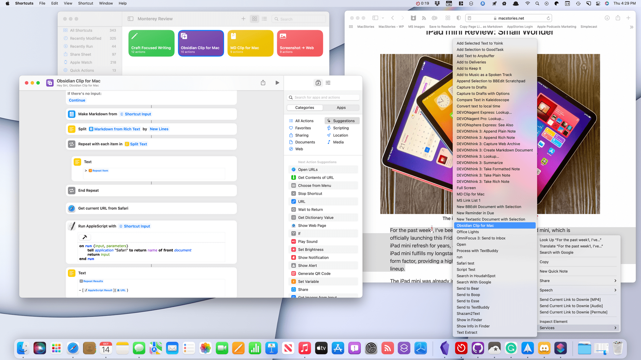
I made an Obsidian-centric version of MD Clip for Mac because that’s the app I currently use most often for the kind of web clipping. Obsidian doesn’t offer Shortcuts actions, but it has a URL scheme, and there’s a community plugin called Advanced Obsidian URI that can do some amazing things with your documents. I used the plugin to construct a URL that takes the results of the same sort of blockquote generated by MD Clip for Mac and prepends it to a scratchpad note that I use as an inbox for links.
You can download Obsidian Clip for Mac here or on the MacStories Shortcuts Archive.
Obsidian Clip for Mac
Obisidian Clip for Mac is a variant of MD Clip for Mac. The shortcut formats selected text in Safari as a blockquote and adds a link to the source material and then prepends the results to an Obsidian file called @scratchpad using the Advanced URI Obsidian community plugin. To use the shortcut, make sure you’ve installed the Advanced URI plugin and have specified the vault and file you want to use in the URL action below. In Safari, select text and then select Obsidian Clip for Mac from the app’s Services menu.
Craft Focused Writing
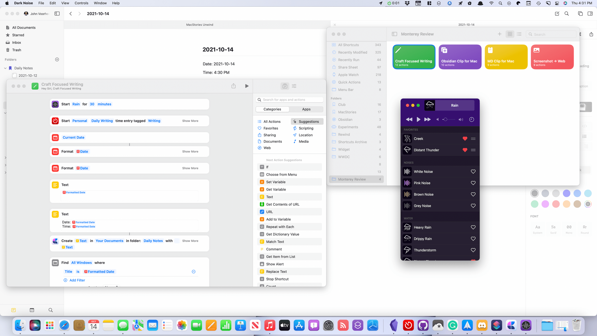
As I mentioned above, the ability to open apps and move windows around makes Shortcuts for Mac a good way to set up work environments with a single click. To show what I mean, I created Craft Focused Writing. The shortcut:
- Opens Craft
- Starts Dark Noise playing the sound of rain for a 30-minute writing session
- Starts a Timery timer with the time tracking details pre-filled
- Creates a Craft note using today’s date as the file name
- Inserts the date and time at the top of the note
- Resizes the Craft window to fill the screen
- Hides any other open apps
Whether you want a one-click way to get started with writing in Craft like this shortcut facilitates, or want to do something similar with a different set of apps, the ability to resize and position windows, along with the ability to quit or hide apps, makes the process easy.
You can download Craft Focused Writing here or on the MacStories Shortcuts Archive.
Craft Focused Writing
Craft Focused Writing is a shortcut that can be used to create a new dated note in Craft, start a ‘writing’ timer in Timery, play 30 minutes of rain sounds in Dark Noise, resize the Craft window to full screen and then hide all other apps.
Screenshots -> Web
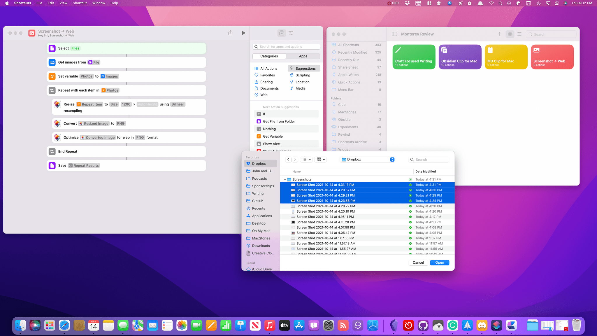
I also wanted to show off a new set of shortcuts actions from a Mac-only app: Pixelmator Pro. More often than not, I use Pixelmator Pro to do things like resizing and optimizing screenshots before uploading them to the MacStories CDN. It’s the sort of repetitive task that’s perfect for Shortcuts.
Screenshot -> Web asks you to pick a series of images and then resizes them to a standard width. The final step optimizes the images for the web and converts them to PNG files. The entire process is fast and efficient, saving me from the chore of clicking around as I do the same thing over and over in the app’s UI.
The version of Pixelmator Pro that includes Shortcuts actions is currently in beta and should be out alongside Monterey, allowing readers to give this shortcut a try too. In addition to the two actions I used for this shortcut, there is a long list of other actions covering an impressive scope of the app’s image editing functionality.
You can download Screenshots -> Web here or on the MacStories Shortcuts Archive.
Screenshot → Web
Screenshot -> Web allows you to select multiple image files that the shortcut resizes to a standard width, converts to PNG, and then optimizes for the web. The image actions are part of Pixelmator Pro and will be available soon after the release of macOS Monterey.
In the wake of WWDC, I was full of excitement and optimism for a future in which Shortcuts is the glue that holds automation together across all of Apple’s platforms. My hope was that Shortcuts would unite existing Apple and third-party automation tools with actions donated by a wide cross-section of the app ecosystem, ushering in an era of cross-platform automation that leveraged the advantages of each in a way that opened up new opportunities for innovation.
Shortcuts for Mac doesn’t deliver on that promise, but it’s still too early to declare it a failure. My greatest concern isn’t that Shortcuts for Mac won’t eventually become the app I’ve hoped for, but that it will frustrate many users who simply never give it a second look. That could stunt the app’s growth no matter how good future updates are, which would be unfortunate. I’d also hate to see Shortcuts’ troubles discourage developers from incorporating it into their apps, but I’ve already heard from some who have shelved plans for Shortcuts support, and the initial buzz from Mac developers has faded noticeably.
That said, there is still reason for cautious optimism. The Automator actions added to Shortcuts provide a solid foundation of Mac-centric actions on which to build and have led to new Shortcuts actions on iOS and iPadOS that are direct descendants of Automator actions. Also, many shortcuts built for iOS and iPadOS, including complex shortcuts like Federico’s Apple Frames 2.0 shortcut and MusicBot, already run on the Mac, though not always as reliably. I also remain encouraged by Shortcuts’ integration into everything from the menu bar and the Services menu to the Finder and Dock.
So, start simple and don’t give up tools you already rely on in favor of Shortcuts just yet. Instead, explore and experiment to familiarize yourself with the new actions available on the Mac. I had hoped Shortcuts would be further along by this point. Still, by setting realistic expectations and goals about what you’ll be able to accomplish, you’ll be less frustrated and better positioned as Shortcuts improves.
Other System Apps
Messages
The changes to Messages in Monterey revolve around sharing. My favorite additions are two of the simplest: image stacks and the download button that appears next to images you receive.

Image stacks.
Image stacks save a lot of space when someone sends multiple pictures. Instead of delivering photos in a long end-to-end line that dominates a message thread, Message delivers images in an overlapping pile. You can swipe through the stack using a Magic Trackpad or the surface of the Magic Mouse to view the photos one at a time.
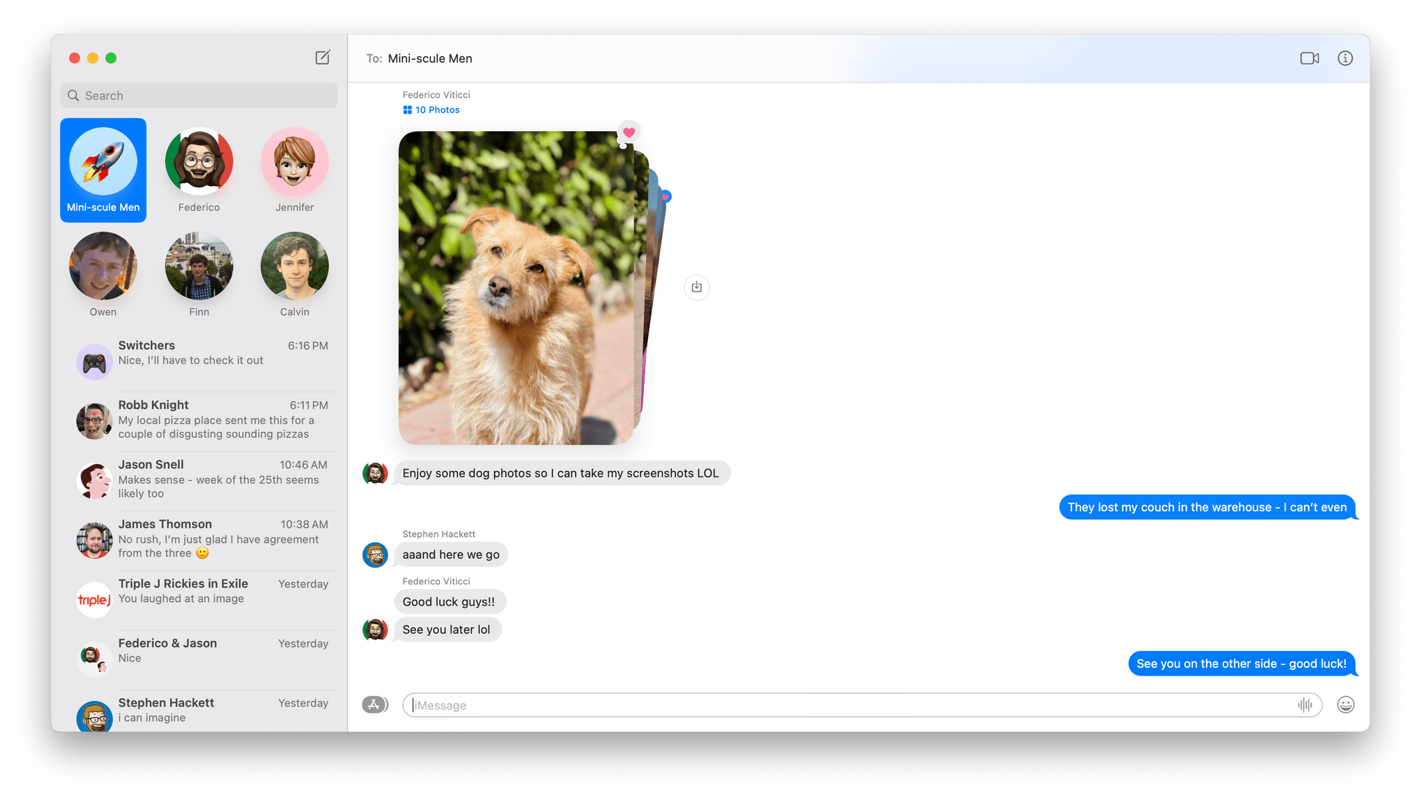
The download button next to images stacks is one of my favorite additions to Messages.
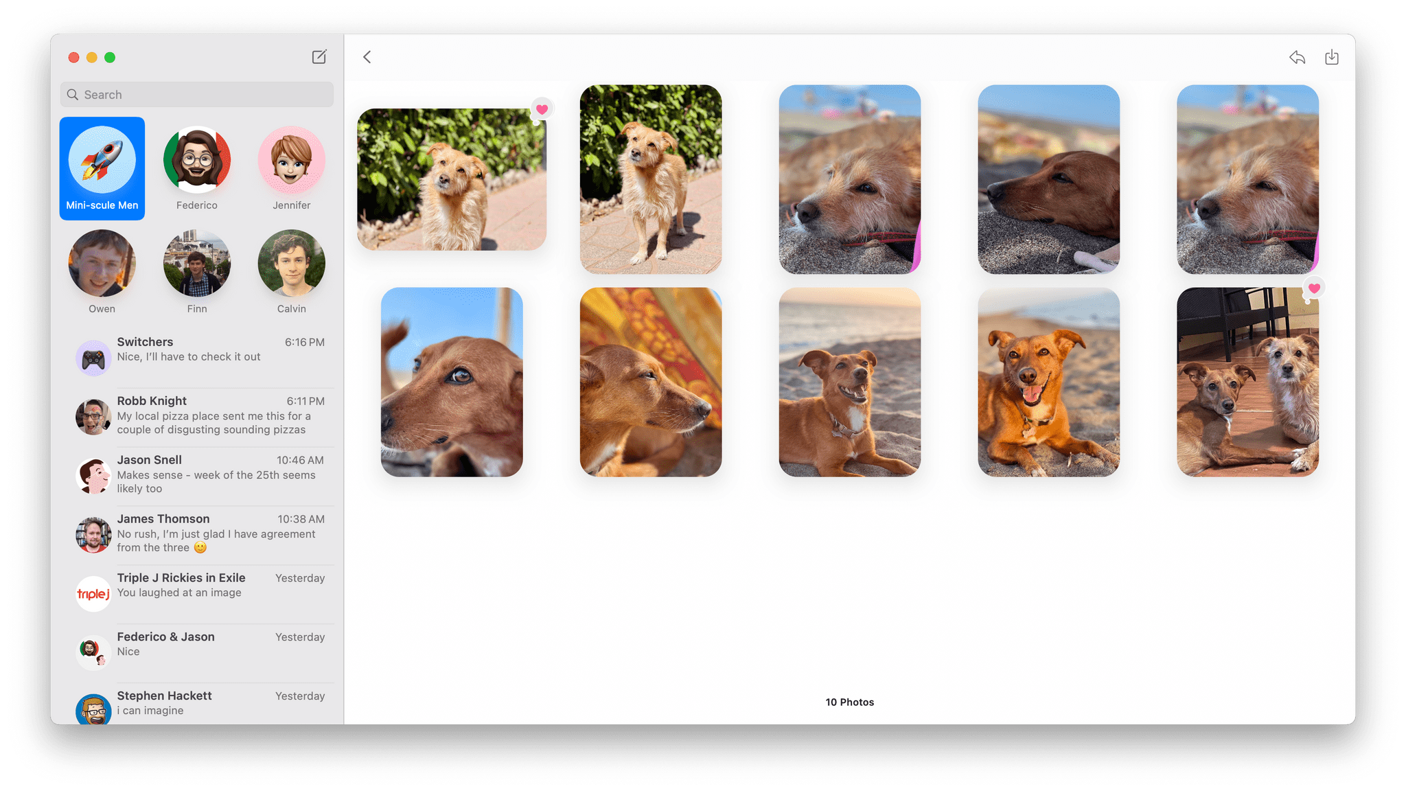
Stacks can be expanded into a grid of images.
Alternatively, there’s a small grid button just above the stack that you can click to open a grid view of the images. From the grid view, you can select images and download them using the download button in the toolbar, right-click to access options like Quick Look, Open, and Add to Photos Library, and Tapback, or save any selected images. You can also use the inline download button next to the stack to save all the images to your iCloud Photo Library at once. The inclusion of that tiny download button has greatly increased how often I save images I get in Messages.
Shared with You is the other headline feature added to Messages in Monterey. The feature gathers links and images shared with you in Messages and surfaces in relevant apps:
- Images appear in the Photos app
- Links to webpages appear in News and Safari
- Podcasts URLs are displayed in Apple Podcasts
- TV links appear in the TV app
Shared with you in Apple News.
In each case, the shared media appears in a special Shared with You section of the related app. Beneath the media is a link back to the conversation where it was originally shared, which you can use to return to Messages for additional context or to respond. You can also pin items that are shared with you in Messages by right-clicking on them and choosing Pin, which puts them at the top of Shared with You in the relevant app.
What’s baffling to me about Shared with You on the Mac is that it doesn’t work with Apple Music even though it does on iOS and iPadOS. That’s disappointing because Music is the category I find most useful when I’m using my iPhone and iPad. You can, however, pin music links in Messages so they are at the top of the info panel in Messages, for easy reference later.
Music include a Shared with You section in Monterey, but you can pin Apple Music links.
Links to articles on the web are the sort of thing I either look at immediately or drop into a read-it-later service, making Shared with You unnecessary. The same goes for media like TV shows that I save to an app like Sofa or TV Forecast. However, I’ve enjoyed Shared with You in the Photos app more than I expected. It isn’t perfect, but it has resurfaced some favorite photos buried deep in Messages’ database.
I expect that a lot of people will have a similar experience with Shared with You. One or two categories may fit neatly with the kinds of media they consume and what their friends and family share, while others won’t, which is entirely fine. It’s simple enough to turn off the Shared with You categories that you don’t use from Messages’ preferences. However, I do hope we see Apple Music integrated into Shared with You in the future. There’s no reason it should be an iOS and iPadOS-only feature.
FaceTime

With Monterey, FaceTime calling is now available on the web, and Apple has introduced a number of notable audio improvements. I tested FaceTime on Monterey with Federico on the Mac and iPad over the summer, so be sure to check out that story for more detail, but here are the highlights.
The web-based FaceTime experience is very close to what you get using the native app. The main difference is that in our tests, the video was a little darker when using the web, which I suspect is the result of not being able to fully take advantage of the image processor and other real-time processing happening in the native FaceTime app. Still, the overall experience of using the web-based version of FaceTime is excellent.
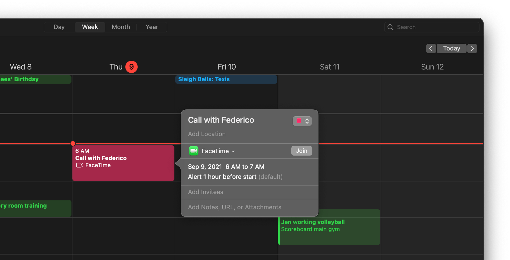
Setting up a FaceTime call link in Calendar.
The practical reality of web-based FaceTime is that it opens up video calling to users who don’t own Apple products, making group calls over FaceTime an option for the first time for many families and groups of friends where some don’t own an Apple device. The update also means that invitations to FaceTime calls can be shared with a link that can be generated in the app or by setting up an event in Calendar where FaceTime is specified as the location.
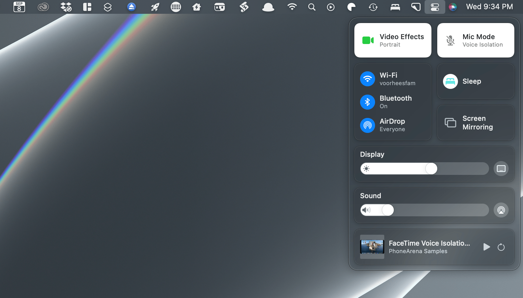
The new video and audio settings for FaceTime are in Control Center.
On Macs released since 2018, spatial audio has been added to FaceTime calls. I didn’t find spatial audio nearly as noticeable as Apple’s other audio updates to FaceTime. Voice Isolation eliminates background noise and boosts vocals. Wide Spectrum does the opposite, enhancing the sounds around a call participant so they can share the audio around them with others. Both features can be turned on or off from Control Center in the Monterey menu bar.

FaceTime’s Portrait mode.
It’s worth mentioning, too, that Apple has added a Portrait mode effect to FaceTime video if you have an M1 Mac. It’s not perfect, but especially with high-contrast, simple backgrounds, I found it to be a good way to keep the focus on the people using FaceTime instead of their backgrounds.
Maps
There are a lot of useful additions to Maps this year, which I covered in detail earlier this summer. However, the feature that has the greatest impact on me on the Mac is also one of the smallest changes. Now, when you do a search and then scroll, the map updates as you move around the map. For example, if you’re viewing restaurants near your home and you drag the map a couple of towns over, the map updates automatically to display restaurants there too. While it’s surprising that it took until now for this to be a feature of Maps, I certainly appreciate that it’s available now. I’ve found it invaluable when researching restaurants, hotels, and other locations in places with which I’m not familiar.

Now, you can zoom all the way out and spin the Earth like a globe if you want.
There is additional detail in Maps at every zoom level.
The changes to Maps run far deeper. Now, you can zoom all the way out to see the Earth as a globe that you can spin to find a region you want to examine more closely. As you zoom into an area, the differences compared to Big Sur are striking. One of the biggest changes is that there is more landscape detail than before. Mountains, forests, rivers, and other features of the landscape are depicted with more detail than before, and they are labeled and featured in the app’s curated collection of guides.
London and other new cities have been added to the lineup of 3D models in Maps.
Maps has also added special 3D landmarks in certain cities. When I covered Maps over the summer, the 3D models were only available in the San Francisco Bay area, but now, they’ve been added to London, New York, and Los Angeles too. The 3D models of landmarks look terrific, and I hope new ones are added to other cities around the world soon.
Maps’ new Driving view highlights road conditions like construction.
A new Driving view has joined Explore, Transit, and Satellite, emphasizing traffic conditions, road hazards, lane closures, gas stations, and similar details. Congested areas also display the length of delays. The new Driving view is most useful on the iPhone when you’re driving somewhere, but it’s still handy to have on the Mac when checking ahead to see what traffic conditions are like.
Place cards have been redesigned too.
Place cards, which are displayed as a popover on the Mac when you click on them, have been redesigned and are packed with more information that’s been made easier to read through a combination of typography changes and layout. Also, there’s a new user icon that provides quick access to locations you’ve marked as favorites and guides you’ve created. This is also where you can report new locations to Maps and report issues with streets, places, and routes, and report traffic incidents. You’ll also find Maps’ preferences here. Access to these features used to be sprinkled elsewhere throughout Maps’ UI, but I appreciate the ability to find them all in one easily accessed location.
All of the additions to Maps this year are solid. The new detail makes the experience of using the app richer on every level.
However, what’s even more notable about Maps is that on a macro level, it’s a fantastic example of Apple’s Mac Catalyst strategy paying off. In years past, Maps would get out of sync on the company’s platforms. Because Maps is inherently more useful when you’re traveling, it was usually the Mac version of the app that fell behind what was available to iPhone and iPad users.
Last year, Maps was relaunched as a Mac Catalyst app, which has fulfilled the promise of helping keep Apple’s apps in sync across its many devices. Mac Catalyst isn’t as simple as pressing a button to deploy new code everywhere, but it’s meant to facilitate the process of maintaining apps on multiple platforms, which it seems to have accomplished, judging from the nearly identical Maps features added on all platforms this year.
Books
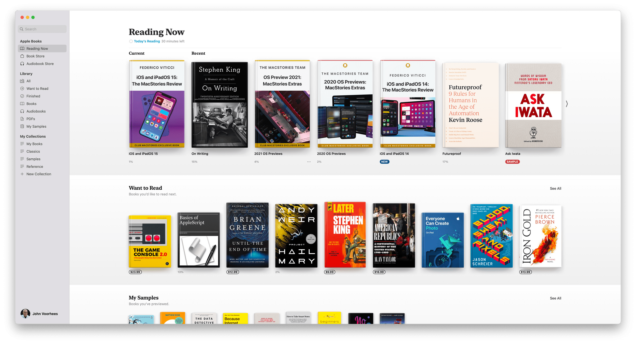
The All-New Books app.
Finally, Books on the Mac has been updated to work like the iPhone and iPad versions. Books is one of those apps that languished on the Mac, which isn’t surprising. Books undoubtedly is used first and foremost on the iPad, followed by the iPhone, with the Mac a distant third. The Mac just isn’t the place you think to go when you want to relax with a good book. However, Books is also a PDF reader, and its store is full of reference and other non-fiction books that serve as companions to students and anyone learning something new, which is why I’m glad to see it has been updated.

Everything in Books is reminiscent of the iPad version of the app.
If you’ve used Books on an iPad, the experience on the Mac is nearly the same, except the app has a sidebar on the left for quick access to the functionality found in the tab bar on the iPad. The changes mean there’s a Reading Now section highlighting the book you’re currently reading, your recent reads, books you want to read, and samples you’ve downloaded. The Book Store has adopted the modern design of Book Store on the iPad, and there’s a separate Audiobook Store on the Mac for the first time too.
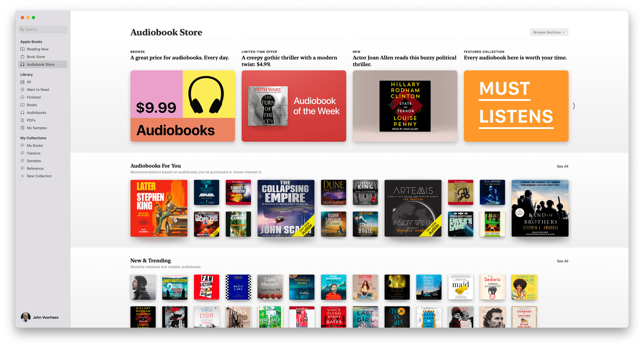
There’s a separate Audiobook Store on the Mac for the first time too.
Over three years ago, we wrote a glowing review of the update to Books on the iPhone and iPad because it was clear from the update that it was redesigned with readers in mind. The Mac isn’t going to be the place I do most of my reading, but I’m pleased that Mac users can now benefit from the same features that have been a joy to use since 2018 on the iPhone and iPad.
Visual Look Up

Right-click the image of a book, select Look Up and you’ll get links to the Apple Books store and Siri suggested websites.
Apple Books also works with Visual Look Up, a new system-wide feature that can also identify animals, plants, landmarks, and works of art. The feature works roughly the same way for each category, but the results are uneven between categories.
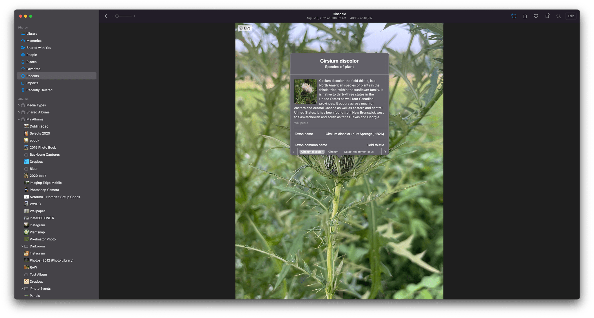
If you’re in the Photos app, you’ll see a little sparkle icon applied to the info button for any image for which Monterey can provide additional information. Click the info button, and for some categories like plants, a small icon will appear in the center of the image that you can click for more information. For landmarks, the icon is of a map shown in the bottom corner of the image.
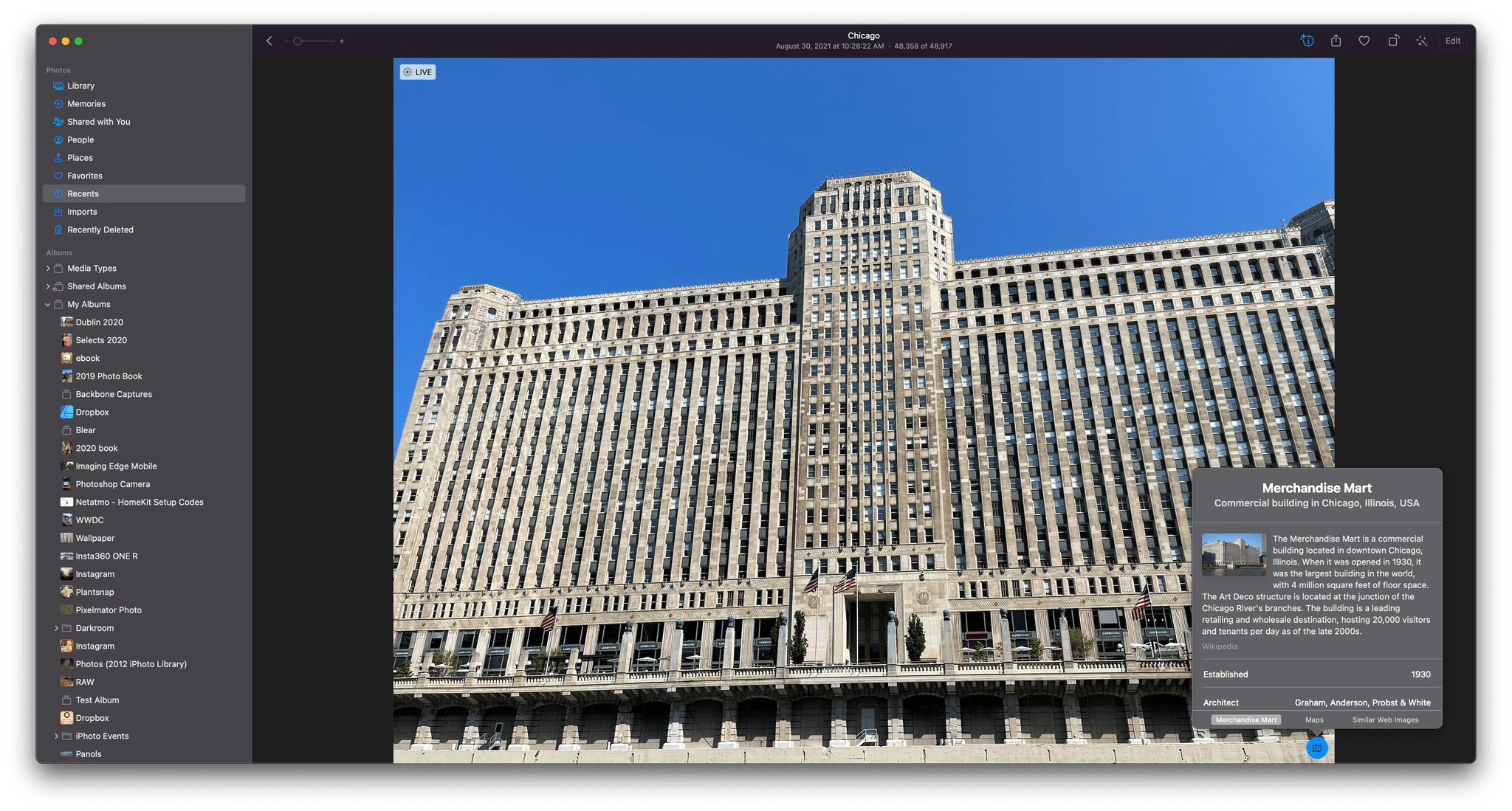
If you’re in Safari, you can right-click on an image and select Look Up to see more information. In the case of books, the feature returns basic information about the book from the Apple Books catalog, a link to the Apple Books store, and Siri suggested links to other sites, including other booksellers. Most other categories return Wikipedia entries.
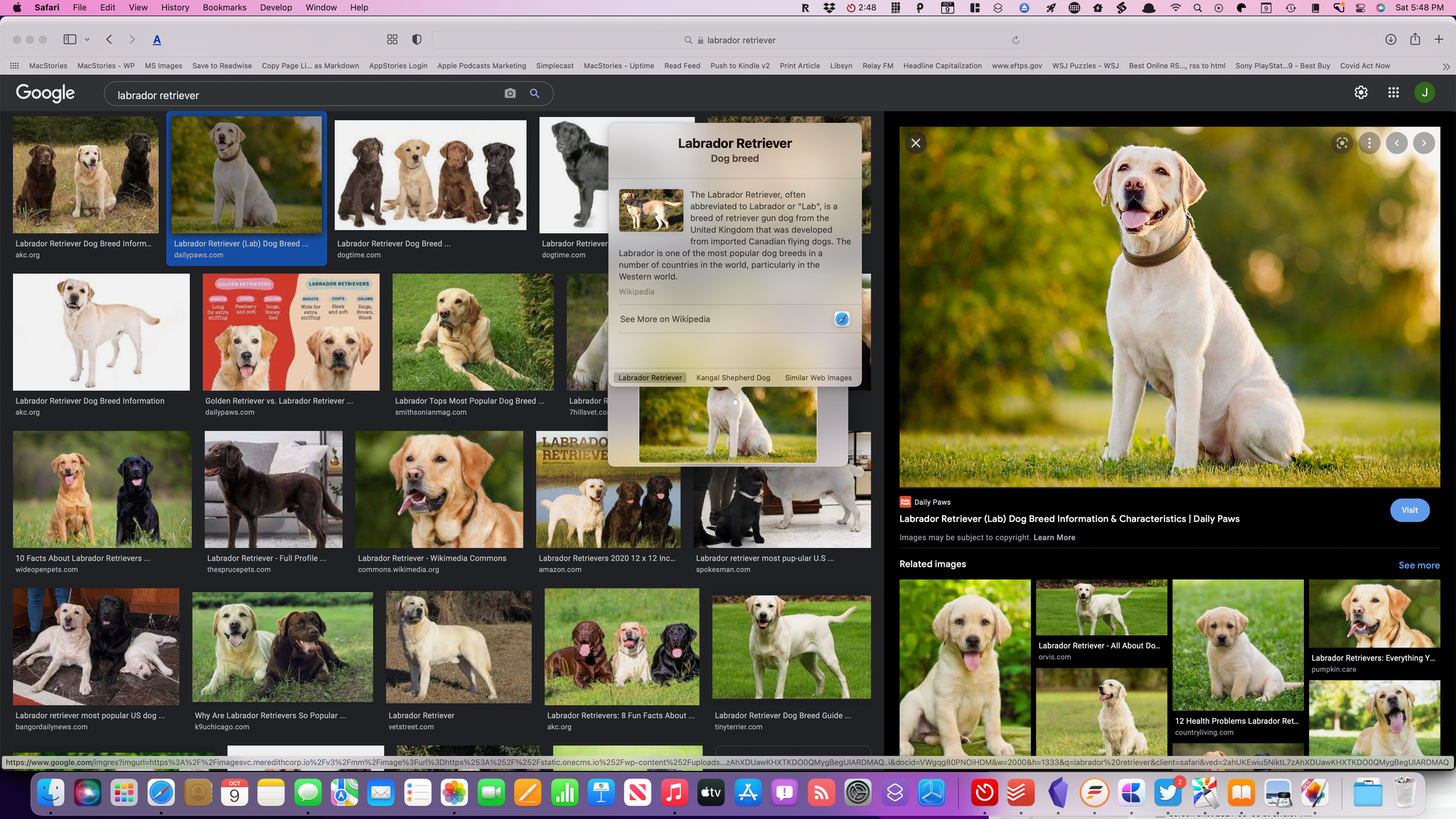
In my testing, plants were correctly identified most of the time, and books were spot-on as long as they were available from Apple Books. Landmarks worked well as long as there was GPS data associated with the image, which obviously narrows down the possible choices significantly. The least reliable categories included dog breeds, which isn’t too surprising. Results for mixed breed dogs often felt like a random stab in the dark, but the feature identifies pure bred dogs and cats without too much trouble.
The most surprising omission from Visual Look Up are other types of media like TV shows, movies, and music. Apple has an enormous database of artwork as part of Apple Music and the iTunes Store, which it should make use of like it’s doing with books. Just as you might be reading a book review on the web and use Visual Look Up to quickly locate it in Apple Books to purchase, I’d like to be able to read a review of an album online and use Visual Look Up to open the album in Music, so I can listen along as I read the review. The same sort of scenario makes sense for movies and TV shows too.
Photos
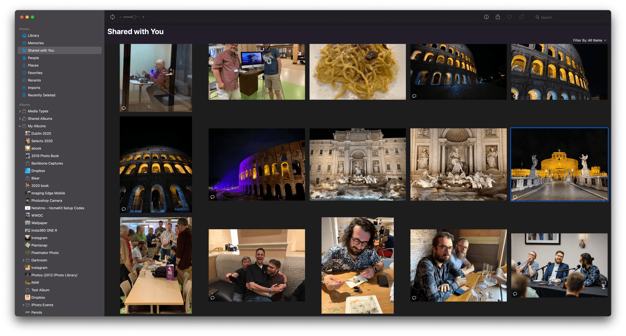
Shared with You in Photos.
The updates to Photos this year are split across under-the-hood improvements and enhancements to Memories that are coming later. Photos can now import images from a second Photos library, which is good to see. Merging photos libraries used to require a third-party utility like PowerPhotos. Apps like that will still be useful for their more extensive feature sets, but I’m glad to see a common task like merging libraries brought into the Photos app itself.
Apple also says that iCloud Photos syncs more quickly with a new Mac than previously. I haven’t had a new Mac to try this on, but I certainly hope it’s accurate because syncing a large library for the first time took seemingly forever on prior releases of macOS.
Photos should identify people more accurately too. That’s a feature that has always been reliable for me, so I can’t say I’ve noticed a difference, but any improvement is welcome when it comes to organizing and searching your photos.
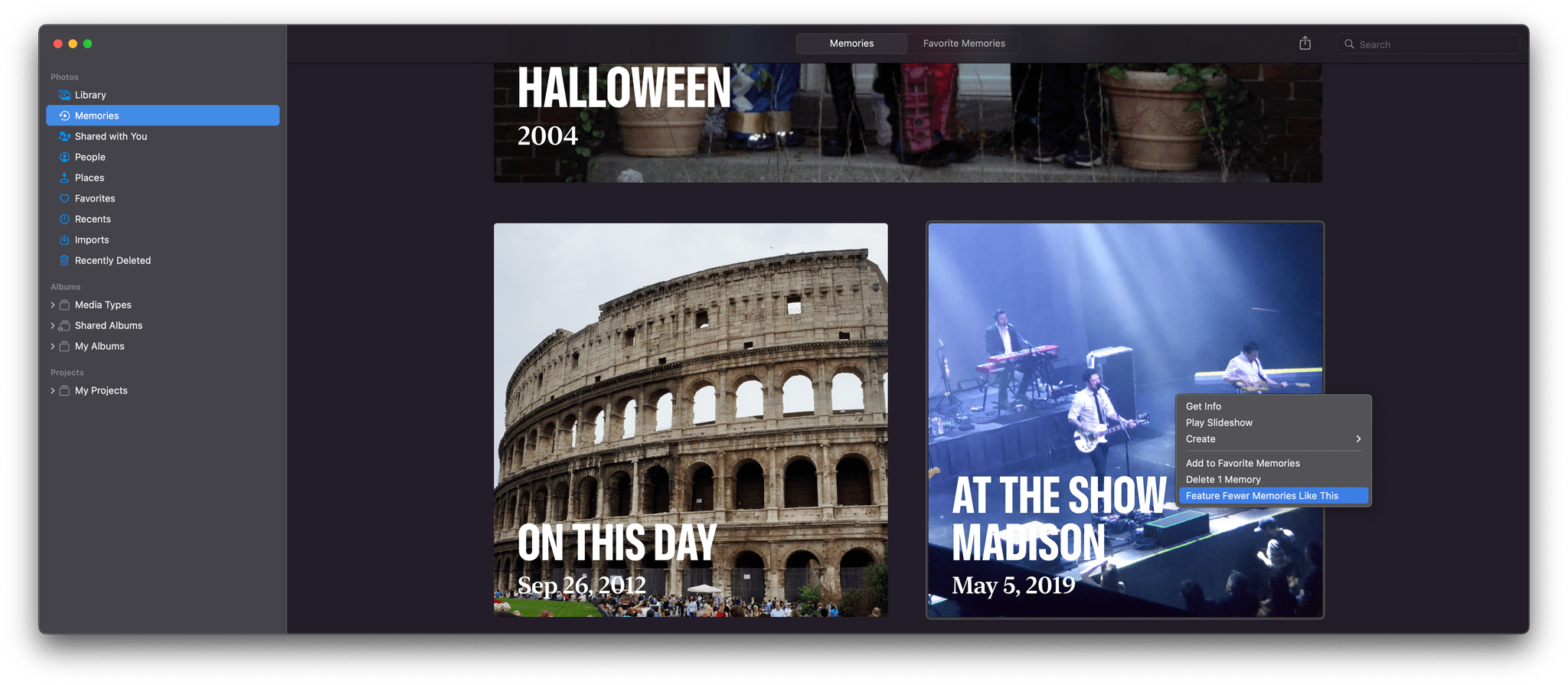
You can instruct Photos to suggest certain memories less.
With Monterey, you can instruct Photos to suggest certain types of memories, places, holidays, days, or people less often, and the change will be reflected system-wide in the Photos app, widgets, and Memories. In Memories, for instance, right-click on a memory, and there will be an option to feature it less. Not all memories are happy ones, so I’m glad to see Apple has put more control in the hands of its users.

I’m sure it will shock no one that my Shared with You photos included this from Federico.
Shared with You is also part of Photos in macOS Monterey. I turned it on to see what would turn up and was generally pleased with the results. I was surprised to find that the shared images stretched back years, grabbing photos from Messages from long before I installed Monterey, which was nice because those were all photos that would have been difficult to locate in the Messages app. There were a handful of design prototype images that Federico had sent me over the summer and an unappealing picture of a half-eaten sandwich from a couple of years ago, but by and large, the images were of friends and family, which were fun to rediscover without scrolling through Messages.
Memories is a feature that’s slated to get new features later this fall that will let you move around inside the auto-generated memory, skipping around among photos without breaking the feel of the memory. Apple says the music and transitions will adjust on the fly to create a more immersive experience. You’ll also be able to change the music and style of Memories. Because the changes to Memories aren’t available yet, I have not tested them.
Finder
The Finder’s new Shared folder.
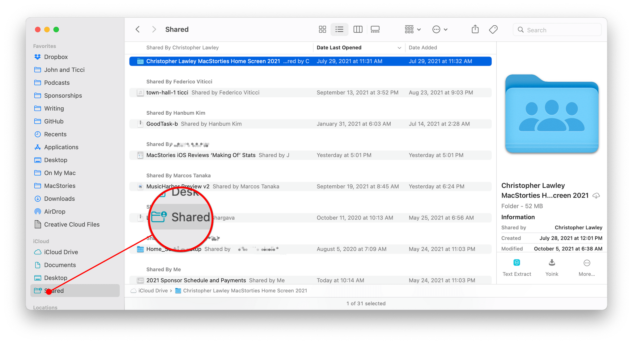
Shared with You isn’t the only way Apple is surfacing shared content on macOS Monterey. The update also includes a new default Smart Folder in the Finder’s sidebar called ‘Shared’ that aggregates any document you’ve shared with someone that uses Apple’s sharing APIs. This is where you’ll find any files shared with you using iCloud sharing or collaboration features in apps like Apple’s iWork suite.
I haven’t found myself drawn the Shared folder much. I have a handful of documents like Numbers spreadsheets that I’ve shared with Federico, but I open them from inside the app or by going to Numbers’ iCloud folder. If your work is more focused on shared iCloud files, I can imagine it being useful, but personally, it’s not something that I’ve felt was missing from the way I work.
The new Spotlight-like Go to Finder UI is fantastic.
The Finder also has an updated Go to Folder menu option that works a lot like Spotlight. Click on the option from the Finder’s menu or use the ⇧⌘G keyboard shortcut, and a floating search bar appears. As you type, results autocomplete. I have rarely used Go To Folder in the past because Alfred, which has had powerful autocomplete functionality for years. Because I use Alfred for so much more than finding files and folders, I’ll probably stick with it, but if you aren’t already relying on a launcher app like Alfred, give Go to Folder a try because it has been vastly improved.
Shortcuts can be saved as Quick Actions, which appear in Finder’s info panel.
As I mentioned in the Shortcuts section, you can also make your shortcuts accessible in the Finder’s Quick Action menu. Quick Actions have been in the Finder since macOS Mojave. macOS ships with a set of system Quick Actions, and they can be created in Automator. Third-party developers can ship their own Quick Actions too, but few have. Whether Shortcuts will be a hit with third-party developers remains to be seen, but if it is, Quick Actions should become significantly more useful than they have been so far.
Copying files has been improved too. There’s a new pie-style icon that fills as a file is copied, and Apple says it will give users a better sense of when a copy will be finished. You can also interrupt a file copy job and resume it later in a manner that’s similar to stopping and restarting a download in Safari.
At WWDC, Apple announced that existing Mail extensions would stop working at some time in the future, although no date has been given yet. In their place, Apple introduced MailKit, a new developer framework for creating four types of mail extensions for composing messages, applying rules to incoming messages to automate things like color labels, inbox destinations, and read status, content blockers for blocking messages based on their HTML content, and message security for encrypting and decrypting messages.
Developers can offer Mail extensions as part of an app or on their own as long as they are sold on the Mac App Store. From what I’ve read and heard, the initial scope of Mail extensions is viewed as fairly limited by developers, which will preclude some existing Mail extension developers from adopting MailKit. However, the new framework promises improved security and easier user installation and management, which could pay off over time.
Voice Memos
Voice Memos can skip silences.
You have to wonder whether Voice Memos is a testing ground for features Apple would like to use elsewhere someday. I say this particularly in connection with the app’s new skip silence feature, which is similar to the skip silence feature pioneered by Marco Arment in the Overcast podcast player. With a single click, you can skip over long silences in audio, which is handy, and while not exactly the same as Overcast’s feature, it’s the sort of thing I wouldn’t be surprised to see come to Apple Podcasts next year. Voice Memos also adds playback speed controls with Monterey, allowing you to speed up or slow down the audio.
Apple News
Apple News has received a modest redesign.
The changes to Apple News are light this year. The design of the app has been tweaked, but the changes are nothing drastic. The second tier of stories after the biggest headlines of the day now feature bigger images that look more like smaller versions of the top-tier stories, but I had to look back at Apple News on a Mac running Big Sur to figure out the differences.
Shared with You is also available in News too. I rarely use Apple News on my Mac, and Shared with You isn’t going to change that, but it could be useful to you if people you know send a lot of links you want to read all at once when you’re in front of your Mac.
Apple Podcasts
Podcasts’ recommendations have been tweaked in Monterey.
Apple has also tuned up the recommendation engine for its Podcasts app this year. The Listen Now section is more personalized with recommendations based on topics the app has decided you’re interested in. The ‘If You Like’ section recommends shows you have in common other listeners. Podcasts also offers topical recommendations based on the categories of the shows you listen to.
I haven’t noticed a significant change to my recommendations, but I don’t play podcasts regularly in Apple Podcasts on my Mac, and most of the episodes I’ve downloaded are from shows we produce at MacStories that I download for testing purposes. As a result, my recommendations unsurprisingly are tech shows with a heavy focus on Apple. They’re good recommendations, though, because many are shows I already listen to in other podcast players on my iPhone.
System Features
Focus and Notifications
Focus modes can let notifications from certain people and apps through and be triggered automatically.
Focus is among the most notable power-user features on macOS Monterey, as well as iOS and iPadOS 15. The feature takes the idea of Do Not Disturb to a new level by allowing you to specify the apps and people that can notify you at different times.
The idea is that you set up Focus modes for different activities. Maybe when you’re on a Zoom call, you still want to get a notification that your boss sent you an email, but you want to be sure that the group thread with your friends is silenced until you’re finished with the call for example. Focus modes are just as flexible for your downtime activities too. If you’re deep into a new game, it’s nice to be able to silence notifications that would break the immersive experience.
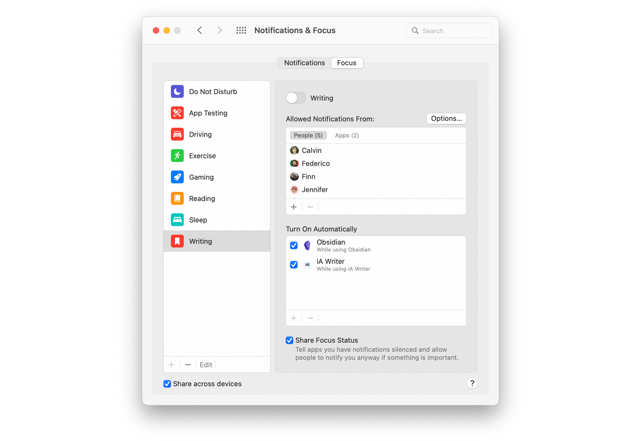
Focus modes can be set up in the Notifications & Focus section of Monterey’s System Preferences. When you select the Focus tab, you’ll see your Focus modes on the left and the options for fine-tuning them on the right. At the bottom of the list is a ‘Share across devices’ checkbox that, when selected, syncs your Focus modes across any iPhones, iPads, or other Macs you use that are also set to sync Focus modes.
Customizing Focus modes.
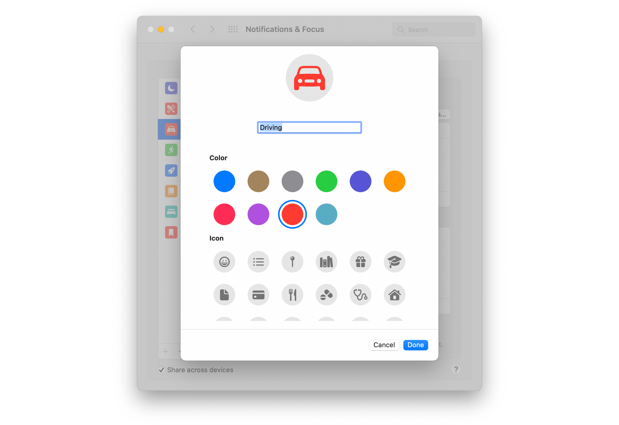
To set up a new Focus mode, click the plus button at the bottom of the lefthand column. Apple has some suggestions like Gaming, Mindfulness, Personal, and Work to get you started, or you can create something entirely custom. Custom Focus modes can be one of ten colors and use one of 37 icons. Once set up, you can use the Edit button at the bottom of the lefthand column to change your selections, but you can’t modify the default Focus modes you add from Apple. Every Focus mode can be deleted, too, using the minus button in the lefthand column, except for Do Not Disturb.
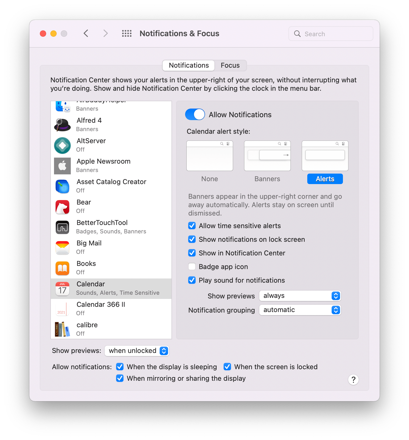
Users can block notifications that are marked as time sensitive by their developers by unchecking the box in the app’s notifications settings in System Preferences.
In the righthand column, you can add contacts one by one who can break through your Focus mode. Clicking the plus button opens a window for searching your contacts. Apps that can break through your Focus mode can be added using a similar UI that, in my testing, includes the same apps you’ll find in the Notifications tab. In addition to the apps you allow to send you notifications when a Focus mode is turned on, apps whose notifications are marked as time sensitive by their developers can break through your Focus mode. Fortunately, users can override time sensitive notifications if a developer abuses the system by deselecting the checkbox in the app’s notifications. You can also turn off time sensitive notifications globally from the ‘Options’ button in the Focus section of the Notifications & Focus.
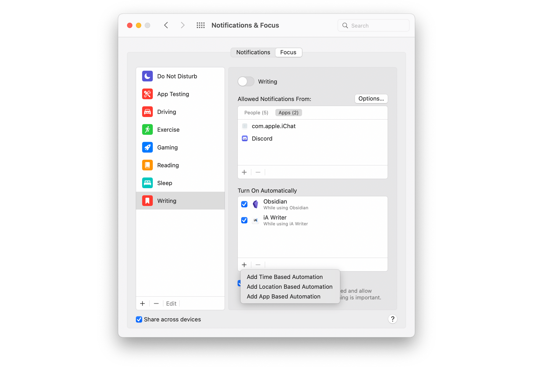
Focus modes can be triggered automatically.
Focus modes support three types of automations. Time-based automation lets you specify the days of the week and times of day the Focus mode will be turned on automatically. Location-based automations can turn on a Focus mode while you are at a location. Also, app-based automations allow you to turn on a Focus mode to coincide with the use of an app, which I expect will be especially useful for anyone who uses a limited set of apps for their work. Each automation type can be paired with multiple automation triggers, but they work to turn on the Focus mode if any of the trigger conditions are activated as opposed to requiring all conditions to be true. Also, as soon as the condition is no longer true, such as switching from an app that triggered a Focus mode to one that doesn’t, the Focus mode is turned off.
Unfortunately, turning on a Focus mode is not a trigger in Shortcuts because the app doesn’t support Personal Automations on the Mac. I’d love to be able to open a bunch of apps and trigger other related actions when I turn on certain Focus modes, but at the moment, Focus modes can only be turned on with Shortcuts, they cannot trigger other actions.
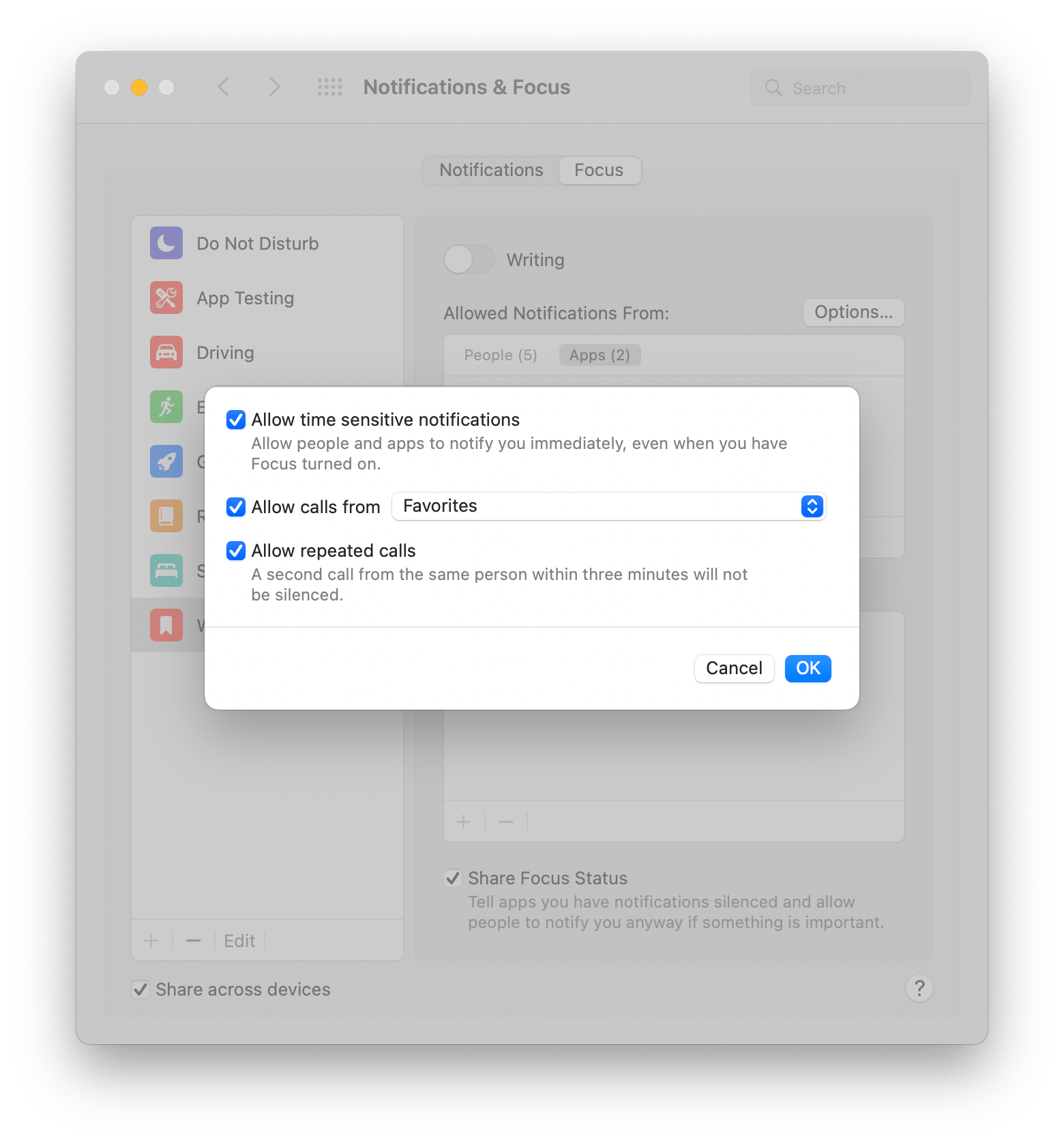
Notifications include additional options that can be set.
There is also an Options button that in addition to allowing you to specify whether time sensitive notifications are let through as previously discussed, let’s you choose to permit calls from Everyone, Contacts, Favorites, or groups you’ve set up in the Contacts app, and decide whether repeated calls get through. You have the option to share your Focus mode status with others too. If selected, Messages and any other apps that support Apple’s Share Focus Status API will let contacts know you are unavailable, although I wish this message were customizable.
One feature of Focus modes you won’t find on the Mac is any control of the apps that are available to you. On the iPhone and iPad, you can specify which Home Screens are visible when a Focus mode is active. On the Mac, there isn’t a similar feature, but I don’t particularly miss it. On the Mac, I have plenty of ways to quickly open a set of apps and close or hide others that I already use, but a simple built-in tool for handling that would be a nice addition for anyone who isn’t familiar with Mac automation.
In my testing, I’ve found Focus modes to work well in Monterey. I’m a big fan of the additional control Focus modes give users. I also appreciate that Focus modes sync across devices.
However, my use of Focus modes is far more limited on the Mac than on my iPhone or iPad. That’s because my Mac was already set up as a focused work machine. I have notifications turned off for most apps, relying on my iPhone and iPad to alert me to things as needed. That means there isn’t much to mute, except active Messages threads, which can be done on a per-thread basis anyway. Still, Focus modes are a good way to temporarily silence notifications that you might otherwise want to see for those times when you need fewer distractions for the task at hand.
Instead, I’ve found Focus modes far more useful on devices like my iPad mini, which has work-related apps on it, but which is also primarily a downtime device dedicated to things like reading. In that context, I appreciate the ability to shut out notifications except those from a limited group of people and apps when I’m relaxing.
Notifications got a slight redesign this year too. Profile pictures of contacts who message you and app icons in notifications are larger, making them more glanceable. There are also new options to mute notifications for an hour or for the rest of the day when you right-click on a notification.
Widgets
Widgets haven’t changed much on the Mac this year. In fact, the way they work hasn’t changed at all, which is disappointing. With widgets being added to the Home Screen on iPadOS this year, I had hoped we’d see them come to the Mac’s Desktop too, but no such luck. Instead, Apple has added a new Find My widget that offers small and medium versions for finding items and people, but it didn’t add other new wwidgets from iOS and iPadOS 15, like a Contacts, Mail, App Store, or Game Center widget.
When widgets were new on the Mac, I tried to use them, but they didn’t stick long-term. Widgets work on the iPhone and iPad because you can see them without doing anything else. On the Mac, widgets are hidden behind a click on the clock in the menu bar. It’s not hard to get to the Mac’s widgets, even though hiding them behind the clock is an odd choice, but the trouble is out of sight means out of mind, so I rarely check them. The Mac’s desktop is often hidden behind many layers of windows, which would mean that widgets would be more hidden than on the iPhone or iPad, but it would still be better than putting them behind a hidden panel. I’d also prefer Jason Snell’s suggestion that widgets should pop down from the menu bar to the current situation.
AirPlay to Mac and AirPods
With Monterey, your Mac can be an AirPlay destination for the first time. That opens up the option to integrate your Mac’s speakers into your music playback system, controlling playback on your Mac and any other AirPlay devices from your iPhone or iPad. Of course, AirPlay to Mac also supports video, photos from the iOS and iPadOS Photos app, and even presentations.
AirPlay works wirelessly or wired and can be used to mirror or extend your display. In fact, you can AirPlay one Mac to another approximating Target Display Mode, a short-lived iMac feature from years ago.
In my testing, AirPlay to Mac works well in the early betas. However, in the late stages of the beta cycle my experience with the feature was mixed, with the M1 iMac I’ve been using to test Monterey not always showing up as a destination. AirPlay to Mac not something that fits well with my day-to-day workflow, but I have used it with Music when I was already listening to something on my iPhone, for example. I expect that for most people, AirPlay to Mac will work best as a way to demo content to others they work with or to share content on a shared, centrally-located household Mac.

Listening to spatialized stereo on YouTube.
Apple has also improved the way AirPods work with the Mac by integrating spatial audio. When I tested FaceTime with Federico earlier this summer, neither of us noticed spatial audio. In my tests since, I’ve seen ‘spatialized stereo,’ a simulated version of spatial audio when Dolby Atmos content isn’t available, like with YouTube videos. I’ve also listened to spatial audio mixes in Music, which work as expected.
Also, as I wrote about recently, AirPods firmware has been updated to make it easier to find AirPods using the Find My app.
Factory Restore
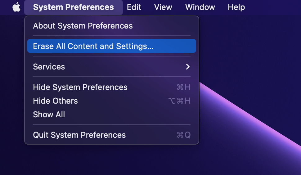
Whenever you sell an iPhone or iPad, it’s easy to erase them, eliminating all of your apps and personal data, leaving only the operating system in place. With Monterey, the equivalent functionality is available on the Mac for the first time. This isn’t the sort of feature you’ll use often, but if you ever want to trade a Mac in to Apple, sell it, or give it to someone else, Erase All Content and Settings, which is available from the System Preferences menu, should provide you with the peace of mind that your old Mac has been wiped clean and in a state where it can be set up as new by someone else.
Low Power Mode
Mac users have asked for a Low Power Mode for laptops for quite some time, and with Monterey, it’s now available. I’ve been testing Monterey on an iMac, so I don’t have first-hand experience with the battery savings Low Power Mode will provide yet, but Low Power Mode promises to extend how long your Mac laptop can last on a single charge by lowering screen brightness and reducing the CPU’s clock speed. The setting is available in the Battery section of System Preferences.
Split View and Full Screen Modes
Picking an app to add to the left of a Split View.
Apple has vastly improved Split View on the Mac by making it easier to swap app pairs. If you’re in Split View and want to change one of the two apps, hover over the green stoplight button in the top left corner and pick the option “Replace Tiled Window.” That will allow you to pick any other open app to swap into the Split View. Hovering over the same button has the added option to move an app in Split View to Full Screen instead. Also, if losing access to your menu bar in Full Screen mode has bothered you in the past, there’s now an option to display the menu bar even when you’re in Full Screen Mode, which you’ll find in the Dock & Menu Bar section of System Preferences.
The new method of swapping in a Split View app reminds me of creating Split View pairs on an iPad. The feature acknowledges that two apps are often not enough, making it far easier to swap apps in and out of a pair as needed. I’ve never been a big user of Split View on the Mac, but a big part of that has been because of previous limitations. It’s going to take some getting used to, but I plan to spend more time in Split View this fall to see if it’s something that could improve some of my existing workflows.
New Desktop Pictures and Screen Savers

Monterey’s new wallpaper.
Every update to macOS brings new Desktop pictures, and this year is no different. This year, the new Desktop picture is a stylized rendition of the Monterey landscape that comes in light and dark modes, as well as a dynamic variant that changes throughout the day. Apple has also made the ‘hello’ screensaver that debuted on the M1 iMac available to all Mac users in Monterey.
iCloud+
iCloud+ is a rebranding of Apple’s iCloud service that adds new HomeKit, security, and privacy features.
The Home app itself hasn’t changed appreciably, but iCloud+ has increased the number of cameras that can be monitored in the app at each service level. Previously, you could use up to five HomeKit cameras with a 2 TB iCloud storage plan. With iCloud+, you can use up to five cameras with the 200 GB plan, an upgrade from that plan’s previous limit of one camera, and the 2 TB plan now works with an unlimited number of cameras. Video footage will continue to be stored for 10 days and doesn’t count against your iCloud storage limit.
Private Relay.
iCloud+ also adds a VPN-like service to Safari called Private Relay. The new service routes your Safari Internet traffic first through Apple’s servers and then through a third-party partner to obscure your location and the sites you visit making it harder for sites you visit to track you. It differs from a VPN in that a VPN knows the websites you visit, even if the site you’re visiting doesn’t know where you are. With Private Relay, your Internet traffic is routed through Apple and then through a third-party partner. That second hop across the web means neither party has a complete picture of your Internet browsing and location. Also, Private Relay only works with Safari.
To turn on Private Relay, open the Apple ID section of the System Preferences app and select the checkbox for Private Relay. If you click the Options button, you can choose to maintain your general geographic location, which is the default and makes some websites easier and more accurate to use. The other option is to maintain your country and time zone only.
Private Relay is marked in System Preferences as a beta feature. Early in the beta period, I turned the feature off because I noticed a substantial dip in Internet speed when I used it. Late in the beta period, I gave Private Relay another try, and as before, I saw about a 50% drop in speed while using Safari. I tested Private Relay using Speedtest with a wired Internet connection.
Hide My Email.
iCloud+ also offers a new feature that hides your email address called Hide My Email. The feature creates a random email address that you can use when you don’t want to give out your iCloud email address. When someone uses your one-off address to contact you, it passes through Apple’s email relay system and then to your iCloud email address.
If you need to look up the address you used for a particular service, you can do that in System Preferences, which shows every burner email address you’ve used and the service it’s associated with. The list you’ll see on first-run may already have email addresses in it even if you’ve only recently upgraded because those are addresses generated by the existing Sign in with Apple service. You can copy the address, turn off forwarding to your iCloud email, and if you click the Manage Settings button, you can even revoke a service’s access to your Apple ID.
I’ve used Hide My Email several times over the summer when signing up for accounts with restaurants, and ordering items from some websites and it’s worked well. The only issue I had was when I contacted someone about a problem one time, and they went looking for my account and didn’t find an email address that used my name, but that’s arguably the point of the feature and something you’ll just have to keep in mind.
Passwords, Security, and Privacy
Passwords is now part of System Preferences.
Apple’s support for managing passwords continues to improve every year. With macOS Monterey, Passwords has its own section in System Preferences, which makes sense given that Passwords is a section of the Settings app on iOS and iPadOS too. If you’ve used the Passwords tab of Safari’s preferences, you’ll be right at home with the new System Preferences section because they’re identical, with a list of passwords on the left and details about each on the right. As with Safari, you’ll also be told if you have any passwords that need attention because they’re easily guessable, there have been security breaches, or other issues are detected.
Passwords also supports code generation for two-factor authentication systems. What’s more, codes work with AutoFill to generate and fill in the codes, making the process of using two-factor authentication easier than before. If you’re switching from another password management app to Monterey’s built-in system, it handles importing of passwords. Likewise, passwords can be exported to a third-party app. Both importing and exporting passwords can be accessed from the ‘more’ buton at the bottom of your list of passwords in the Passwords section of System Preferences or Safari’s Preferences. If you use Windows, Apple has introduced an iCloud Passwords app that lets you access your passwords and integrates with Microsoft’s Edge browser with an extension. An extension is also available for Google’s Chrome browser.
Importing and exporting passwords is possible from the Passwords section of System Preferences or Safari’s Preferences.
Finally, Apple is introducing a couple of other security and privacy updates to macOS apart from the new iCloud+ features. The first is that Intelligent Tracking Prevention precludes known trackers from viewing your IP address. Also, if you use an http:// address for a site that is known to support https://, Apple will automatically send you to the https:// version of the site.
Account Recovery Contact.
An Account Recovery Contact can be added to your Apple ID now to help you get back into your account if you get locked out. Apple is also in the process of creating a Digital Legacy program that will give your heirs access to digital assets associated with your Apple ID, but it’s not available yet.
Finally, there’s a new Control Center indicator showing when an app is using your Mac’s microphone. The indicator is a small orange dot next to the Control Center icon in the menu bar. Open Control Center, and you’ll see the name of the app using your microphone at the top of the popover.
Translate
Translating the introduction of Federico’s iOS and iPadOS 15 review into Italian in Books.
Monterey’s translation functionality isn’t a separate app like it is on iOS or iPadOS. Instead, it’s built into the operating system.
Monterey supports system-wide translation between the following languages:
- Arabic
- Chinese (China Mainland)
- English (UK)
- English (US)
- French
- German
- Italian
- Japanese
- Korean
- Portuguese
- Russian
- Spanish
To translate text, simply highlight it, right-click, and pick Translate. The first time you use the feature, you’ll be warned that your text will be uploaded to Apple for translation. However, if you prefer, you can visit the Language & Region section of System Preferences and download a language, so the translation can happen locally.
From the popup that appears when you invoke the Translate feature, you can play audio of the selected text in the language in which it’s written or the language to which you are translating it. There’s also an option to copy the translated text, which you can then paste into any app that accepts text.
Accessibility
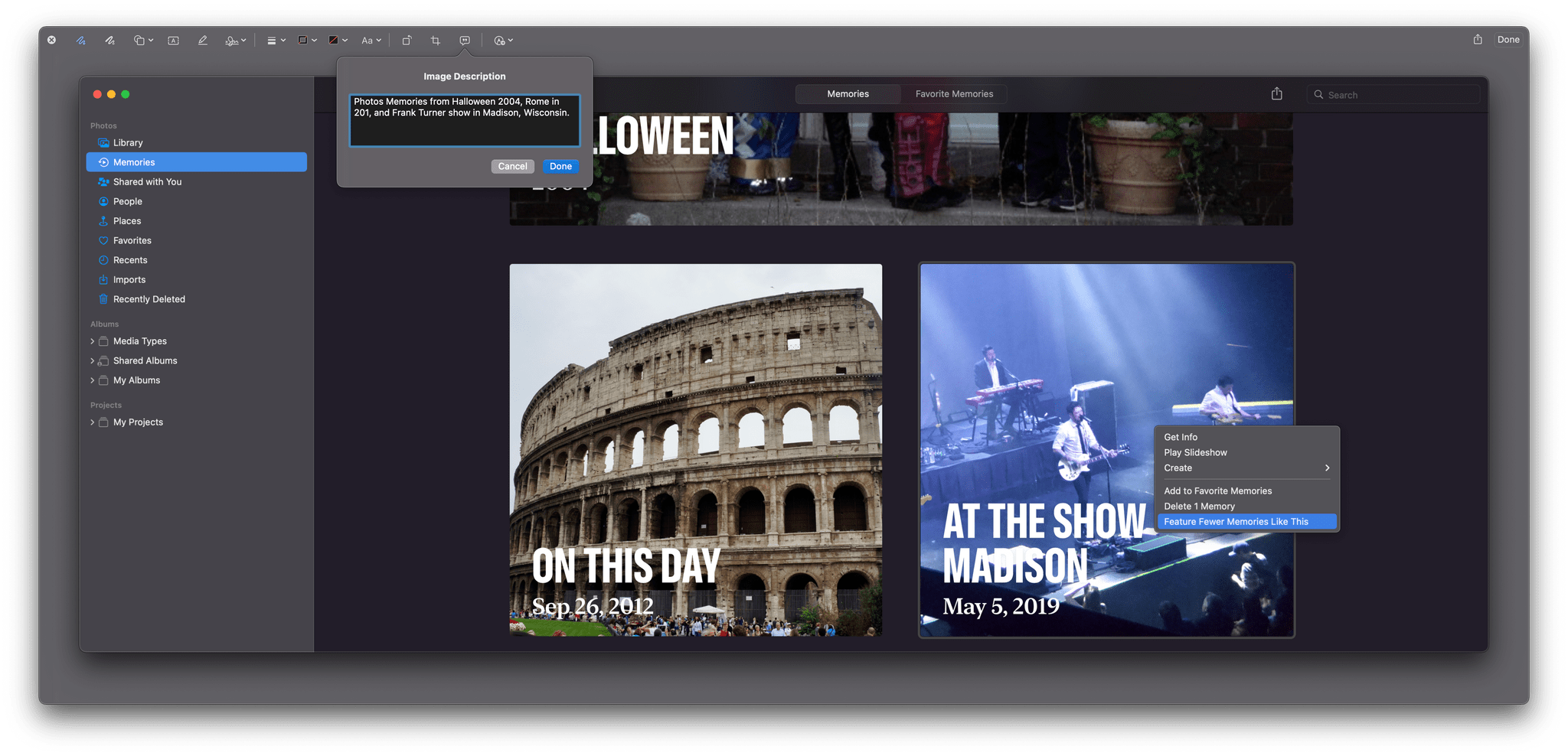
Adding a text description to a screenshot using Markup.
Markup is one of my favorite macOS features for quickly editing an image and sharing it. With Monterey, Markup can add text to images that can be read aloud by Apple’s VoiceOver framework. Descriptions can be added to signatures on PDFs too.
As with iOS, Apple has also included new accessibility features to Memoji, adding customizations like a soft helmet to headware, cochlear implants, and oxygen tubes. Accessibility has also been improved with:
- New SwiftUI tools, making it easier for developers to adopt accessibility features in their apps
- Improvements to Full Keyboard Access to onscreen elements
- Mouse pointers with customizable outlines and fills
- Accessibility support for FileVault’s login process and the Mac’s Recovery mode.
Everything Else
Launchpad includes a new dedicated Games folder.
There are a lot of other small changes in Monterey too. For gamers, there’s a new Games folder in Launchpad, the ability to capture 15 seconds of gameplay using an Xbox or PlayStation controller, new ways to connect with your friends in Game Center, and support for adaptive-sync displays.
If you use an M1 Mac, there is no longer a limitation on how long you can dictate a message.
There are also many more ways to customize your Memoji this year, many of which Federico showed off in his iOS and iPadOS 15 review.
Separate from updates to developer tools like Xcode, Monterey adds features that developers should appreciate. The first is the ability for third-party virtualization apps like Parallels to run up to two instances of macOS on M1 Macs.
Apple is also releasing an app called Reality Converter that requires macOS Monterey. The app takes advantage of Apple’s Object Capture API to convert still photos into 3D rendered AR objects.
Conclusion
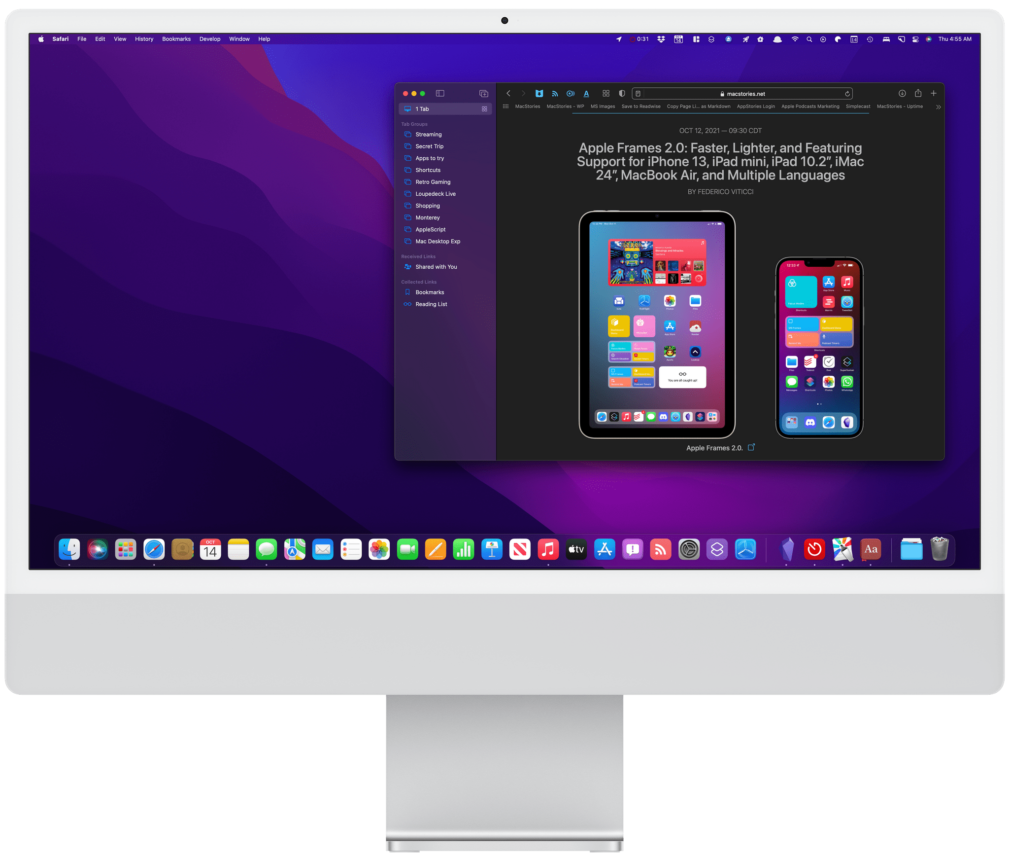
I have mixed feelings about macOS Monterey.
On the one hand, Apple has come a long way from 2018 to reposition macOS so that it’s in step with iOS and iPadOS. Many of the areas where macOS differed from Apple’s other OSes for historical rather than substantive reasons have been eliminated. I’m also a fan of most of the design changes ushered in with Big Sur last year.
On the other hand though, Shortcuts is a big disappointment. I’m all for the vision of a singular approach to automation across Apple platforms, but I’m concerned that too many people will be turned off by how frustrating Shortcuts can be to use. Still, I’m encouraged by the progress that has been made in the last couple of beta turns of Monterey. The app’s crashing has stopped and although the interface remains awkward in places, it’s improving. Even so, adoption by third-party developers has been more limited than I had hoped because of the issues with the app during the beta period, and despite the admirable addition of a long list of Automator actions, the beta cycle didn’t see much else added to the app.
That said, Shortcuts still has an incredible amount of potential to be the glue that holds together automation across the iPhone, iPad, and Mac. Some of that is possible now, but we’re still in the early stages. My hope for Shortcuts is that it continues to receive substantial improvements in point updates over the next year that fix issues but also introduces new actions. That’s certainly been something we’ve seen on iOS and iPadOS, so there’s no reason why it can’t also happen on the Mac. Waiting until the next major update to macOS would simply be too long.
When Apple revealed the first details of what would become Mac Catalyst in 2018, the Mac, its OS, and the Mac App Store felt out of step and sleepy compared to the iPhone or iPad. That’s not entirely surprising for a mature platform, but it also posed risks for the Mac, especially in a mobile-first computing world.
There are lots of good reasons for the Mac to be different from iPhones and iPads. The Mac is better suited to some tasks than an iPhone or iPad. The trouble in 2018 was that too many of the differences between macOS and Apple’s other computing platforms were the result of their development along separate paths using different tools.
Over the span of three updates, macOS has made incredible strides. It’s not surprising that not everything Apple has tried has worked. There’s still work to be done especially with young technologies like SwiftUI, which seems to be the root of at least some of Shortcuts’ problems. That doesn’t mean SwiftUI isn’t still the future for apps on Apple’s platforms – it just means the framework still needs time before it’s developed to the point where it’s the right solution for most apps.
In 2018, there was virtually no overlap between our iOS and macOS reviews. Today, Apple’s system apps are being developed in sync.
What I hope, though, is that Apple listens to critiques of the past few years and spends 2022 addressing the places where macOS doesn’t yet live up to its promises. The Mac is on an exciting path and, I think, the right one. With the most powerful Apple silicon Macs on their way to customers for delivery tomorrow, the next year is a perfect time to refine macOS, correct course as needed, and further harmonize the integration of Apple’s OSes and hardware.
And while the remaining issues mean that it’s not possible to close the book on Apple’s realignment of its OSes quite yet, there’s a very simple indicator of just how far Apple has come. Look at the system apps Federico and I covered in 2018 in his review of iOS 12, compared to my macOS Mojave review, and then look at our reviews this year. In 2018, there was virtually no overlap because updates to an iOS app often took a year or more to come to the equivalent Mac app. This year, the overlap is striking, not just in the apps that have been updated but down to the individual features. It’s not that the platforms are merging: for the first time, they’re moving forward together.
Support MacStories Directly
Club MacStories offers exclusive access to extra MacStories content, delivered every week; it’s also a way to support us directly.
Club MacStories will help you discover the best apps for your devices and get the most out of your iPhone, iPad, and Mac. Plus, it’s made in Italy.
Join Now