We may earn revenue from the products available on this page and participate in affiliate programs.
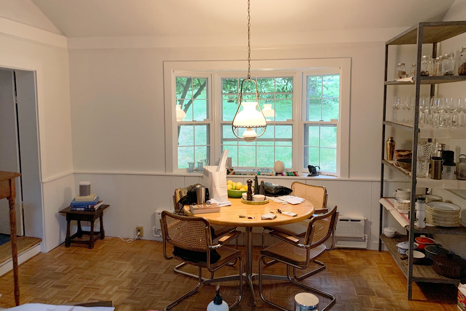
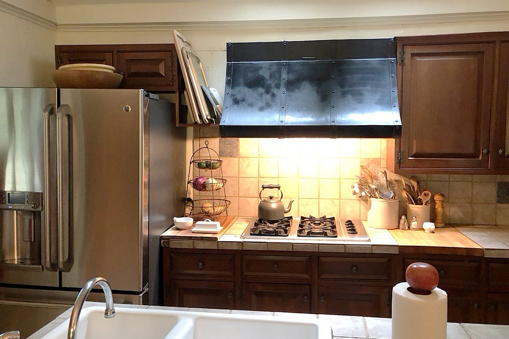
When Nick Spain, founder of design firm Arthur’s, first walked into the kitchen of this historic 1800s country home in Red Hook, New York, he thought: Hodgepodge. Well loved, but well worn. Kinda dark. Funky flow. Short on storage. Incredible views. Low ceilings but historic bones (the Smithsonian-archived house was previously owned by painter Edward Ludlow Mooney). In other words, a spot-on project for a designer who named his firm after his grandparents’ best friend, whose lopsided home was the frequent haunt of a certain little neighbor boy who honed his imagination and inventiveness during many an afternoon there.
“The first thing I do is ‘listen’ to the soul of older homes,” says Spain. “The clues of what it wants and needs to be are there between the original impulse, the existing architecture, and the previous owners. It’s my job to put them together, like a puzzle, and layer on my client’s needs.”
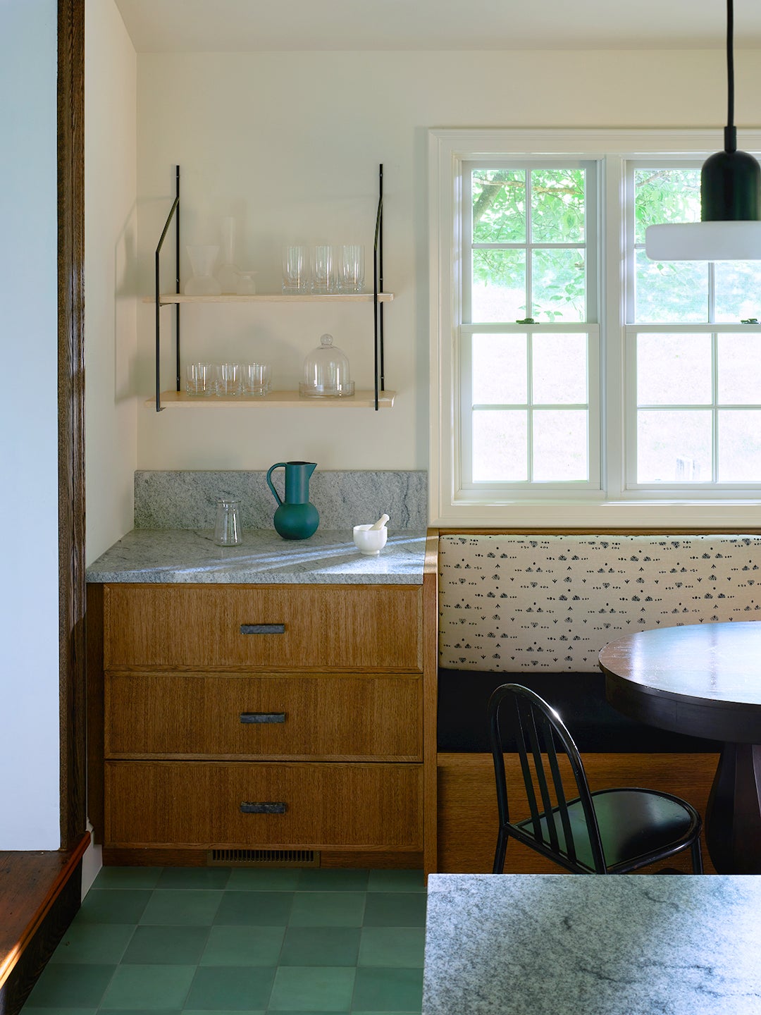
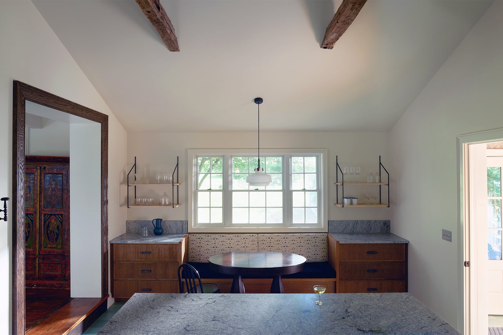
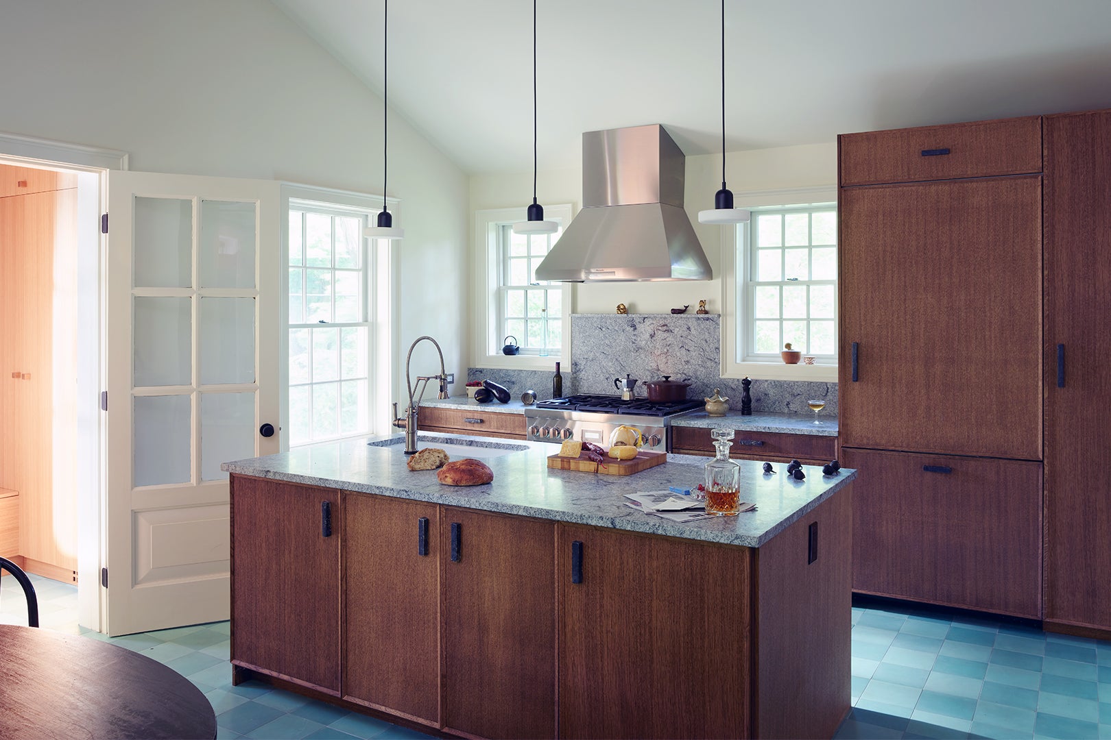
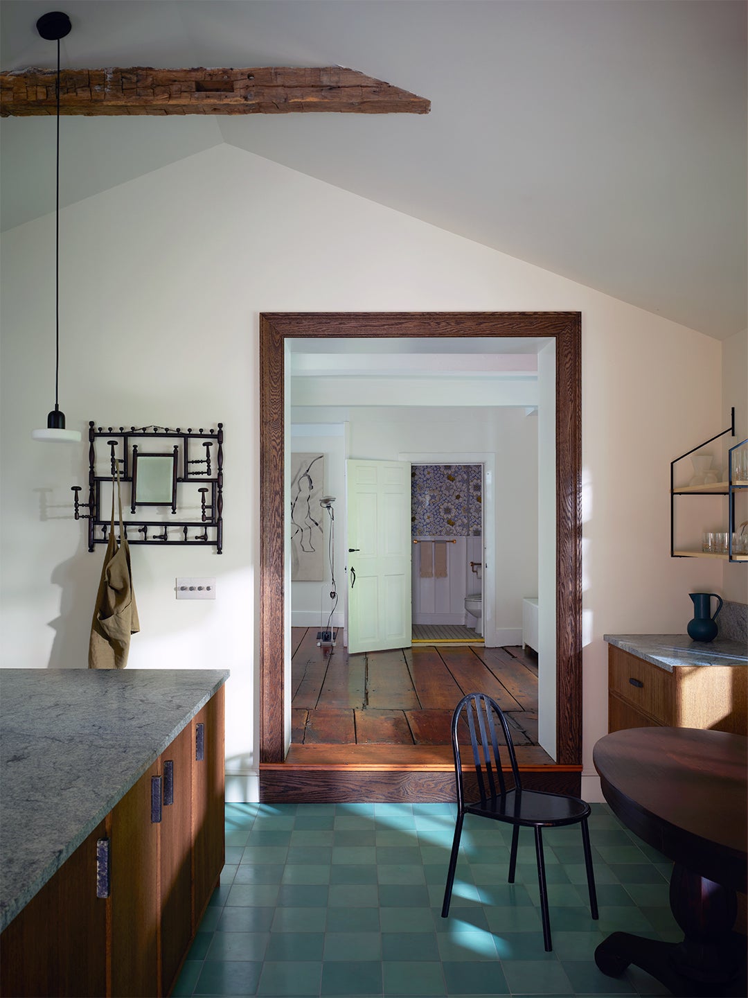
Spain’s ultimate goal with this project was “to acknowledge precedent but not be constrained by it,” he says. This meant a history-meets-modernity narrative complete with a palette drawn from Mooney’s masculine portraits, dark oak cabinets in contemporary cuts, ceilings vaulted with collar ties from the original framing, and a rethink on the traditional checkerboard floor.
Here’s how he maneuvered the mix.
Ditch the Wrong Kind of Retro
Some “awful” ’80s skylights were bringing in more light, sure, but bringing the vibes down—way down. “Immediately those had to go,” says Spain. “Skylights don’t belong in that Colonial house.” But the owners did need more light, so he expanded the window space with traditional six-over-six windows that, according to Spain, “feel in conversation with the original house.”
Hold Onto What Makes You Happy
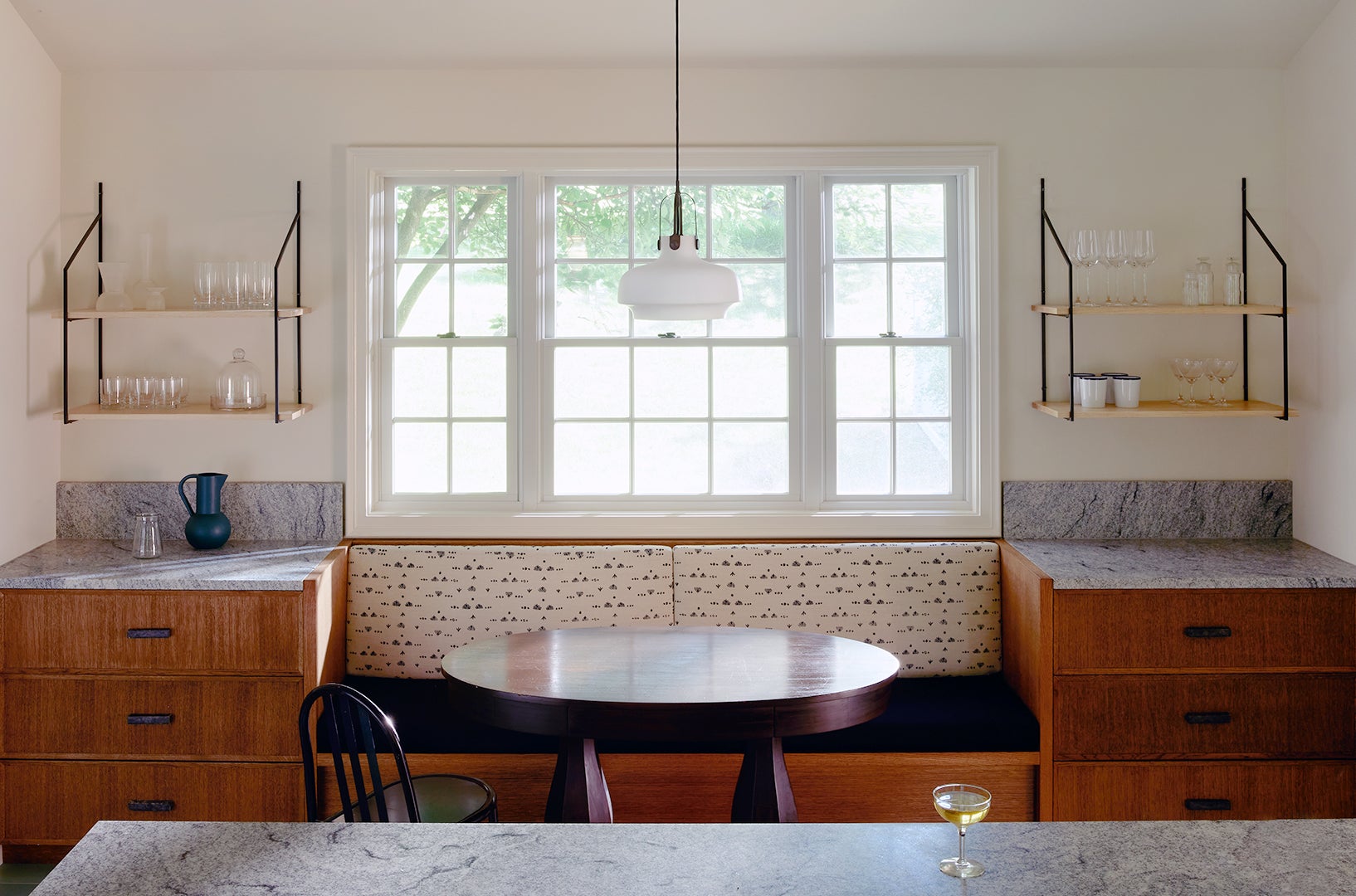
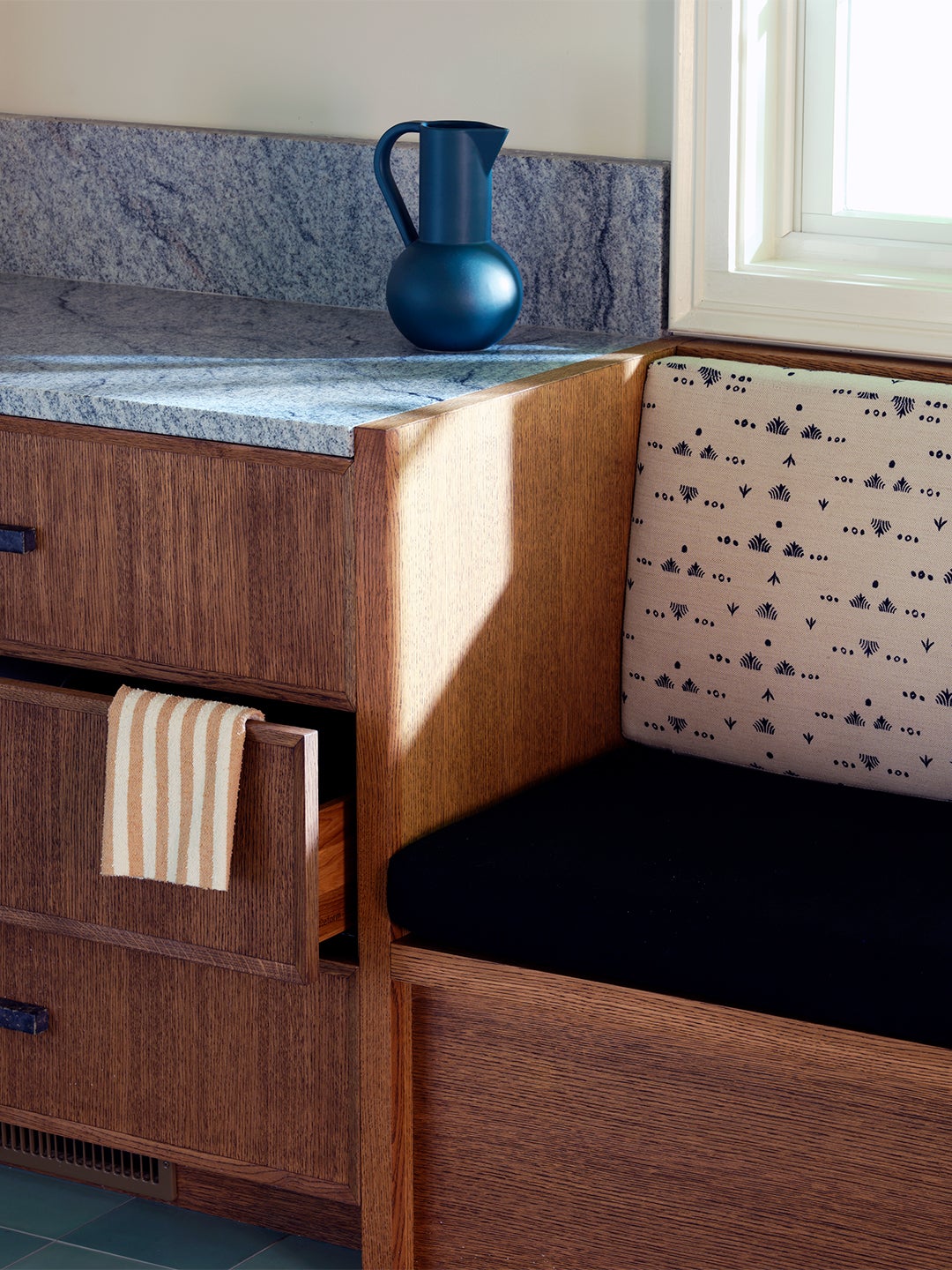
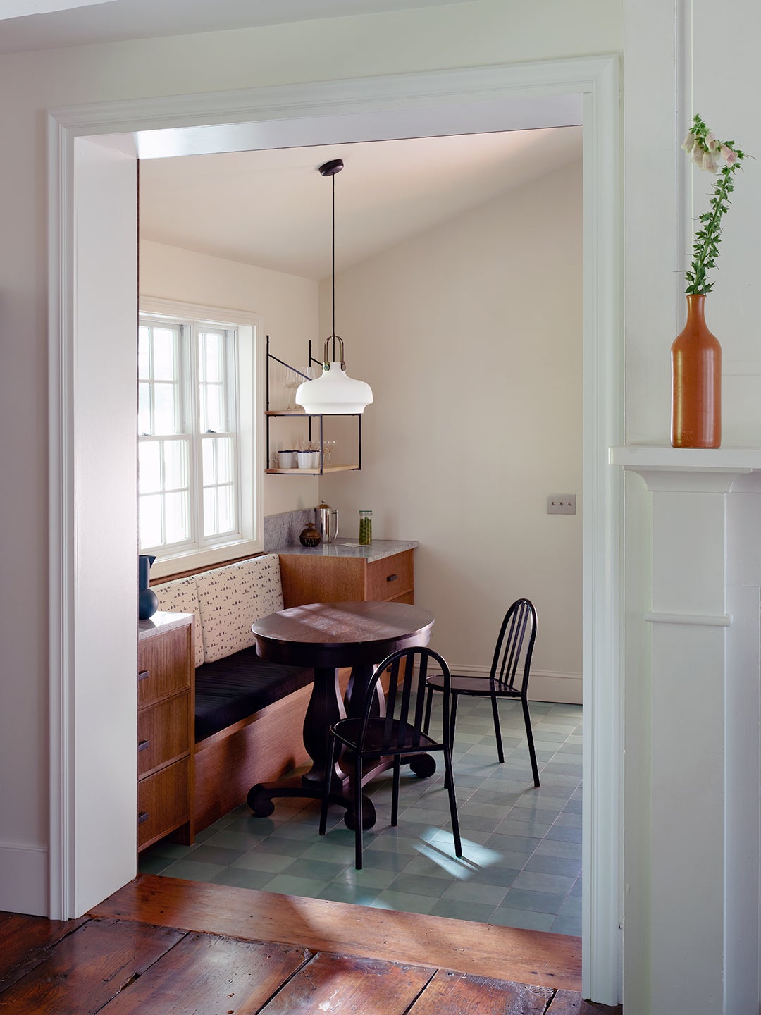
Spain dives deep with homeowners to determine which part of their existing space—if any!—they already cherish. In this home, it was the view out this window to dogwood trees and rolling hills. That was his cue to permanently frame it up with a built-in banquette (backed with fabric from Rebecca Atwood) and breakfast table for meditative, mug-in-hand mornings.
Own Your Habits (and Mess!)
Once pure function, kitchens now wear all the hats. Nowadays most people are using the space for cooking, eating, entertaining, WFH-ing, homework-ing—you get the drift. “You need a proper storage plan in place,” says Spain. “It’s the most crucial thing you can do.” Daily-use pots and pans in easy reach, cabinets reserved for miscellany, and room to grow. “We all have at least one junk drawer,” says Spain. “Admit it! All the funky stuff goes in there. It’s a must!”
Do Away With Design Friction
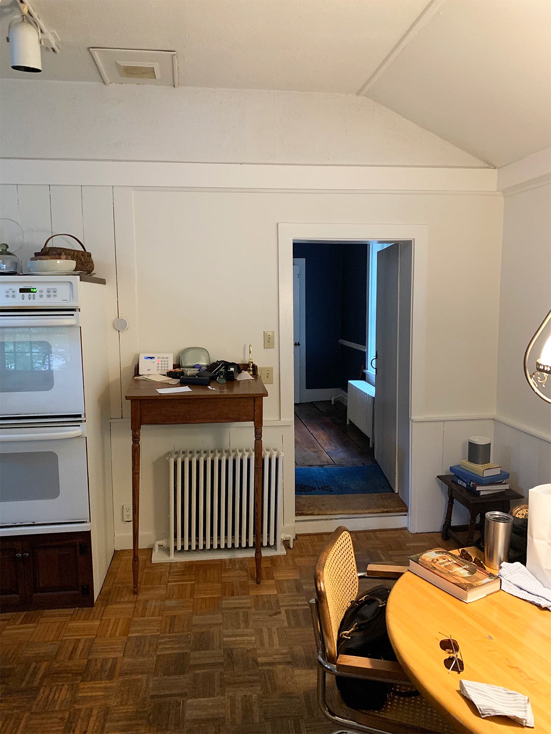
That light switch you always reach for and miss, those cabinets opening the wrong way, the counter you bump into weekly. When you’re reno-ing, fix them. “We moved the door to the mudroom by 8 inches so you could make a beeline across the kitchen to the rest of the house,” says Spain. “It sounds crazy, but sometimes the smallest tweaks can make all the difference in how functional your space is day-to-day.”
Splurge on High-Touch Items
Those items you constantly interact with deserve extra love. “We underestimate the value of things like handles, hardware, knobs, light switches, and cabinet guts,” says Spain, who brought in custom pulls by ceramist Jordan McDonald. “Loving the feel and function of things you mess with daily in your home significantly impacts your life.”
Put a Twist on the Classics
Though found throughout global history all the way back to ancient Egyptian temples, black and white checkerboard floors bring a certain amount of nostalgic Americana to the party. “They’re in the background of a lot of our cultural touch points, like pizza parlors and coffee shops,” says Spain. So while nodding to the checked diner standard, he drew from one of his client’s color-saturated childhood in India with a palette of deep blue and green Zia tiles.
Don’t Follow Trends
“We went to this place on Instagram where all the oak was whitewashed,” says Spain. “But I love natural oak. All shapes and sizes. And in this home, dark oak felt more old world and appropriate.” The cabinets by Reform give a smidge of modernity with their sleek, simple framing.
Don’t Sleep on Small Spaces
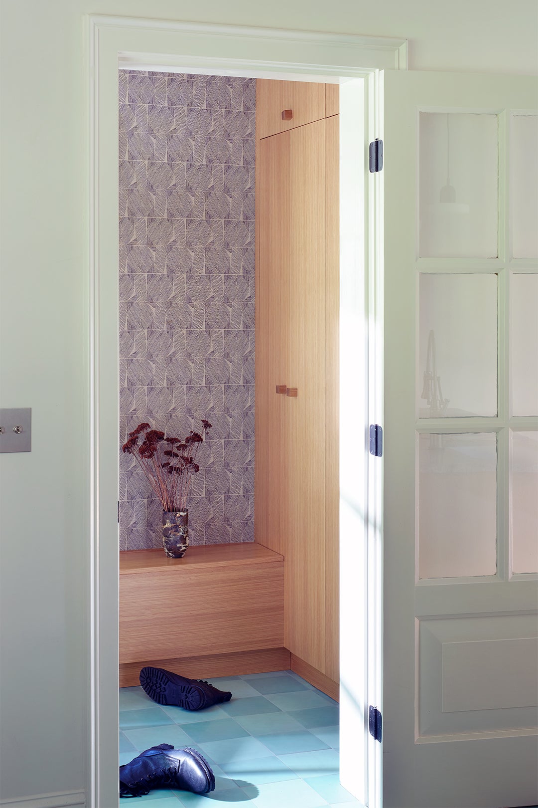
Off the kitchen, a tiny entryway languished. “It was a mess,” says Spain. “Tight space, insignificant storage. But it’s your first entry point to the house and really needs to function.” He wrapped the petite room in cabinetry and carved out space for a bench. At 10 inches wide, it’s narrower than the 12-inch standard but still wide enough for storage down below and a seat to perch and de-boot before walking into the kitchen.
The post How One Designer Tackled The 1800s (and Then the 1980s) in This Kitchen Reno appeared first on domino.


