Your email newsletter is one of your most powerful marketing channels. Between sharing news, making announcements, and nurturing relationships with your customers, newsletters can be molded into just about anything.
While other marketing tactics go out of vogue, it begs the question: why have newsletters stood the test of time? Well, newsletters keep subscribers informed about your business or product without being overly “salesy.” They give subscribers the agency to engage with your business on their terms.
But there’s one condition…your email newsletter content needs to stay fresh, competitive, and original to keep readers from hitting that dreaded “Unsubscribe” button. When you’re creating new email content on the daily, it’s easy to lose sight of your creativity.
That’s why we’ve compiled 15 of the best of the best newsletter examples to reference when your brand needs a boost. These newsletter examples are more than eye candy — they contain valuable tricks of the trade and proven tactics that work.
Ready for your brand to make a splash in the crowded waters of email marketing? Use these 15 newsletter examples as inspiration for your next send.
15 of the best email newsletter examples we’ve ever seen
1. General Assembly
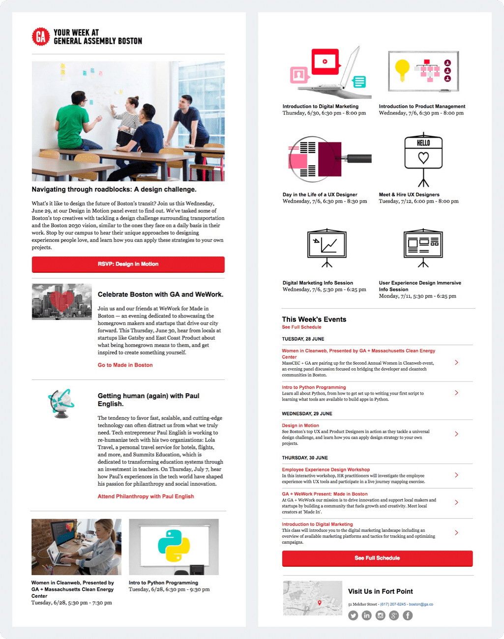
General Assembly offers educational courses, workshops, and boot camps in topics like coding, digital marketing, analytics, user experience (UX) design, and software engineering.
Their newsletter provides valuable dates and allows users to RSVP to upcoming events and workshops, and they do it in a very minimalistic fashion, even breaking down dates on a per-week level with a section called “This Week’s Events.”
Why it works
General Assembly’s email newsletter example is effective for two reasons: (1) it offers up a wealth of upcoming content and (2) keeps that content simply organized. At a glance, you can quickly see what long-term courses and after-work panels are available to you at the click of a button.
This kind of email newsletter works best with an engaged audience who is further in the conversion funnel — they’re actively looking for courses, webinars, boot camps, and workshops from GA.
2. Penguin Random House
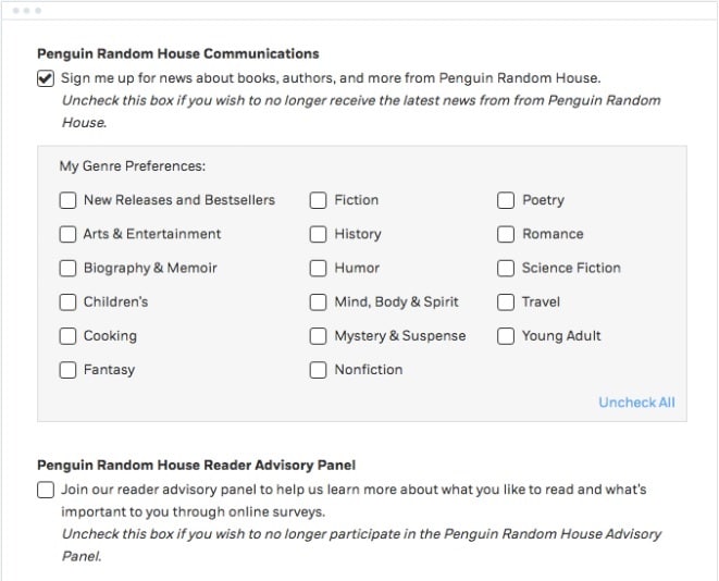
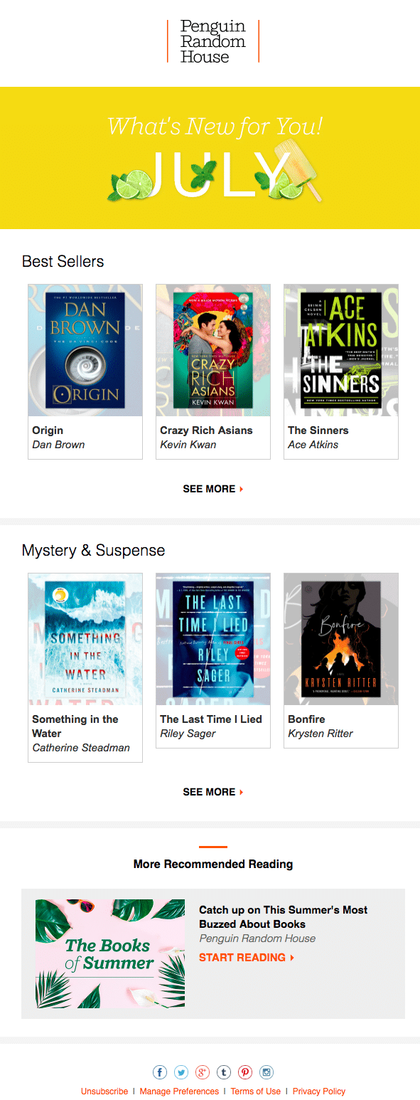
Are you creating one newsletter and sending it to all of your subscribers? Take a page out of the Penguin Random House playbook and send more personalized newsletters. Based on the information that you collect from your subscribers, you can segment your list and provide personalized content.
A personalized send shows people content that’s relevant to their interests. After all, you wouldn’t market sci-fi to a romance novel enthusiast, or vice versa.
But how does the publisher know which books the subscriber likes? In this case, Penguin Random House sent the subscriber a link to a preference center to select the most appealing book genres. Using that information, all of the newsletters that this subscriber gets are now customized.
Why it works
This email newsletter example illustrates why customization pays off. Before doing a mass send, remember that personalized emails get 6x the transaction rates.
Penguin Random House’s email example also highlights multiple book genres and, by encouraging subscribers to update their reading preferences, increases the lifetime value of their subscriber base.
When you’re trying to please everyone, you ultimately please no one. That’s why customization can be so powerful; it makes everyone on your list feel heard and paid attention to.
3. The Moz Top 10
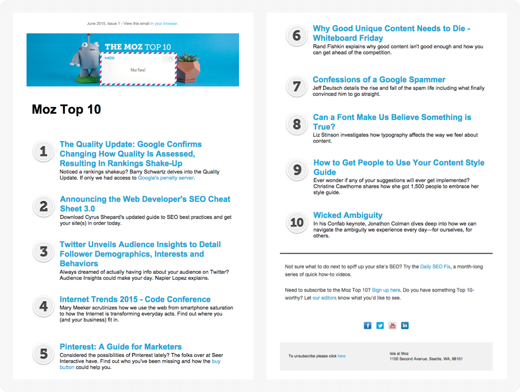
SEO giant Moz sends out a semimonthly email newsletter to share 10 of valuable, recent articles about search engine optimization and digital marketing.
Even better, they don’t stick strictly to their own content, choosing to curate the best they can for their readers.
These kinds of roundups can be relatively low-lift for businesses to put together — for example, you can throw a Google Alert on a trending topic or relevant keyword to make compiling your top 5 or top 10 easy.
Why it works
Moz’s Top 10 email features simple, no-frill design elements. It’s content-driven yet concise, and each article — whether they’re demystifying Google’s latest algorithm updates or diving into voice search — gets a 1-2 sentence tag to grab readers.
This kind of B2B email newsletter is perfect for establishing your brand as a thought leader or industry expert. It shows readers that you provide ongoing value, stay on top of the latest trends, and collate important updates that’ll keep open rates high.
The Moz email newsletter example plugs a few of their own features, but is primarily a tool for knowledge share.
Because you’re not trying to constantly sell, sell, sell, your readers will look forward to the insights each round-up brings.
4. Fizzle
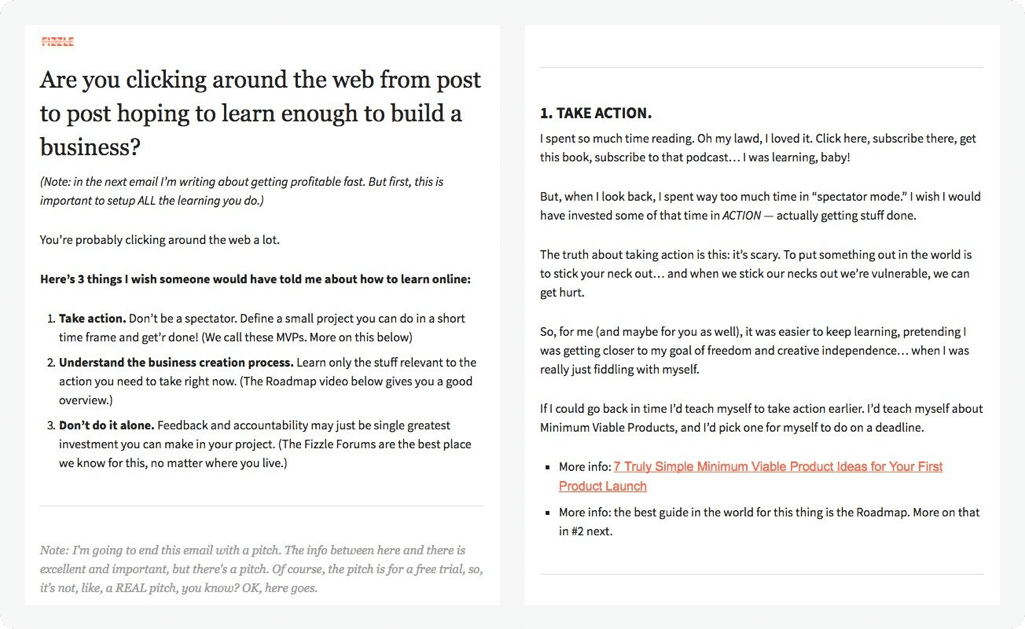
This is another unique take on a newsletter because Fizzle tries to keep the reader in their inbox instead of directing them all over the place.
In other words, Fizzle brings their content directly to subscribers so that they don’t have to click on links unless they truly want to dive deeper into the topic.
Why it works
This kind of email is a great way to establish trust with your subscribers because, while it culminates in a call-to-action for a free trial, they aren’t desperate for you to make a sale right then and there.
If you stay on the email page, great! You learn something new from the Fizzle team. If you sign up for a free trial, awesome. This kind of example proves that it’s less about conversion and more about building a relationship.
There’s enough meaty, relevant content to prove that they aren’t trying to be salesy or spammy. Instead, Fizzle offers a peek behind the curtain, often using a first-person POV to establish intimacy and expertise.
5. Apartment Therapy
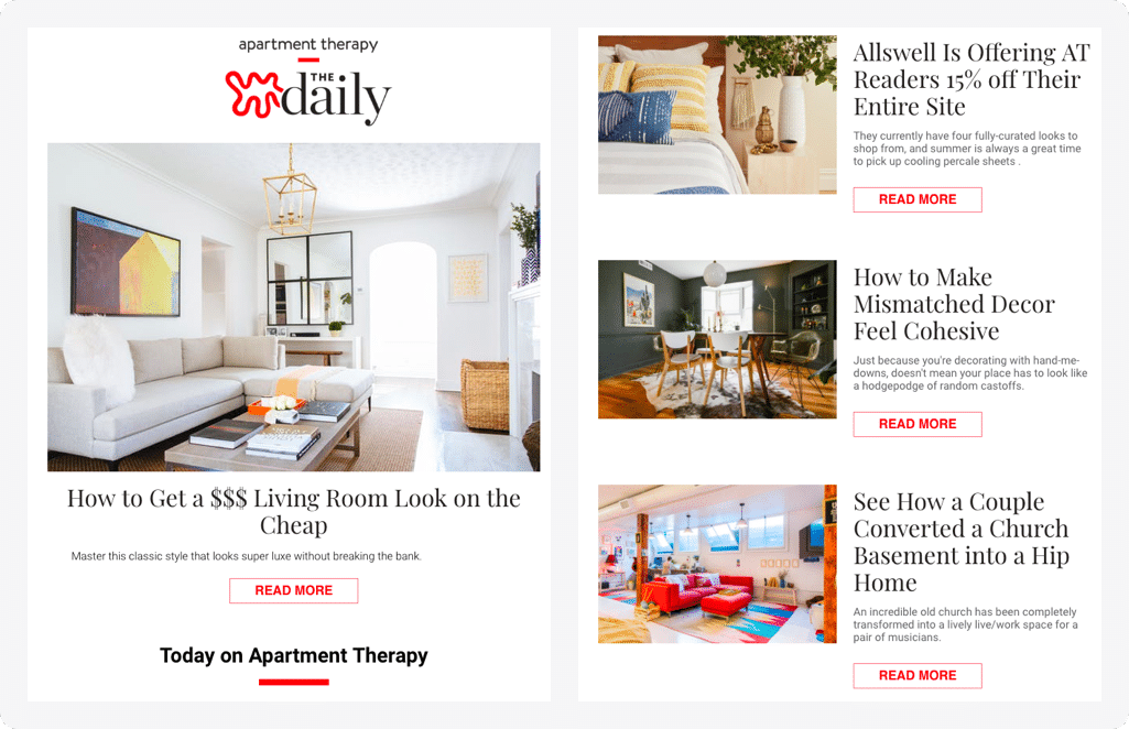
Content will always be king — especially when it comes to email — but the value of great imagery can’t be understated.
In fact, images can be just as important as the copy in your email newsletter. Apartment Therapy does a great job of selecting images for its newsletter. Each image is crisp, clear, and directly related to an article in the newsletter.
Why it works
Apartment Therapy knows why people come to their website: to look at beautiful photos of dreamy apartments. They apply that same knowledge to their email newsletter. It’s a core pillar of their brand to lead with visuals, because a home is a physical and emotional experience before it can become a digital one.
Research shows that content with relevant images gets 94% more views than just blocks of text.
Text can be intimidating, and an email newsletter that’s too text-heavy will have users clicking “delete” within seconds of opening.
Relevance is key here. In other words, the images you select should complement the content. (If you’re having trouble finding relevant images, check out this list of eight free sites to get images for your newsletter.)
6. Bloomscape
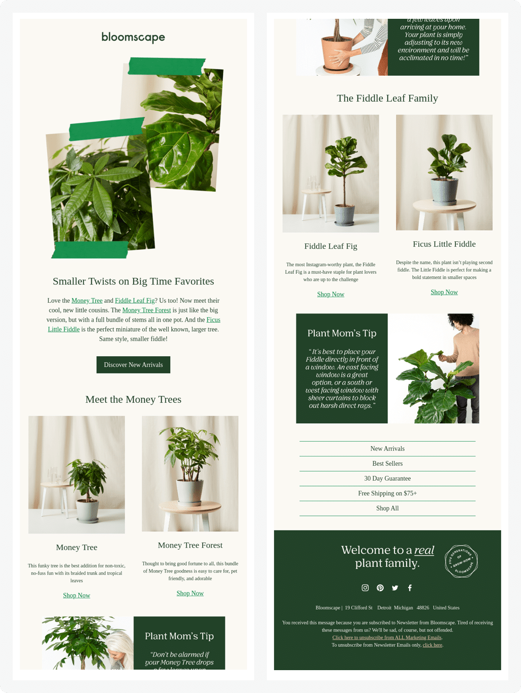
Bloomscape is a direct-to-consumer (DTC) brand that sends houseplants straight to your door, everything from low-light and low maintenance ones like zz plants to finicky fiddle-leaf fig trees. Bottom line, Bloomscape brings you an Instagram-worthy plant jungle with the click of a button.
In this email example, the Bloomscape team peppers in lots of beautiful plant photography plus descriptions of plants you might like (“Smaller Twists on Big Time Favorites”), shows off new arrivals, and offers up a helpful “Plant Mom” tip.
Why it works
This Bloomscape email is minimalist but with thoughtful touches. It leads with green and neutral colors while also giving readers the low-down on different plant types and their stories. What works about Bloomscape’s emails is that they help readers plan their next plant purchase. It’s educational, but also delightful.
7. Canva
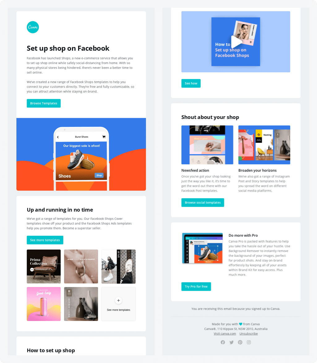
Canva sends about 5 emails per month, so each one is carefully constructed for engagement and retention. This email newsletter example from Canva is a deep dive on all things Facebook for ecommerce, like Facebook Shops, which allow users to shop directly from Facebook.
Canva knows how much of its audience consists of small ecommerce businesses who make their own marketing materials and need easy templates to make product ads, newsfeed posts, and more for their business.
Why it works
Being a one-stop-shop for knowledge on all things FB means that Canva positions itself as a helpful and timely resource. On email sends like these, timing is everything, so make sure to align your newsletter with a recent product launch or press release.
This email content succeeds because it introduces the reader to something new (Facebook Shops), offers immediate solutions (Canva templates), and gives you options for even more Facebook content you can create with their tool (like posts or IG Stories!)
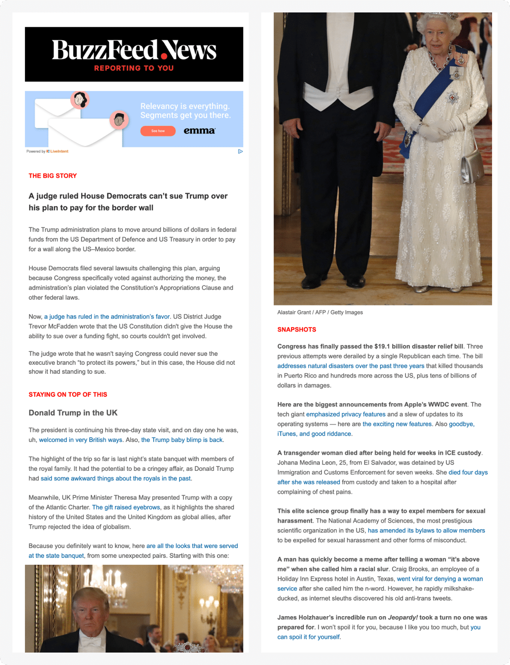
8. BuzzFeed
BuzzFeed has the market cornered on more than just online quizzes. In fact, Buzzfeed’s simple email marketing strategy is one to copy.
You’ve probably noticed a common tactic in newsletter marketing: the teaser email.
This kind of newsletter example doesn’t provide the full text of an article; instead, there’s a small description of the article with a call to action that drives traffic back to a website or blog where the entire article lives.
The small description is important. Your job is to write something that “teases” the reader, giving them a unique piece of information that encourages them to click on the story.
Why it works
The teaser email should be designed to grab the reader immediately, then encourage the reader to click through for more. It’s deceptively simple, but hard to pull off.
First, you need a strong understanding of copywriting and how to hook your subscriber. Why do they subscribe to your list? For Buzzfeed, they’re looking for snackable, quick, and fun content (like their famous quizzes).
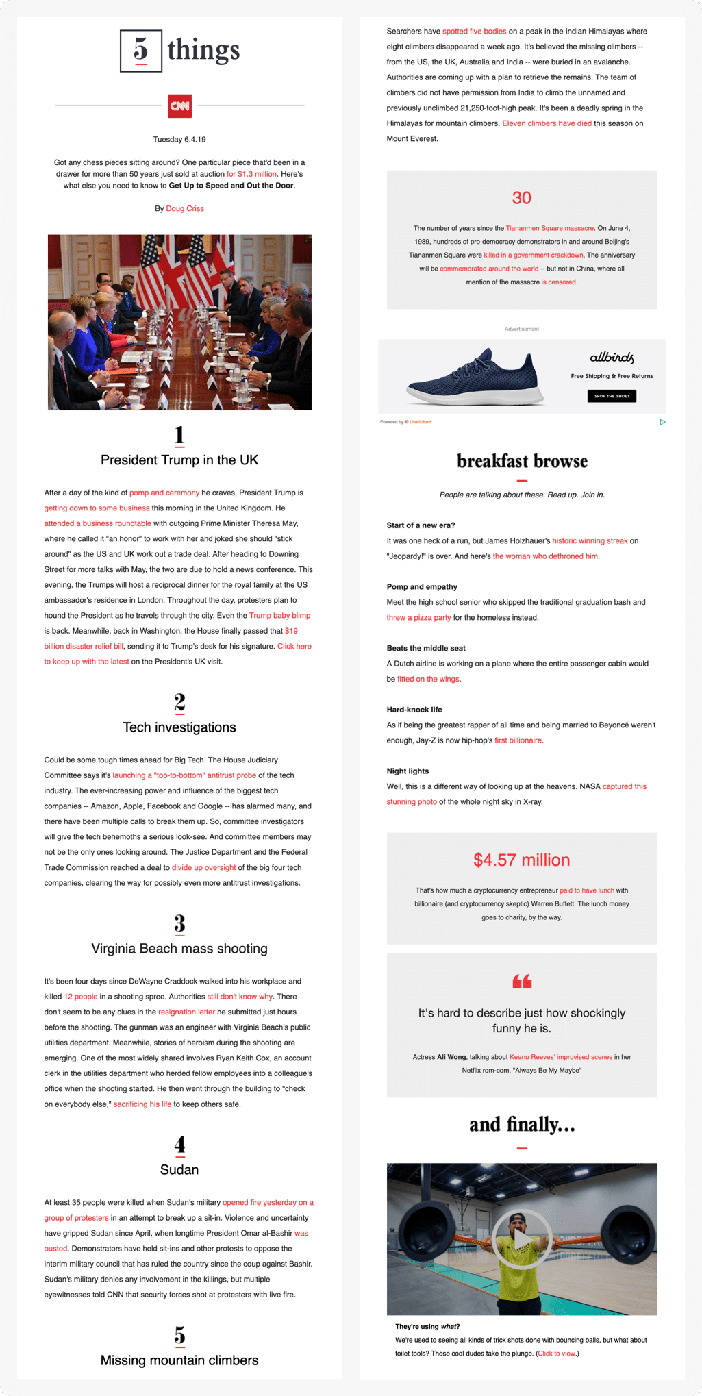
9. CNN’s 5 Things
As far as newsletters go, marketers simply can’t go wrong with curated news on top trending topics. In CNN’s 5 Things newsletter, they take the top five morning news stories that they believe “you must know” and send them directly to your inbox.
Why it works
Hear us out: email marketing, like exercising or forming a new habit, thrives on consistency. What makes CNN’s regular 5 Things newsletter a success is that readers expect it and the content follows a predictable but valuable format.
It’s not lengthy or preachy, but keeps it simple. Here are the 5 things you need to know that are going on in the world right now. CNN’s 5 Things reminds marketers of a key lesson in email 101: when in doubt, go back to basics.
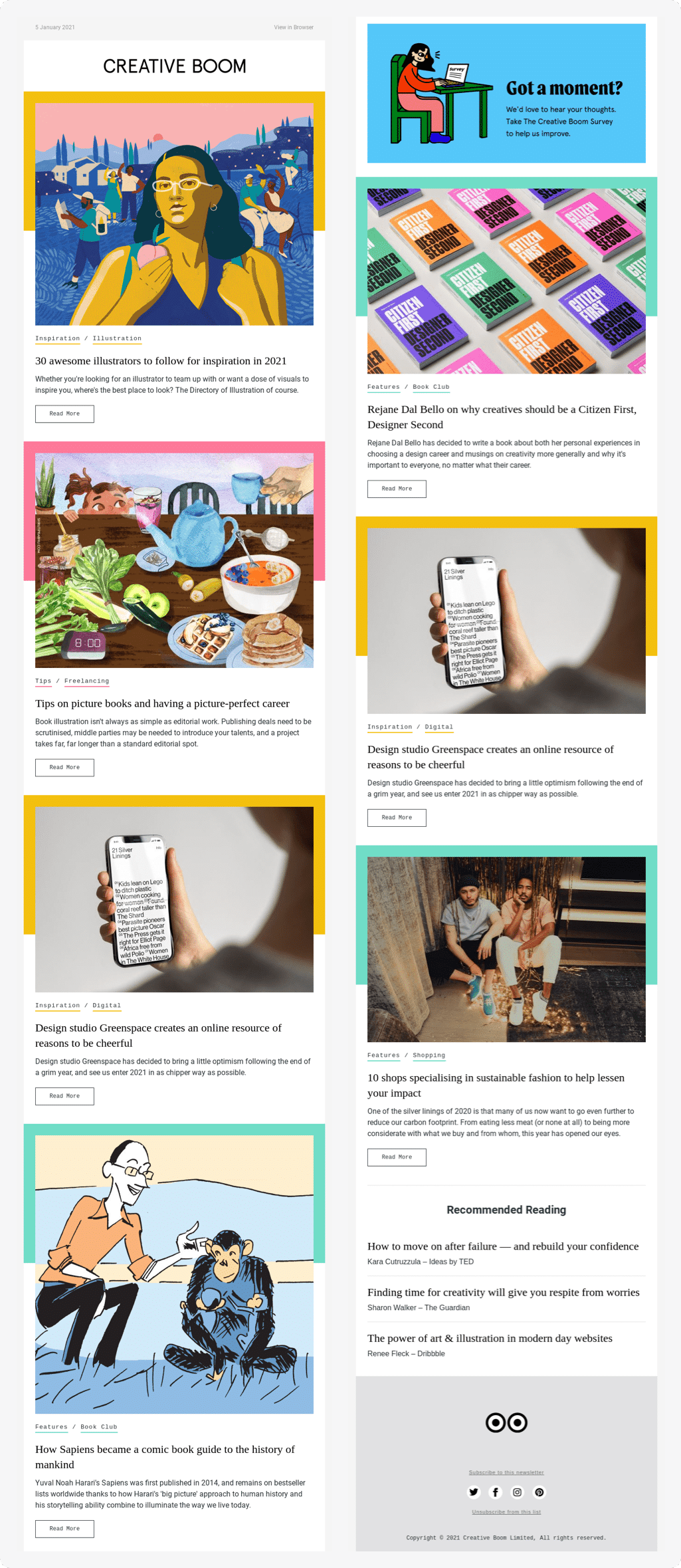
10. Creative Bloom
Creative Boom is a UK-based arts and design magazine specifically for creatives, illustrators, and designers. So for their email newsletter, they pair thought-provoking and inspirational article roundups with beautiful imagery — including a sleek header GIF.
Why it works
Would you trust an arts magazine with an “ugly” or “bad” email newsletter? We wouldn’t, either.
Creative Boom understands exactly who its target audience is, and that they’re artists and creators. It wouldn’t make sense to appeal to designers and illustrators with an all-text newsletter.
Instead, Creative Boom leads by example, highlighting artists and creators making cool stuff. Substance and style.
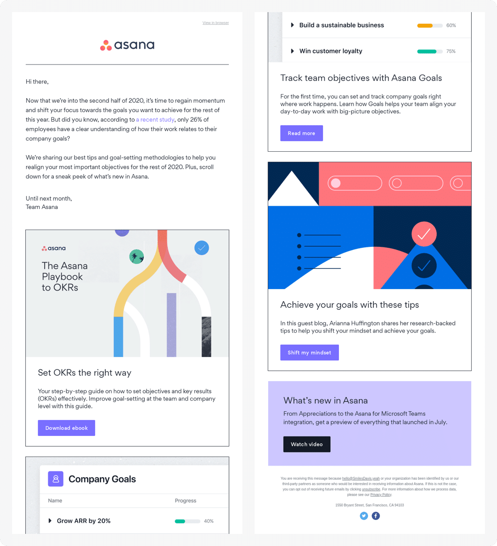
11. Asana
Like other successful newsletters we’ve highlighted in this post, Asana’s example follows a few best practices: it has a primary CTA button to download their e-book, and the content is themed around something seasonal. In this case, Asana breaks down mid-year goal setting, which is an important rallying call for corporate America and knowledge workers everywhere. Plus, this email includes Asana’s trademark visual style — clean, geometric, almost modernist illustrations galore!
Why it works
It’s simple: when you see this email, you know it’s from Asana. Their visual consistency and branding are huge differentiators. Plus, it feels organized, which is exactly what you want from a project management software.
There’s something appealing about the way Asana has the email designed into three simple sections, each clicking through to an ebook or relevant piece of content.
12. Academy of American Poets
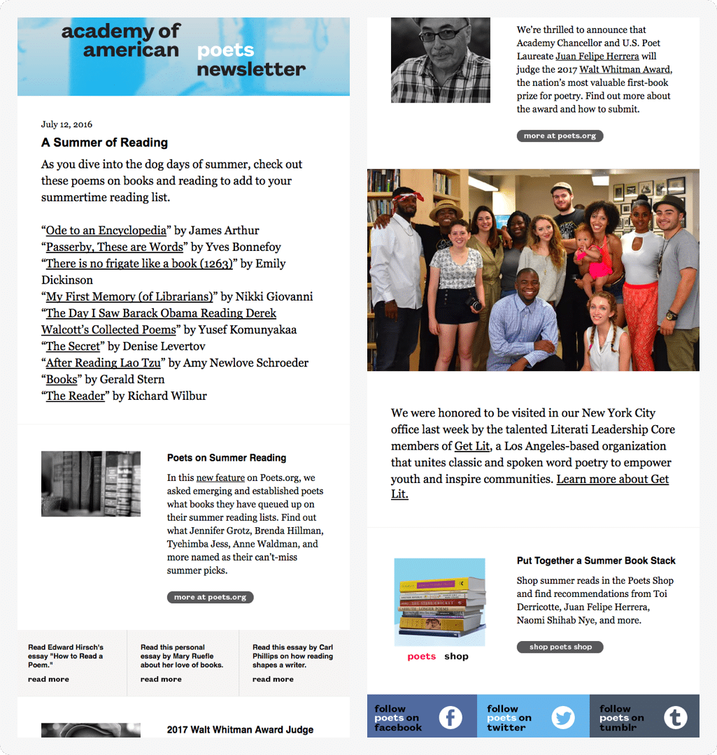
Academy of American Poets knows how to keep their content fresh and diverse. Take a look at the example below. Their newsletter features a list of summer-themed poetry, a feature piece on a judge that will participate in an upcoming competition, and more.
Why it works
Theming your content gives it a cohesive POV, and it also signals intentionality in your sends. Instead of a new send every time they publish a poem, Academy of American Poets curates its best and most thought-provoking content. This increases the likelihood of social shares and forwards, growing their brand awareness in the process.
13. Virgin Experience Days
Don’t underestimate the overall look and design of your newsletter. Pick a color scheme that’s appealing and coordinates well with your brand.
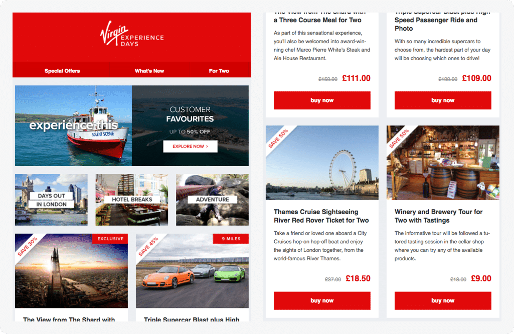
Take a look at a newsletter from, Virgin Experience Days. The company uses red, which is their main brand color, throughout the newsletter, to make each offer pop.
Why it works
The brain looks for patterns and visual consistency, and with Virgin Experience Days, the viewer immediately knows that color indicates significance.
Color theory can be a powerful tool in any email marketer’s arsenal, particularly for email newsletters that lean heavily into imagery. For an image-centric newsletter, you’ll want to make sure your offer or call-to-action stands out in another way (i.e. pops of color).
14. Unsplash
Unsplash is a stock image company that prides itself on beautiful, free photography. Many Unsplash images wind up on popular Instagram accounts or aspirational Pinterest boards.
One of the newsletters that Unsplash sends out is a selection of curated images that the brand thinks will best suit its readers.
Why it works
This email works on multiple levels. First, it shows that Unsplash features its user-generated content, meaning that anyone who contributes has a chance of their photography or imagery being seen by an email list of thousands.
Secondly, Unsplash only includes a few lines of text, leaving plenty of room for contributor images to be the star of the newsletter.
Simple, but effective.
15. Tracksmith
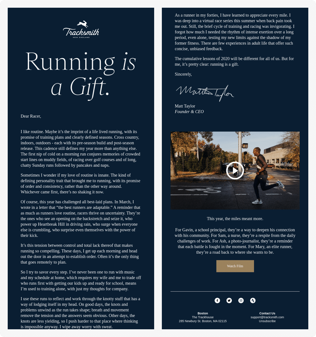
For one of their newsletters, running brand Tracksmith uses a tried-and-true email tactic: the letter. Tracksmith presents a large header that reads “Running is a Gift,” and launches into a letter from its CEO who decided to “savor every step” as a runner in his forties.
Why it works
When the letter is done right, it’s a beautiful way to capture the attention of your subscriber and keep them enthralled. Tracksmith’s use of the letter culminates in a link to a film they made about the power of running, but the beautiful copy and storytelling stand out on their own.
The lesson here for email marketers is twofold:
- Never underestimate the power of copy
- Sometimes, writing an email without a “buy now” or “get started” CTA button can give your audience a much-needed break from constant consumption.
Appeal to pathos and our human instincts, and you’ll foster more than a sale — you just might get a customer for life.
Create your own amazing newsletter
There you have it — 15 email newsletter examples that caught our eye, whether they’re designed to inform, educate, or simply delight readers.
Your newsletter doesn’t have to be the flashiest or trendiest one out there, but it does need to keep things interesting.
So, keep these tips in mind during your creation process.
Your newsletter should:
- Lead with the most important information. Ideally, your top story should live right below the fold to give people a greater chance of interacting with it.
- Give your content a job to be done. Was the email created for brand awareness, engagement, or conversion?
- Provide value to your audience. Is your email created for thought leadership, a product announcement, beautiful visual inspo, etc.?
- Personalization goes a long way. Readers want relevant content, which means personalizing the content to them, not to you.
- Newsletter design matters. It’s better to send nothing than to send an email that looks like it was coded in 2005 (hey, unless that’s your brand’s big thing).
- Keep it skimmable. For longer emails, vary up your sentence structures.
- Include a clear CTA for readers to act on.
Now, go out and send great emails!
The post 15 of the Best Email Newsletter Examples We’ve Ever Seen (and Why They Work) appeared first on Campaign Monitor.


